Toronto Comic Arts Festival (TCAF)
Logo redesign & Brand Identity
The Toronto Comic Arts Festival (TCAF) is a celebration of comics, graphic novels, and visual storytelling that draws a global audience of creators, fans, and industry professionals. Despite its growing prominence, TCAF’s existing logo felt outdated, lacking the vibrancy and modernity needed to represent the dynamic nature of the festival.
With my take on TCAF’s visual identity, I wanted to go beyond just a logo refresh—it needed a complete reimagining to capture the energy, creativity, and inclusivity that define TCAF. My goal was to craft a design that not only reflected these qualities but was also functional and adaptable across digital and physical platforms.
Understanding the Challenge
The first step in the process was understanding why the existing logo wasn’t working. It lacked the visual appeal to resonate with TCAF’s diverse audience, which includes comic creators, fans, and industry leaders. Furthermore, it didn’t align with TCAF’s core values: creativity, community, and the celebration of diverse stories. The logo’s limited scalability and adaptability also made it less effective in modern applications, such as social media graphics and event merchandise.
With a clear problem to solve, I framed the challenge: to design a brand identity that authentically represents the spirit of TCAF while maintaining versatility and functionality.
Diving into the World of Comics
To create a design that resonated with the comic arts community, I immersed myself in the world of TCAF. I began by researching its history, exploring its audience, and studying the visual language of comics. This deep dive helped me uncover the cultural and aesthetic elements that make TCAF so unique.
I sought inspiration from iconic aspects of comics, including vivid colours, bold lines, and the structured layouts of comic panels. These elements provided the creative foundation for the design. To capture TCAF’s identity as a hub for creativity and connection, I conceptualized a visual direction that emphasized energy, storytelling, and diversity.
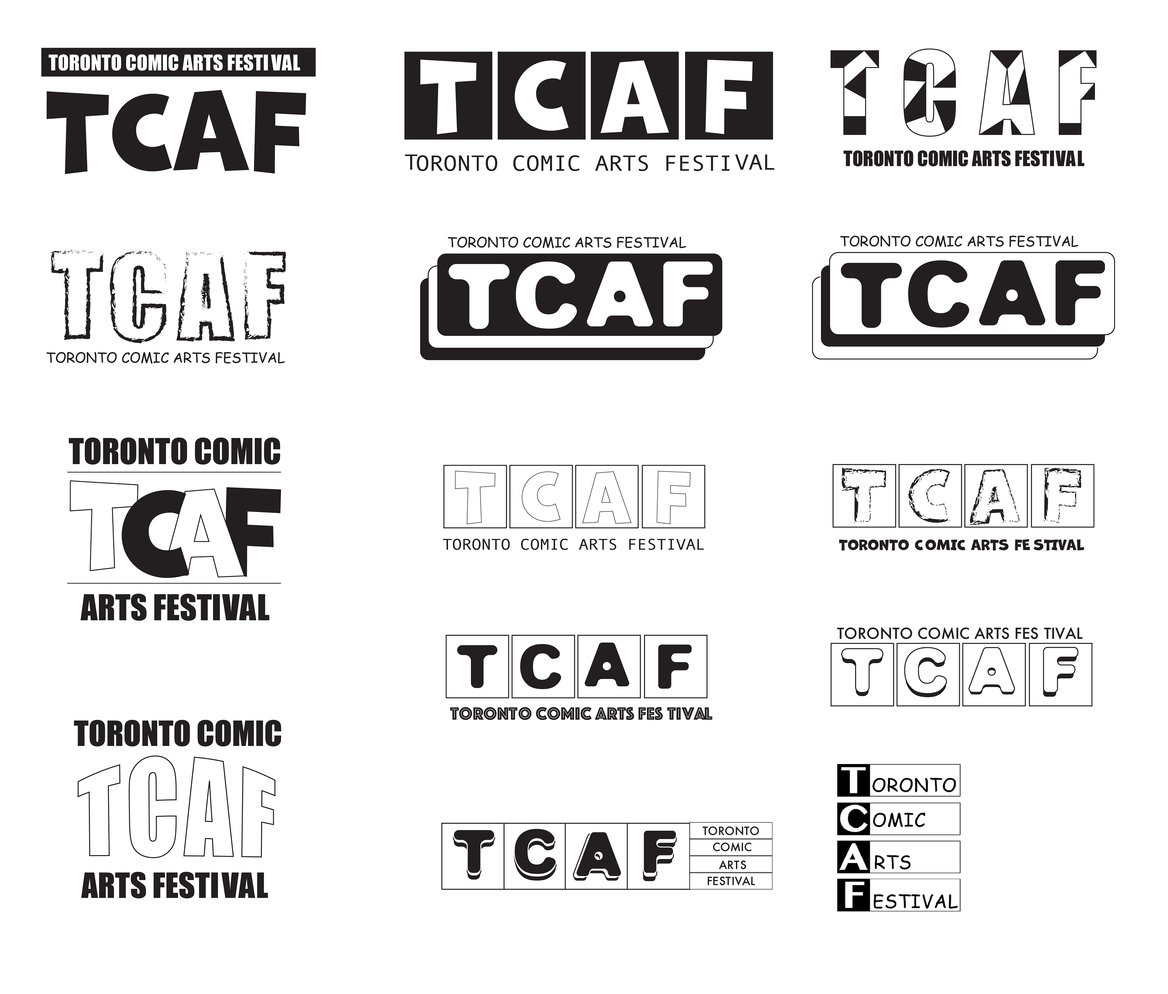
Sketching the Concepts
With a clear creative direction in mind, I began sketching initial logo concepts. Inspired by the structure of comic panels, I focused on clean lines and balanced layouts, ensuring the design would be visually compelling while maintaining readability. The goal was to subtly reference the storytelling medium without overwhelming the design.
As the concepts took shape, I refined the typography and layout to ensure they worked cohesively with the colour palette. The addition of subtle horizontal lines evoked the rhythm of comic panels, further tying the design to the festival’s essence.
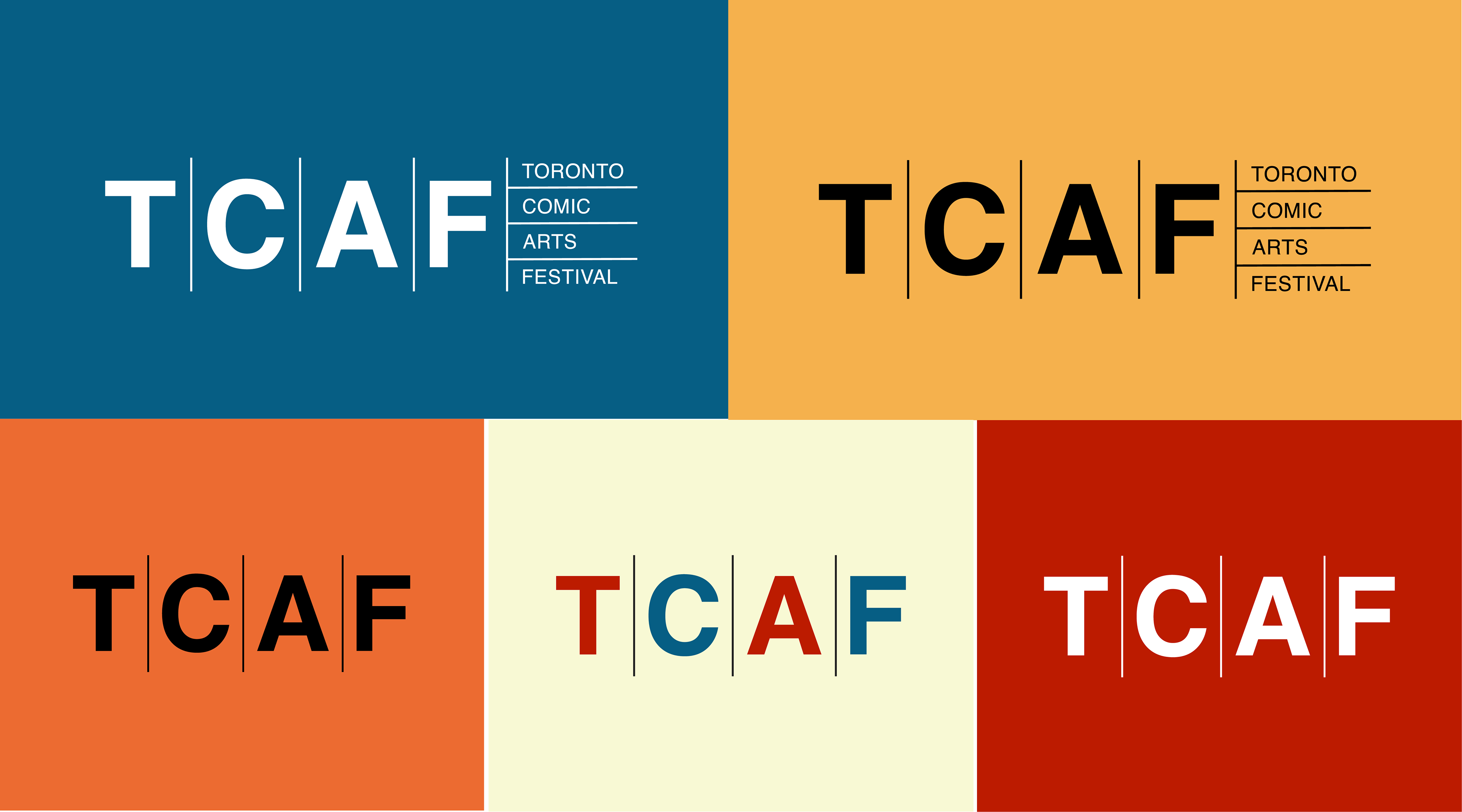
Testing for Versatility
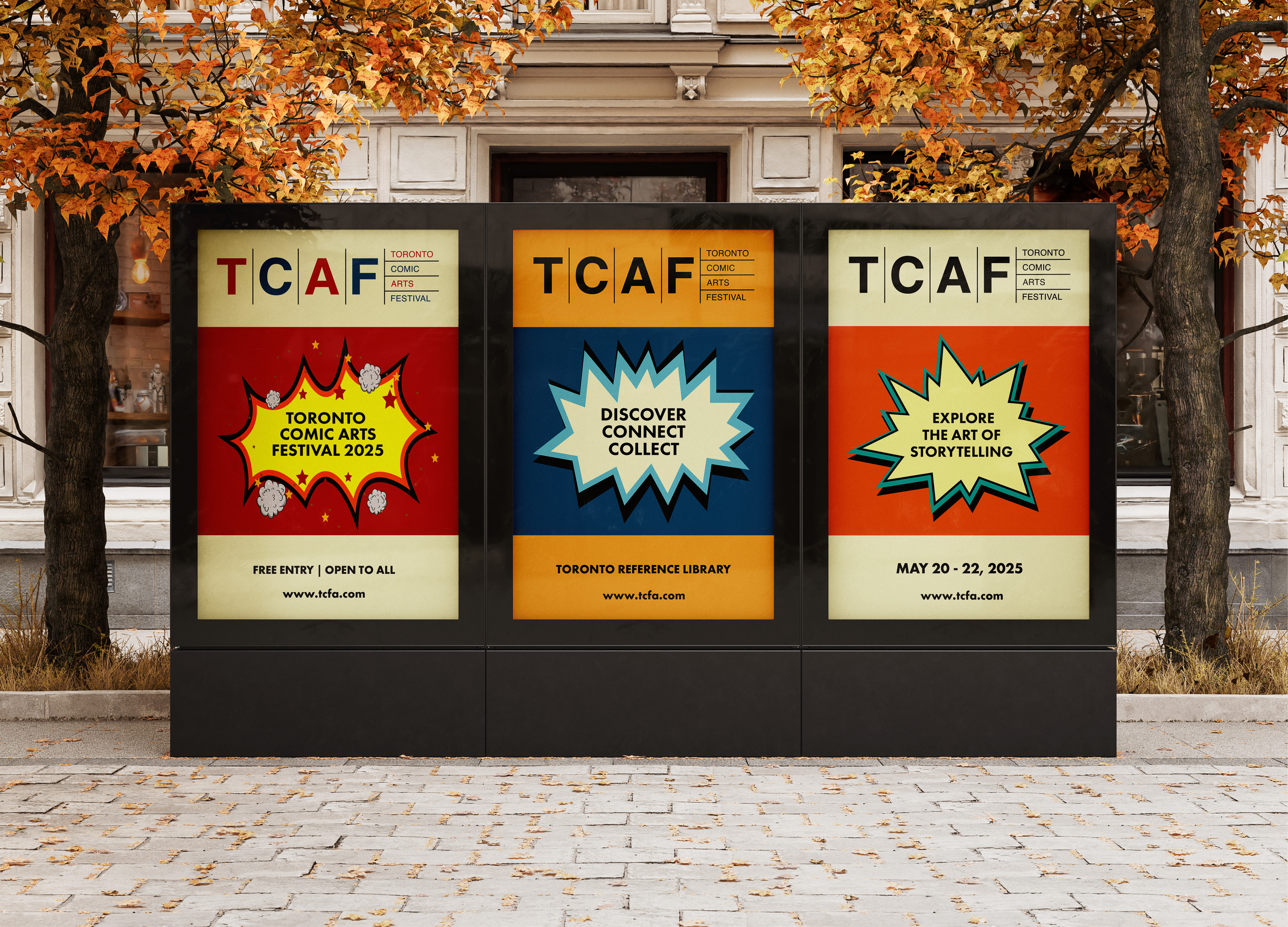
To ensure the logo met the functional needs of TCAF, I tested it across various applications. It needed to scale seamlessly from large banners to small merchandise and remain impactful in both print and digital formats. I also tested its readability and vibrancy against different backgrounds and lighting conditions to guarantee versatility.
Through this iterative process, I fine-tuned the logo to ensure it performed effectively in all contexts while maintaining its visual impact.
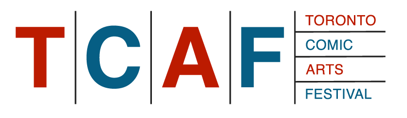
The Final Outcome
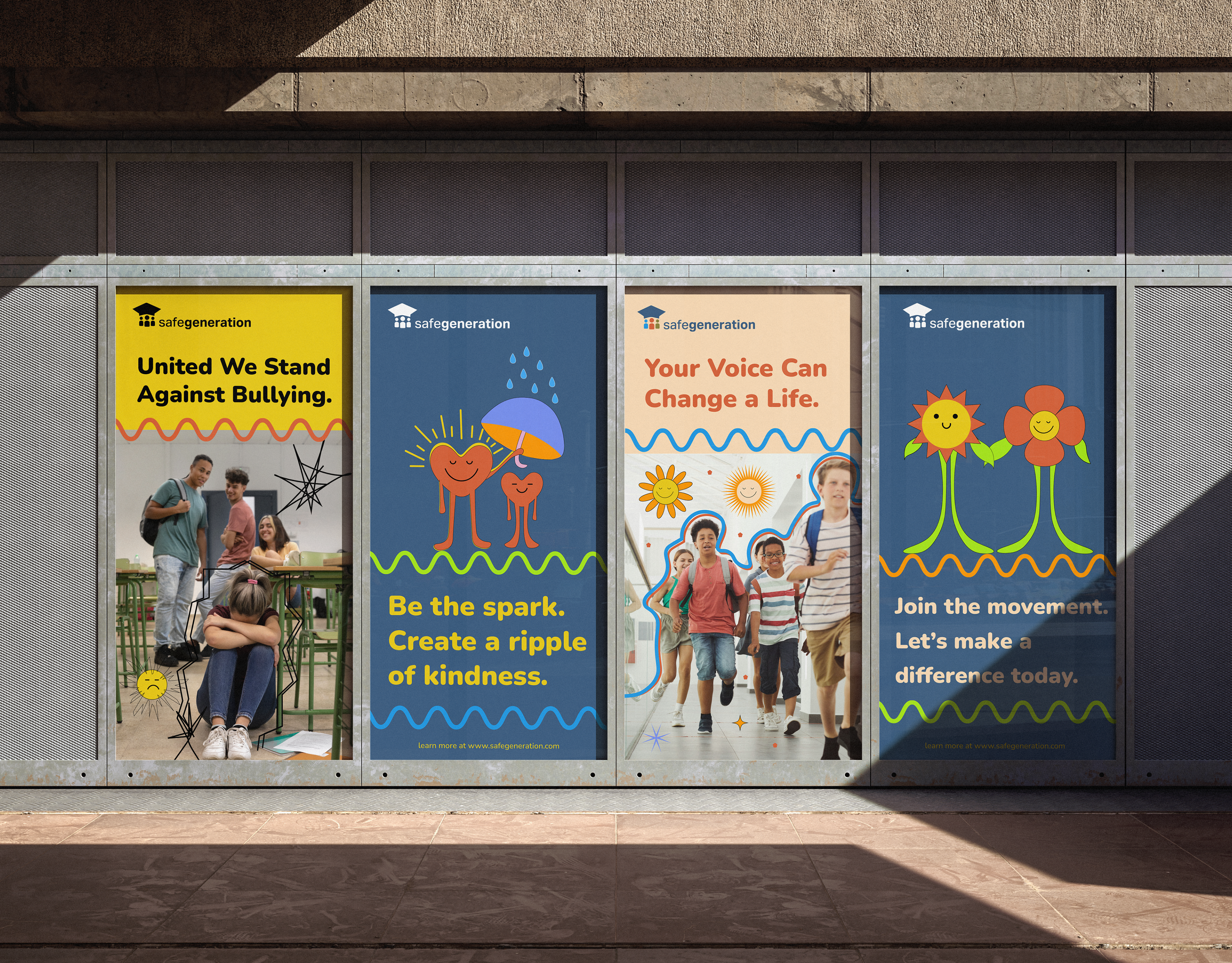
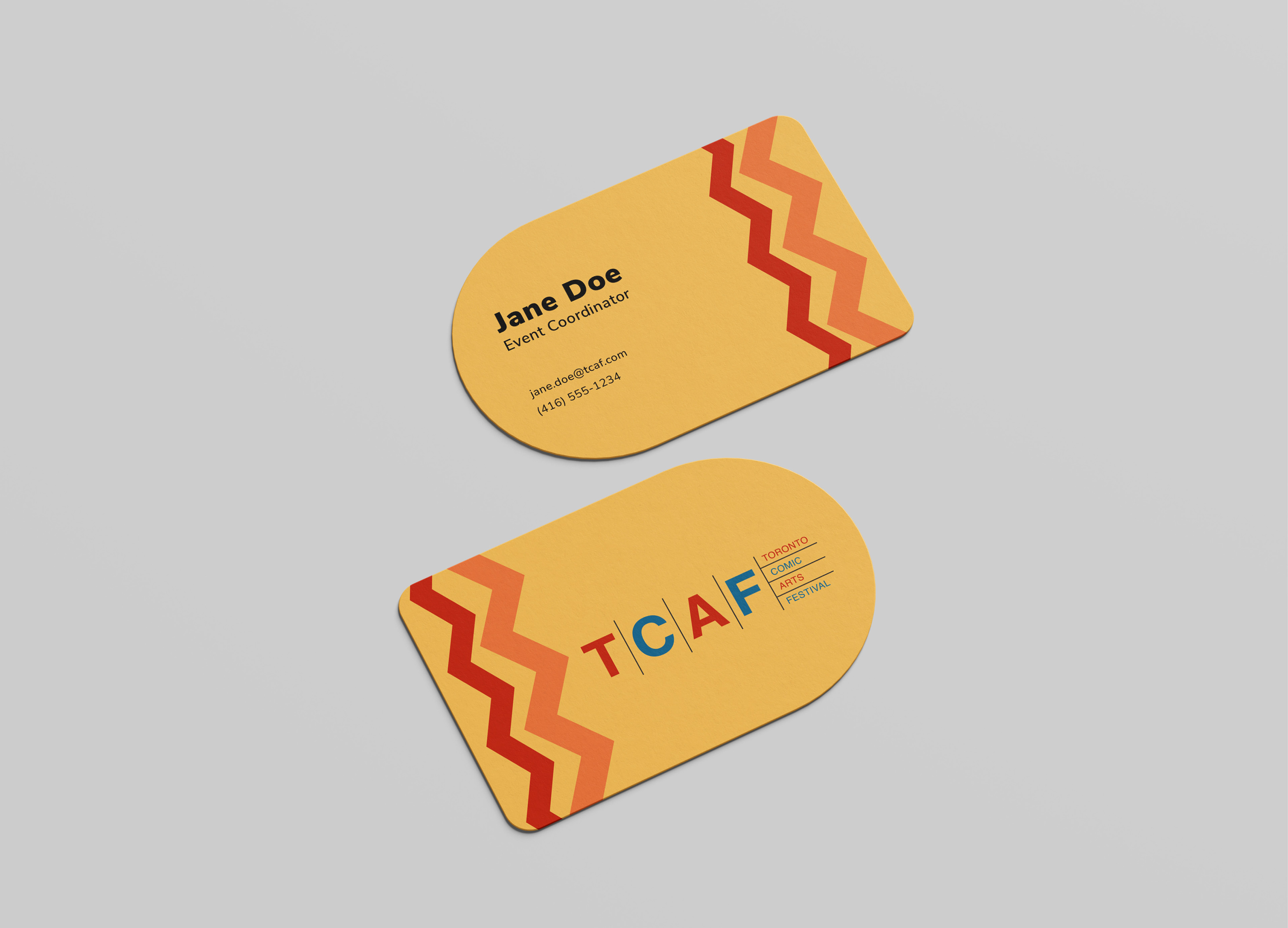
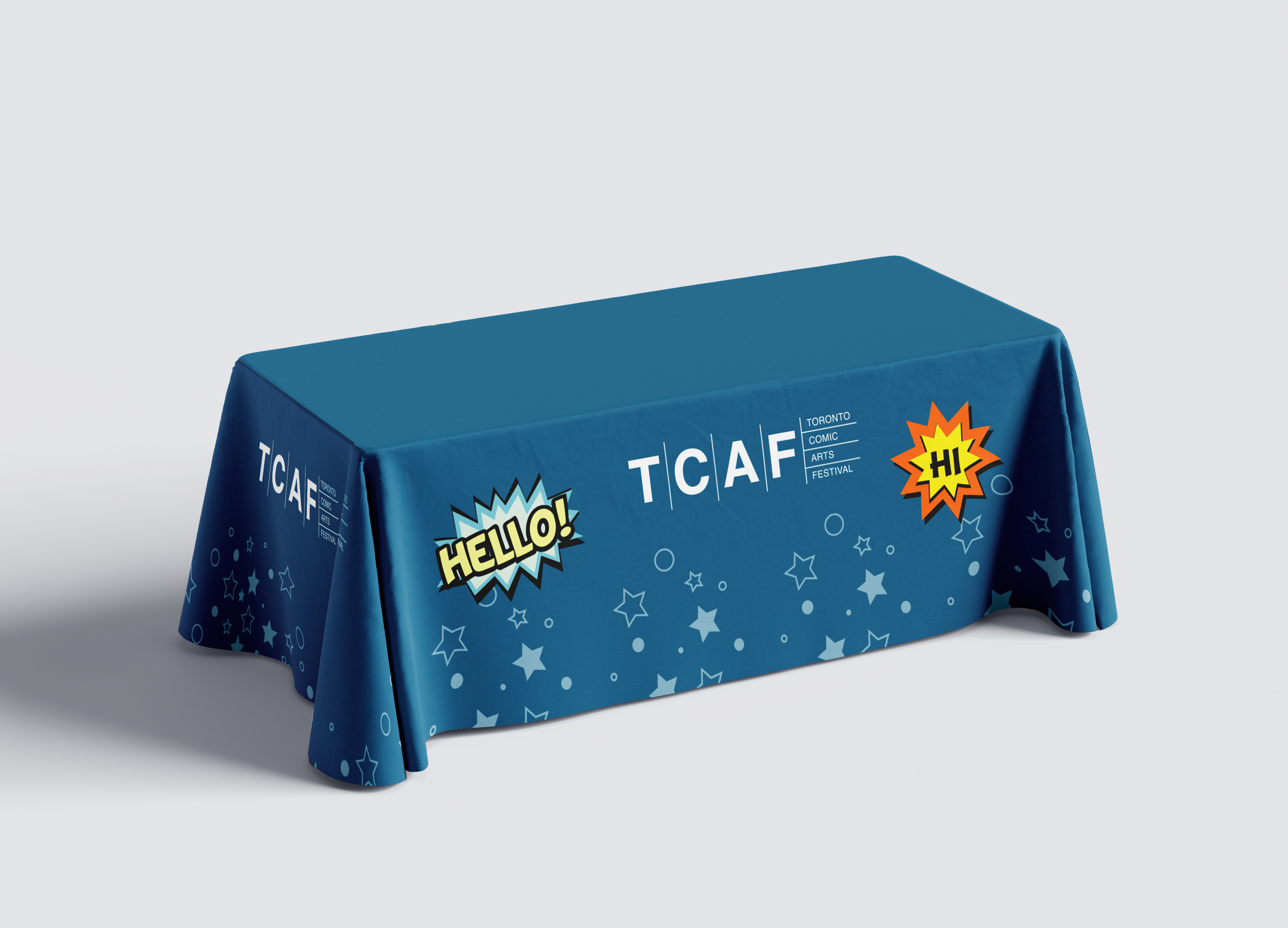
The redesigned TCAF logo is a bold and modern representation of the festival’s identity. Vibrant colours and sleek lines capture its dynamic energy, while subtle references to comic panels ground the design in its storytelling roots. The logo strikes a perfect balance between creativity and professionalism, ensuring it resonates with TCAF’s diverse audience. Its adaptability allows it to shine across a variety of formats, from digital screens to print materials, making it a versatile and enduring symbol for the festival.
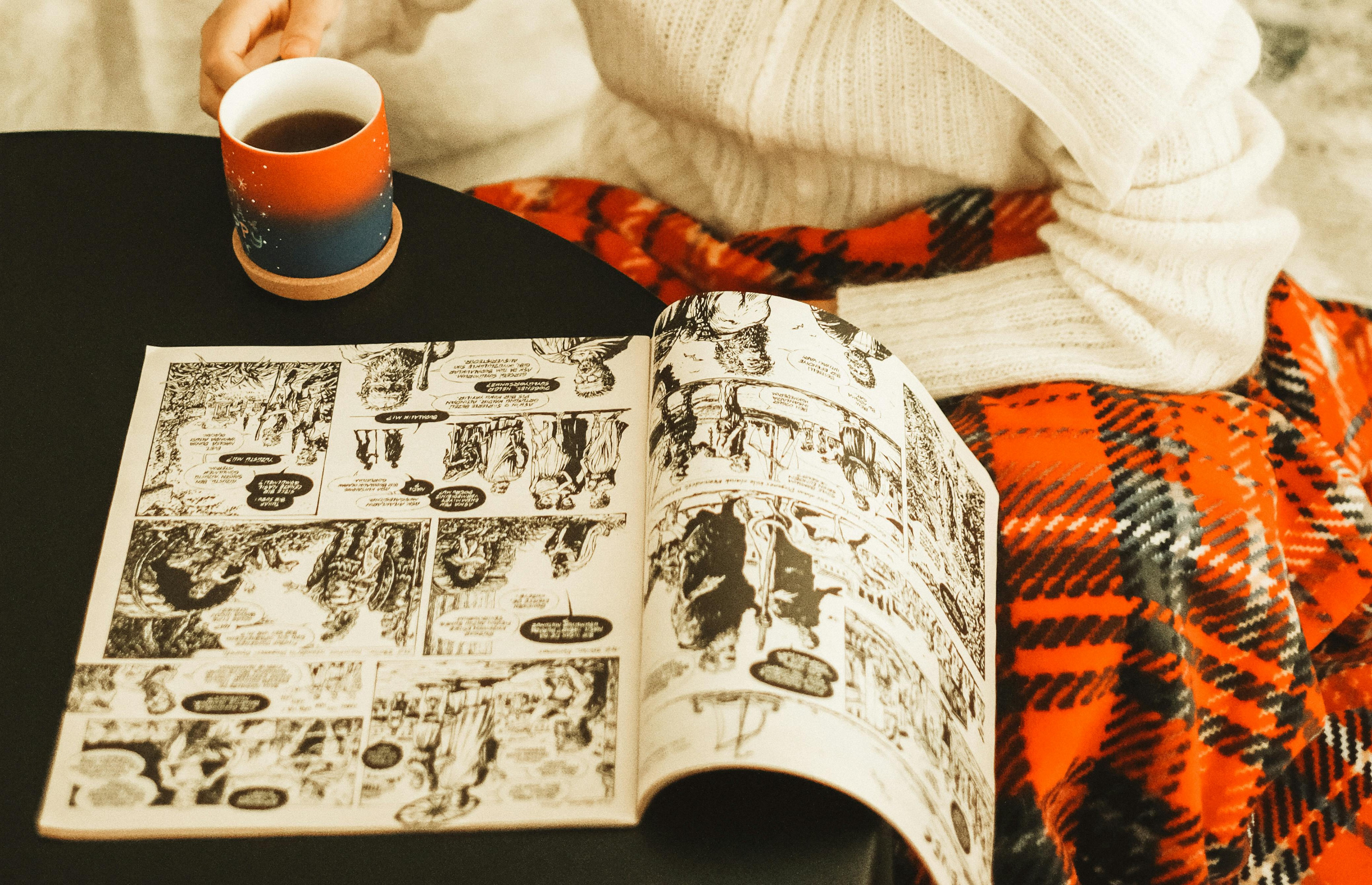
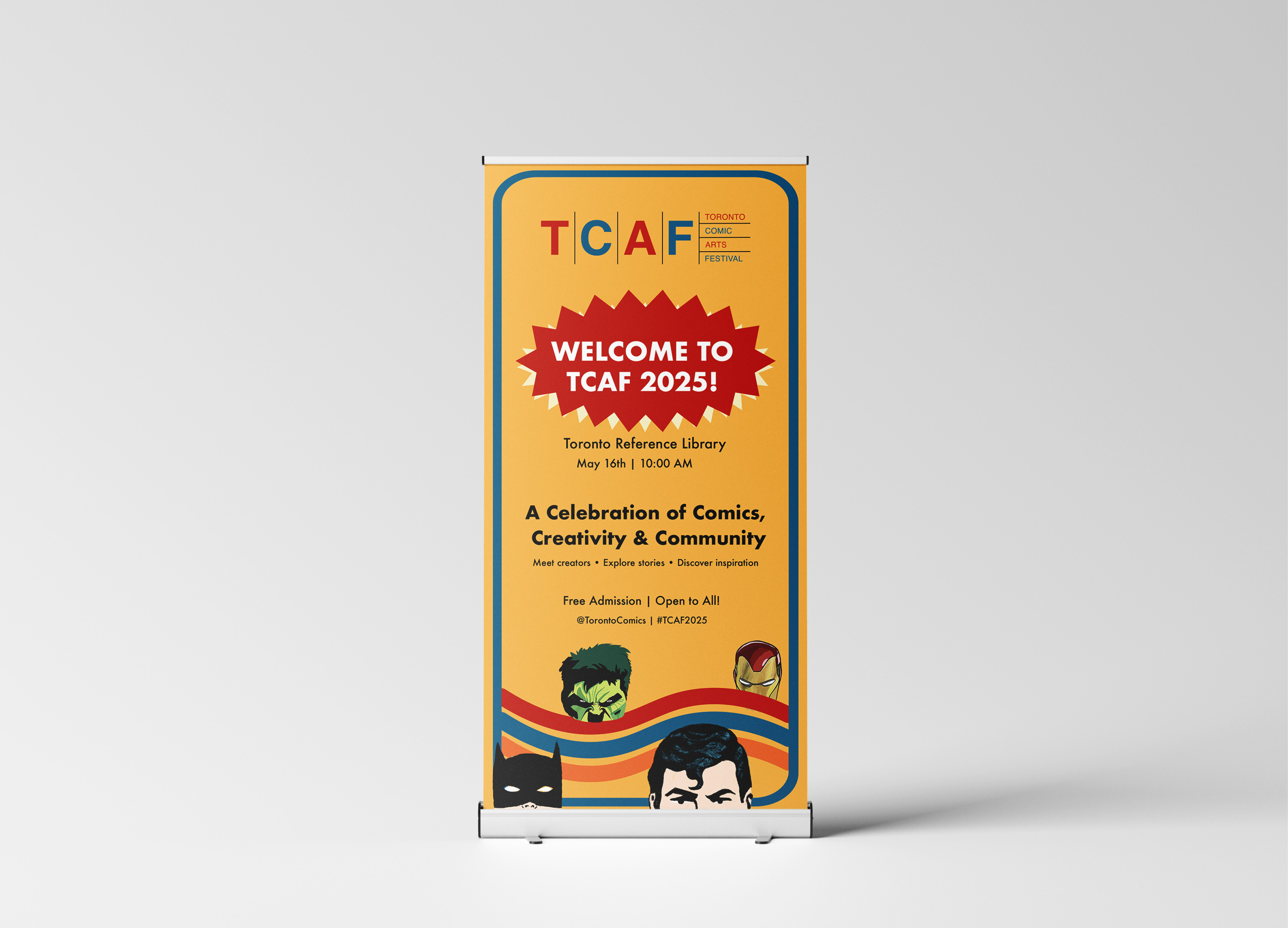
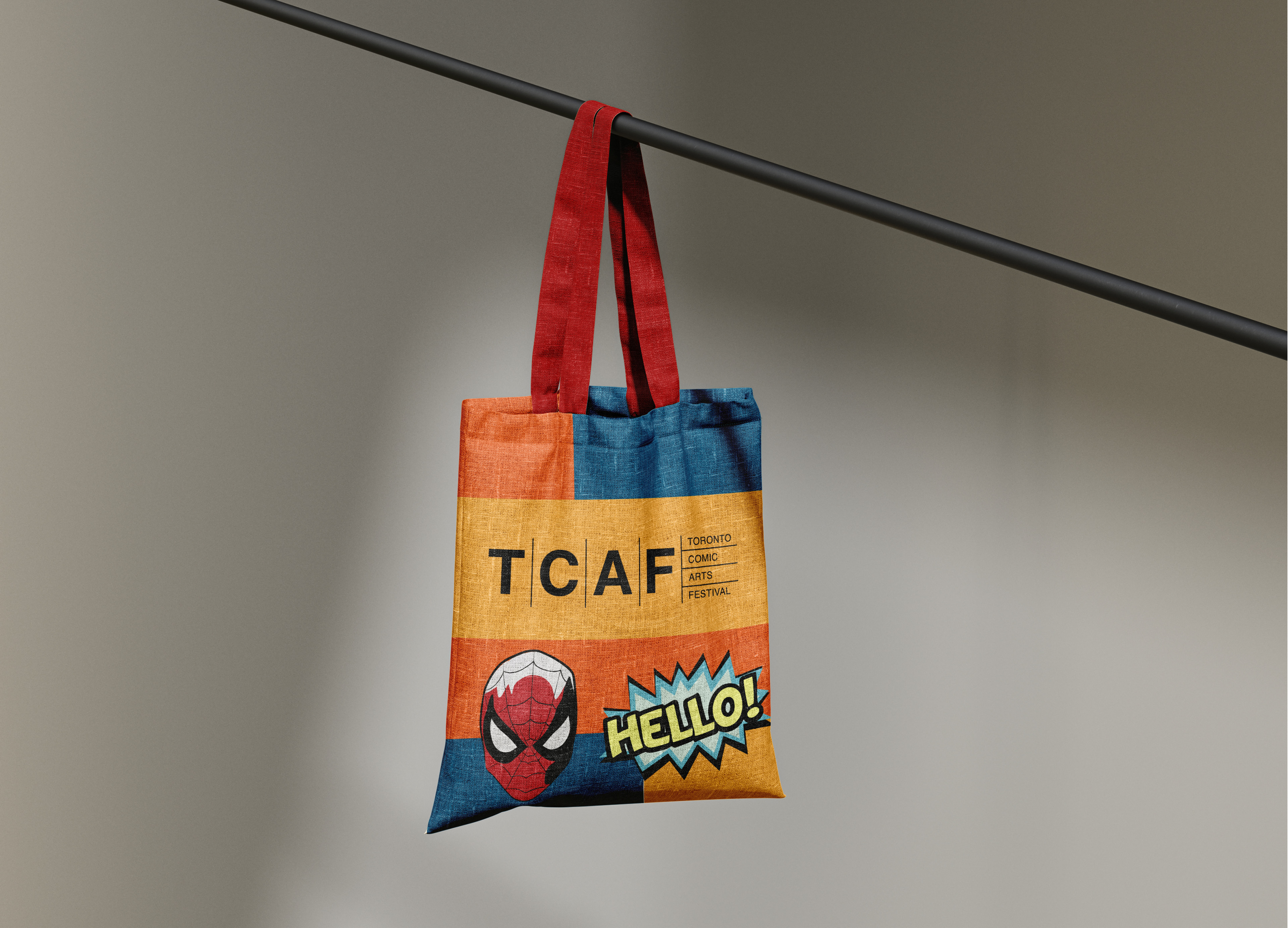
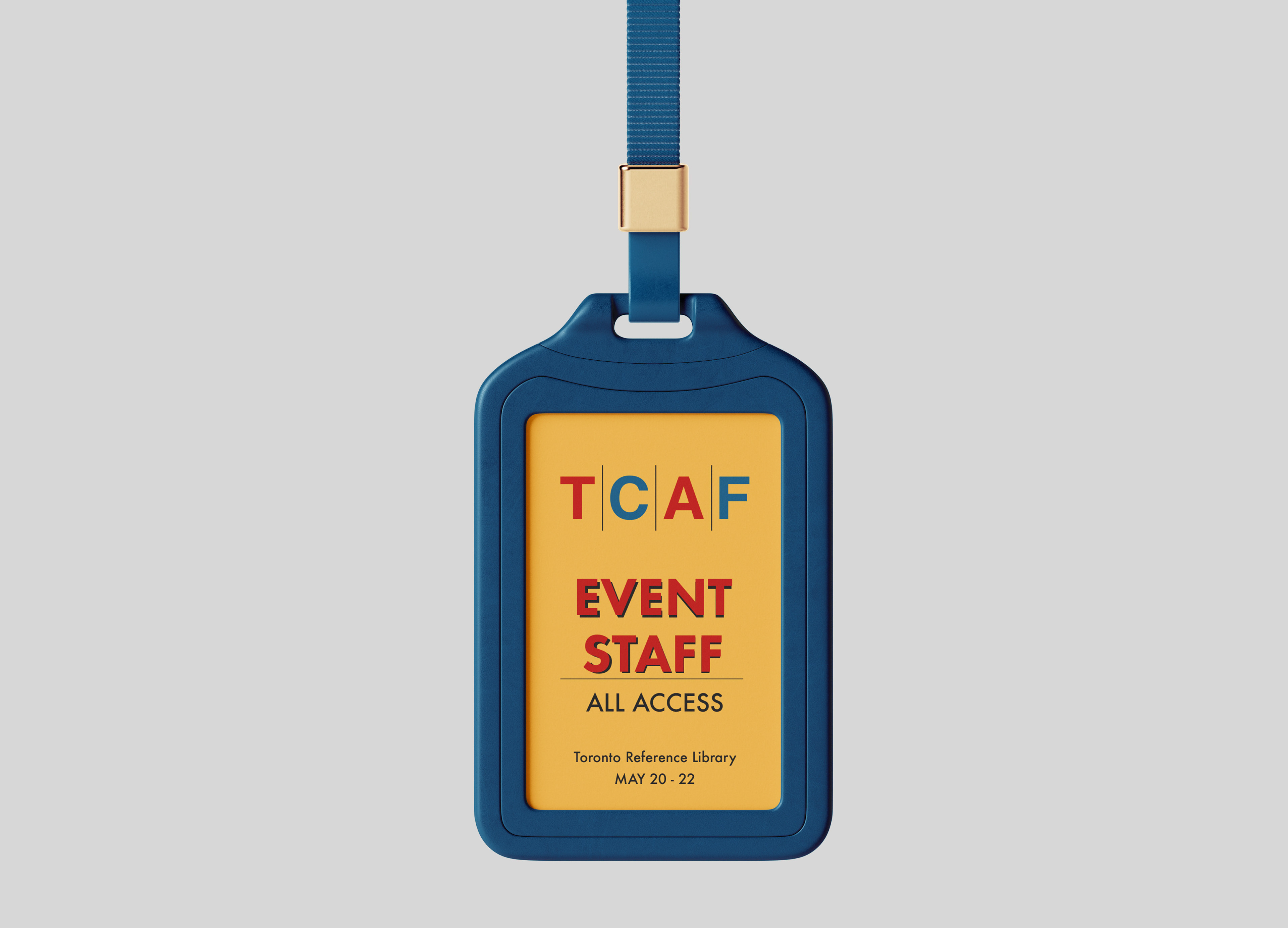
Mockups

View the Brand Guidelines here
Mockups by: Designed by Freepik www.freepik.com