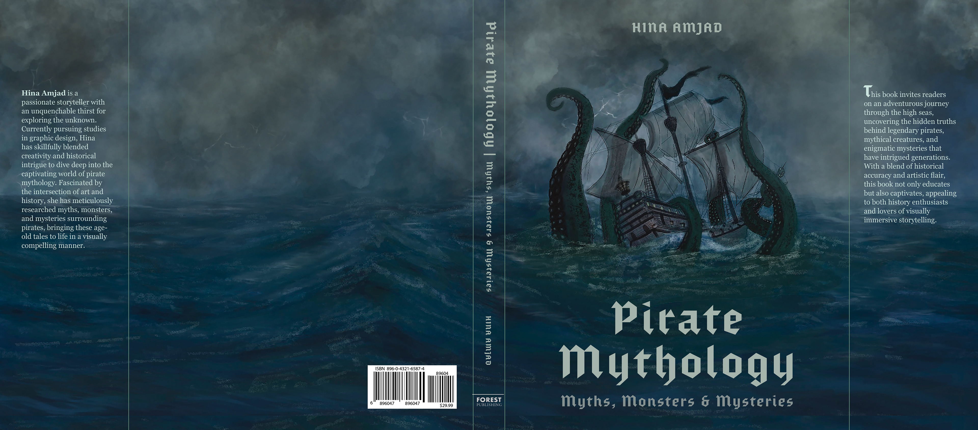
Pirate Mythology
An Interactive Book Prototype
Pirate Mythology is an interactive book prototype designed to pull readers into a world of maritime myths and pirate history. Combining adventure, history, and mythology, it offers a seamless blend of factual stories and legendary tales that educate, entertain, and spark curiosity. The project's goal was to create a visually captivating and interactive experience that connects the past with the present, utilizing design, storytelling, and technology.
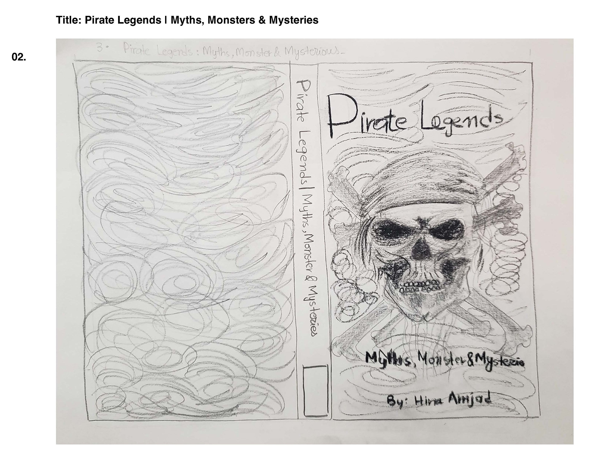
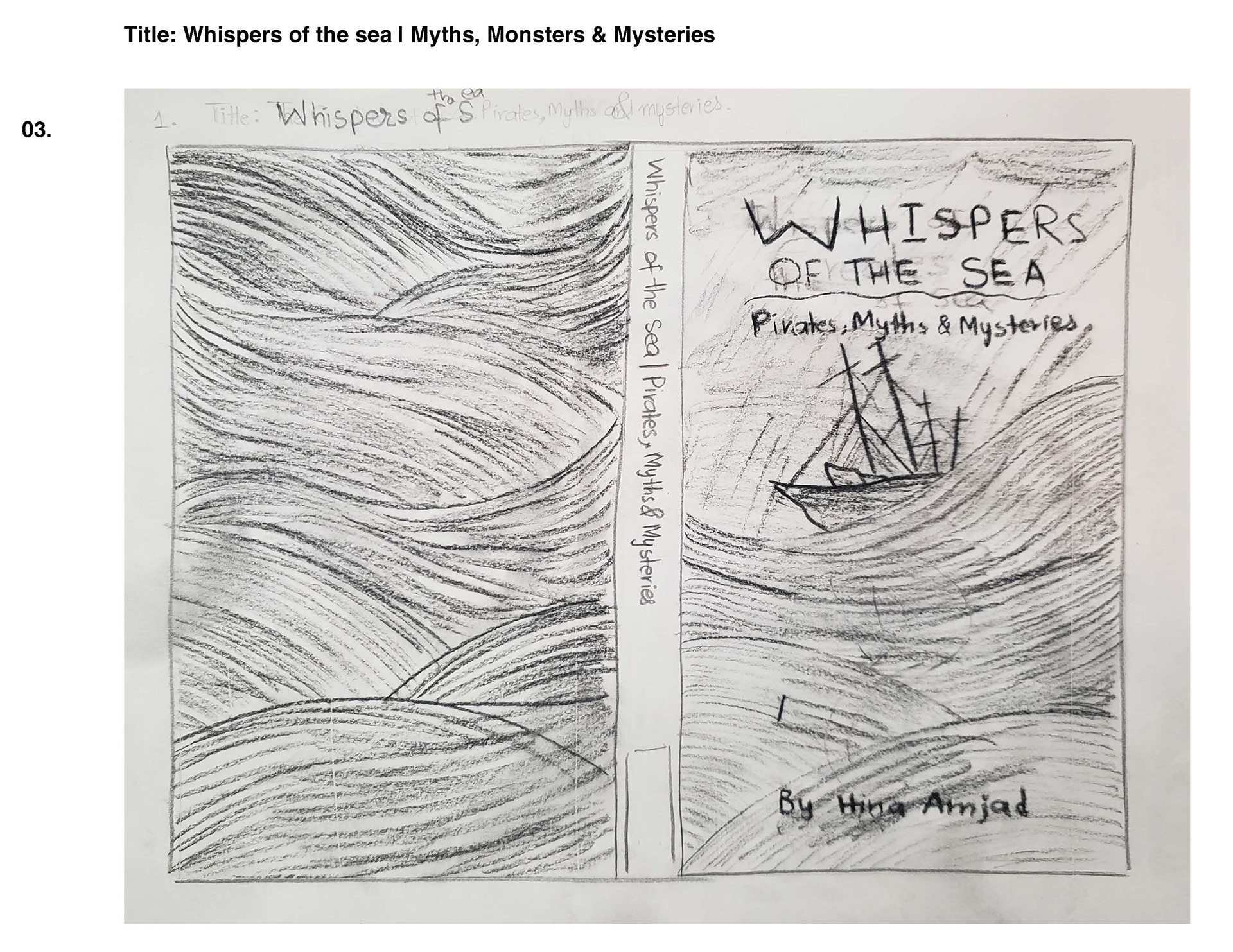
This project began as a challenge—to create a book prototype on a fictional topic. I wanted something visually engaging, a theme that blended fiction with exciting opportunities for illustration. Pirate Mythology was the perfect choice. It had all the right elements: legendary sea creatures, ghost ships, and maritime myths that balanced history with the unknown. More importantly, it provided a rich visual playground where I could experiment with storytelling, design, and interactivity.
Blending History with a Modern Aesthetic
From the beginning, my goal was to merge historical mythology with a contemporary design approach. I didn’t want the book to feel outdated, nor did I want it to be so modern that it lost its connection to the lore. This balance had to be reflected in every aspect of the book—from the layout and typography to the colour palette and interactive elements.
To achieve this, I designed a layout that combined classic storytelling elements with modern editorial design principles. The pages featured large, striking visuals that commanded attention, while clean, structured text placements ensured readability. Instead of overwhelming the reader with blocks of information, I used negative space strategically to make the experience feel cinematic—like turning the pages of an ancient manuscript with a modern twist.
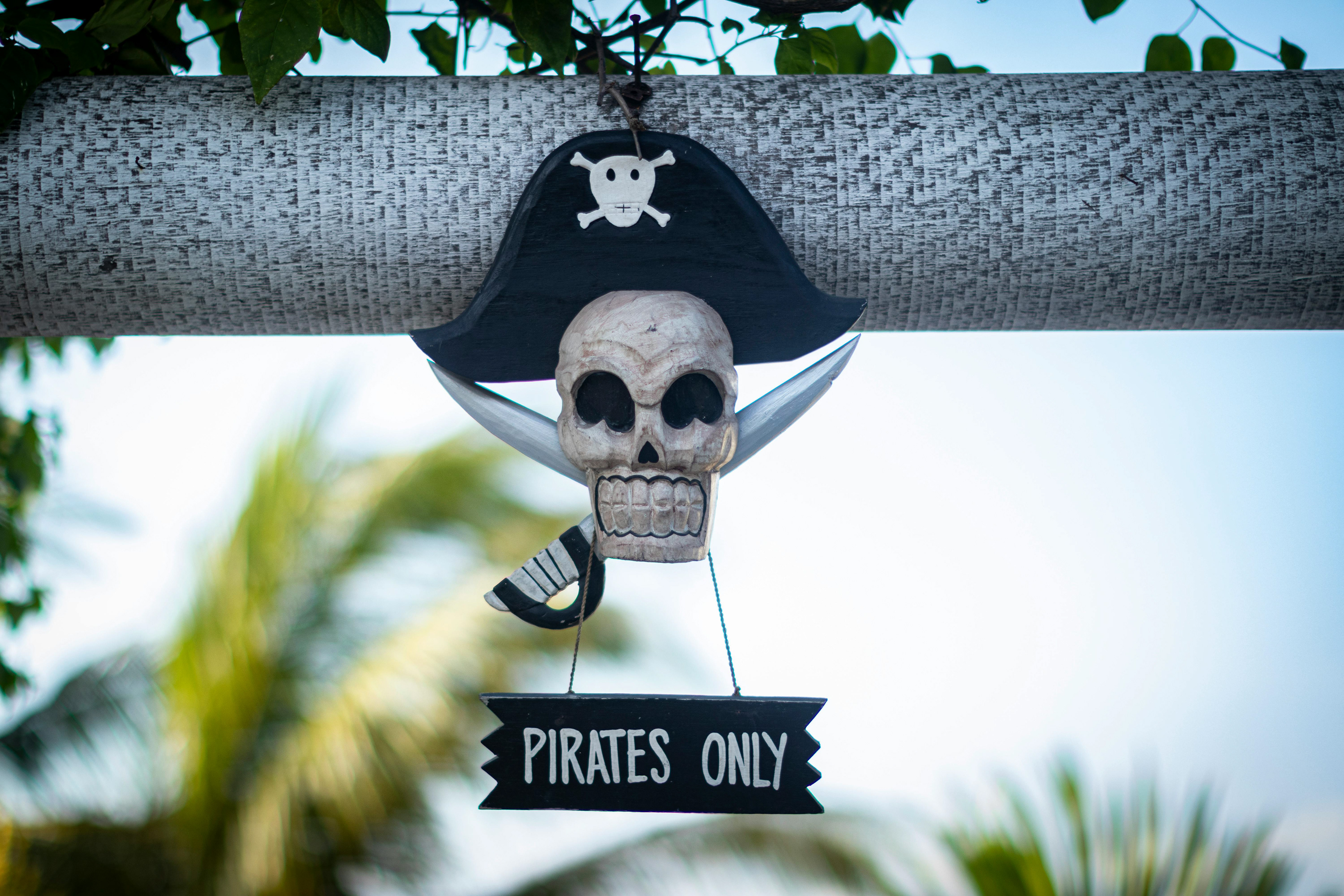

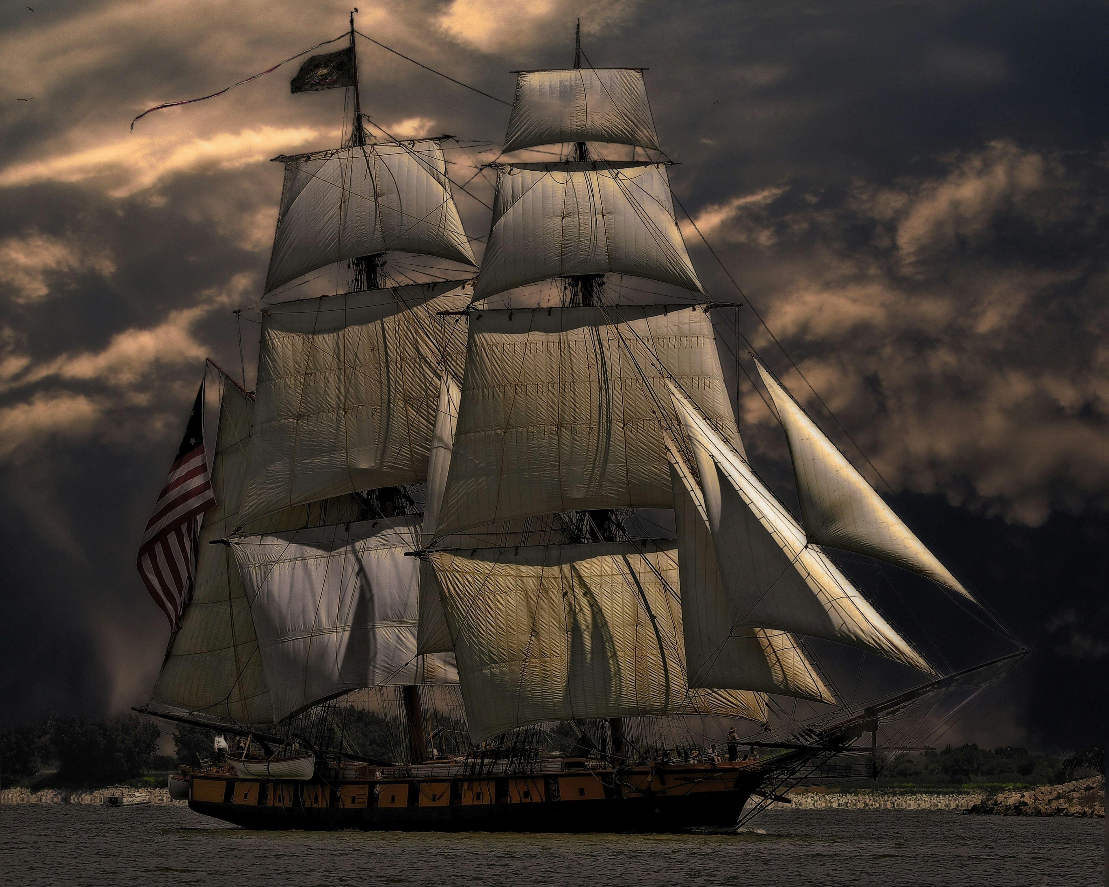
Images are sourced from pexels.com
Bringing the Mythology to Life
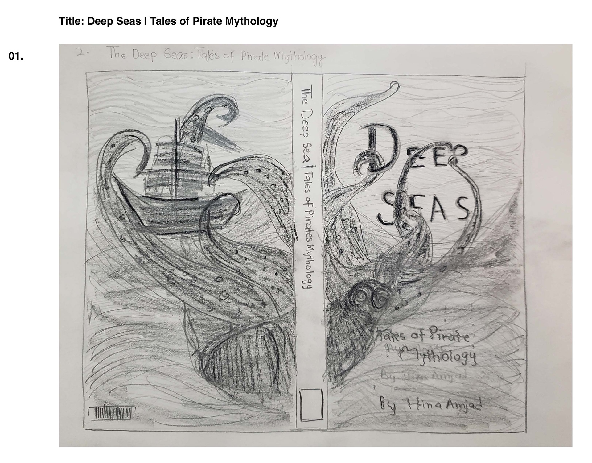
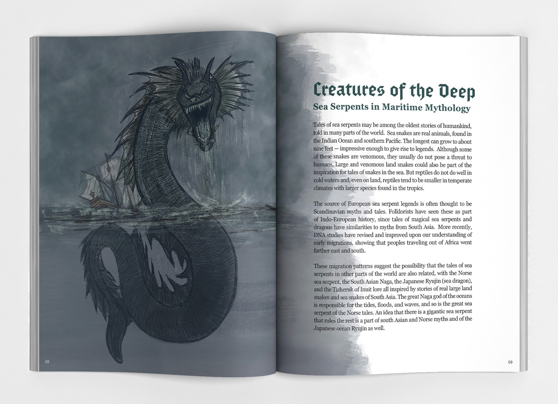
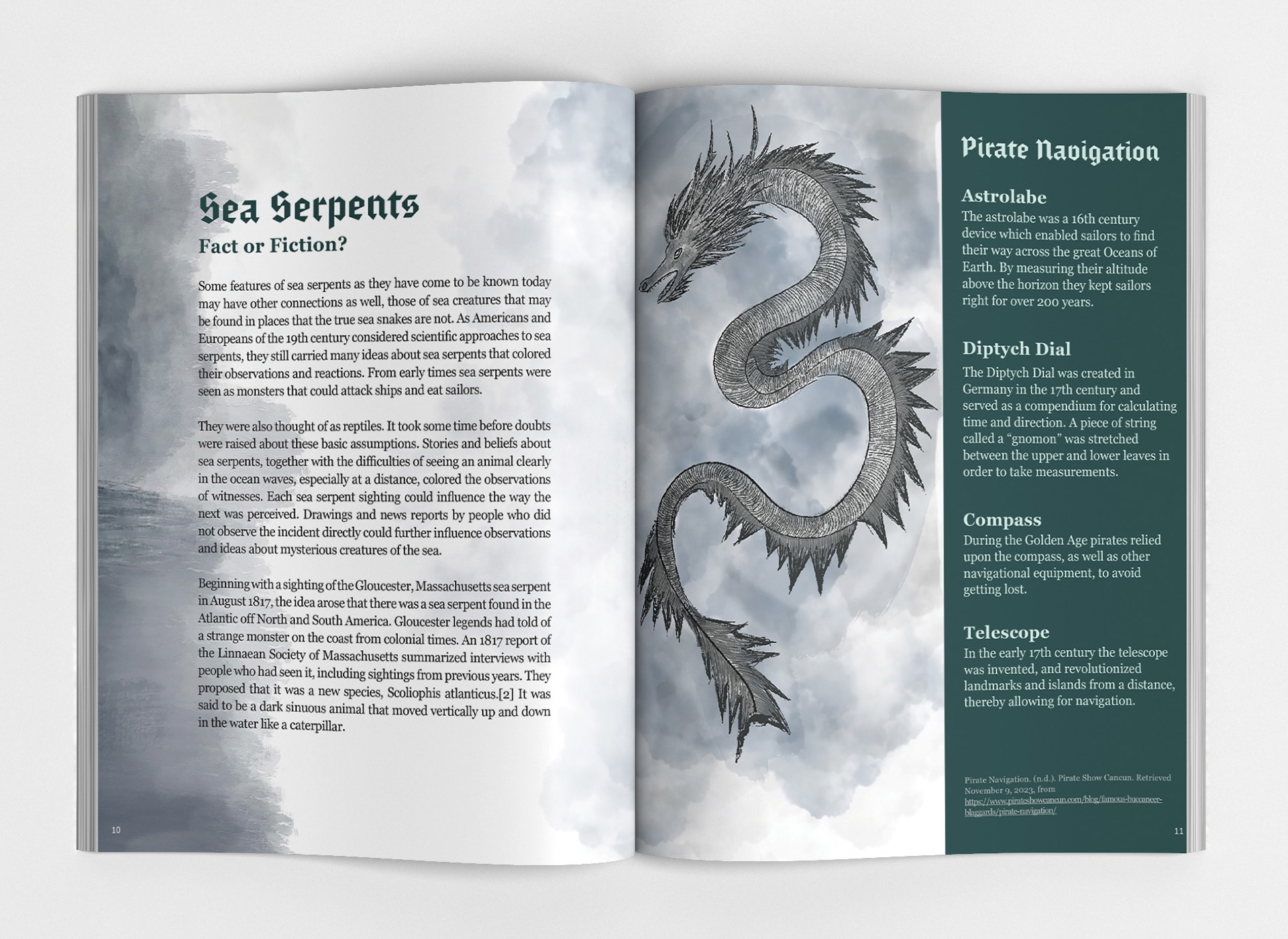
To create a visually compelling book, I started with research—studying legendary sea creatures, ghost ships, and maritime folklore. I examined how these myths had been represented in historical illustrations and modern media, particularly in films, games, and literature. This research informed my choices for colour, typography, and iconography.
The Colour Palette
The ocean, particularly its dark and mysterious depths, became the foundation for my colour choices. I wanted the book to feel immersive, as if the reader were diving into the unknown. Deep teals, inky blues, and shadowy greys formed the primary palette, evoking the mystique of the high seas. These colours were contrasted with subtle highlights—ghostly whites, metallic silvers, and aged parchment tones—to add depth and a sense of history.
Typography and Lettering
Typography was crucial in setting the tone. I drew inspiration from gothic typefaces, reminiscent of old maritime logs and haunted legends, but paired them with a modern serif to maintain readability. I also studied pirate movie signage and packaging to understand how type could evoke a sense of mystery and adventure. The final combination was a balance between history and modernity: a bold, intricate blackletter for chapter headings, paired with a sleek serif for body text, ensuring the book remained easy to read while retaining its thematic authenticity.
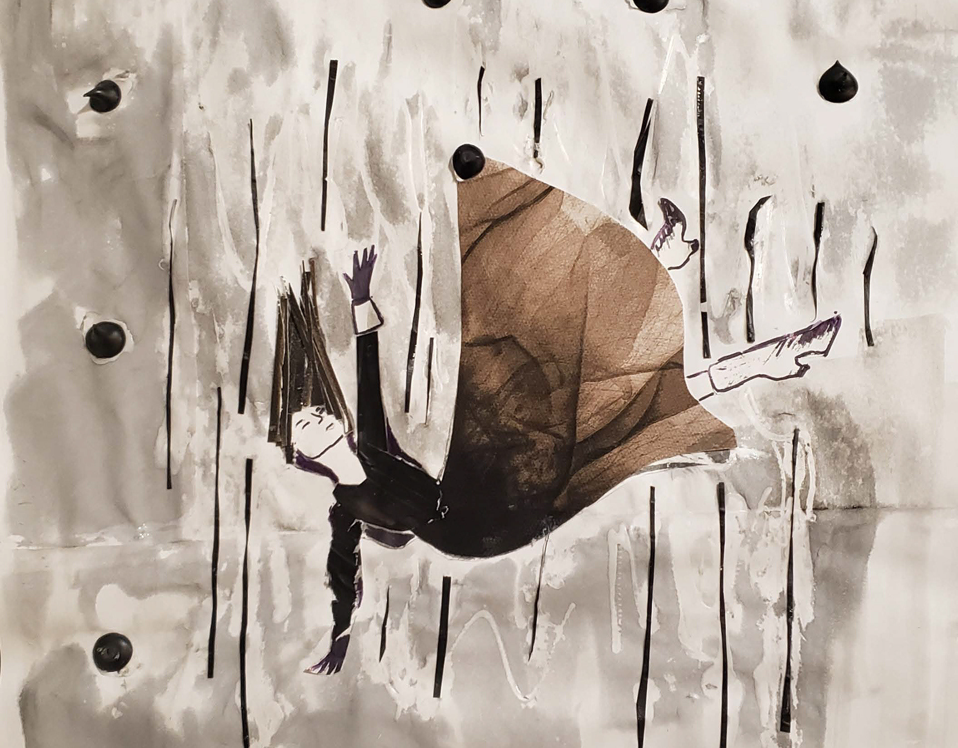
Illustrations and Visual Hierarchy
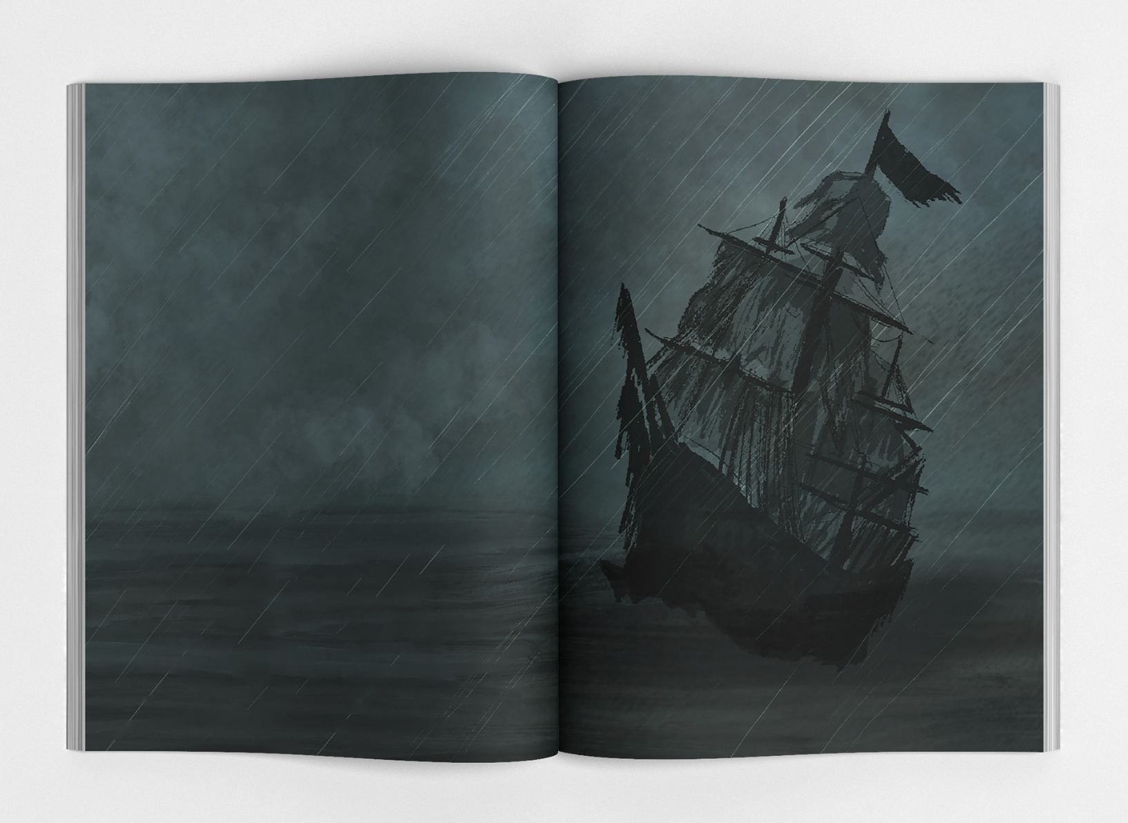
The book’s illustrations played a key role in storytelling. Instead of making them hyper-realistic, I opted for a style that felt like a blend of classic pirate etchings and modern fantasy concept art. The goal was to make the visuals feel rich and layered without being overly frightening.
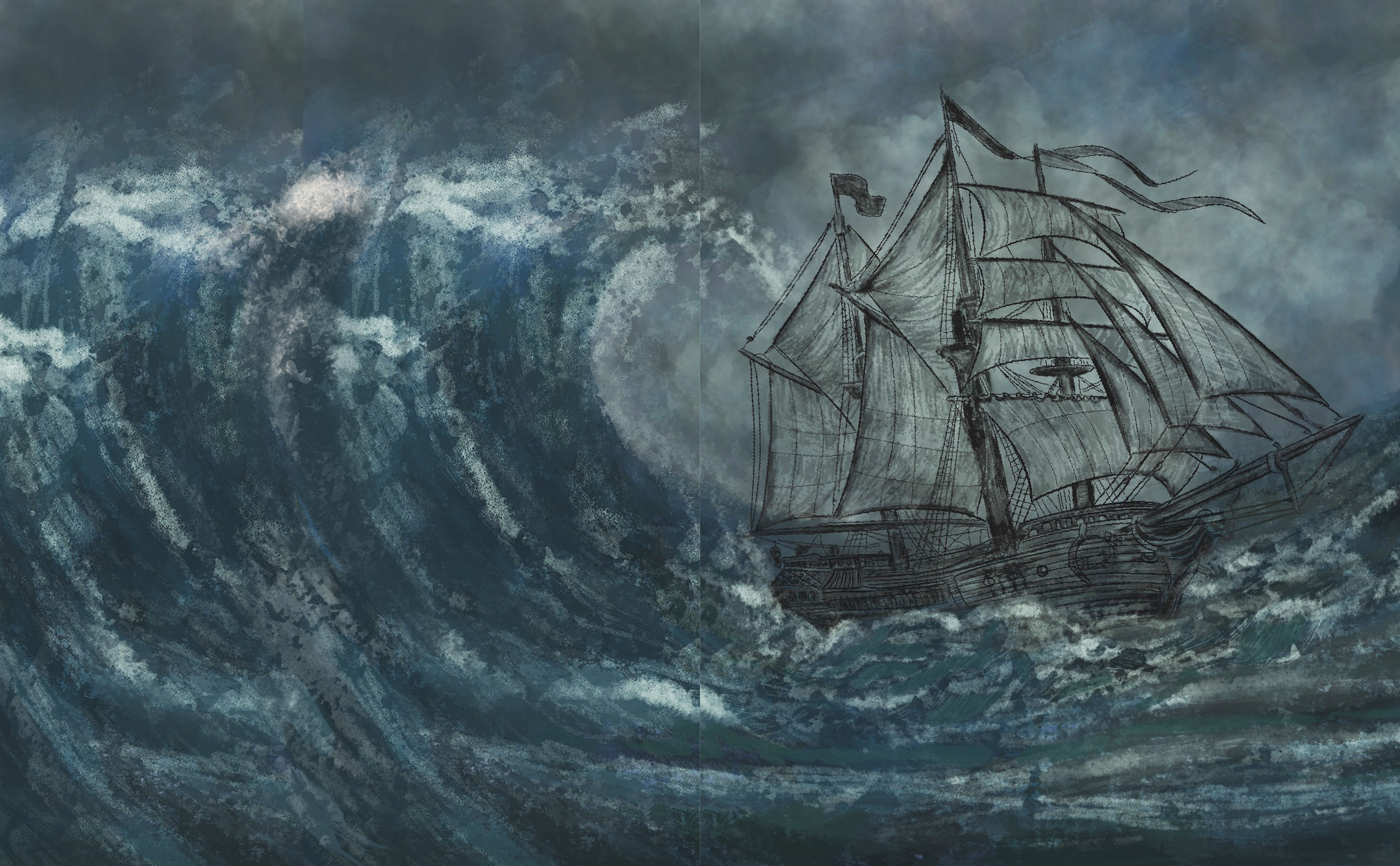
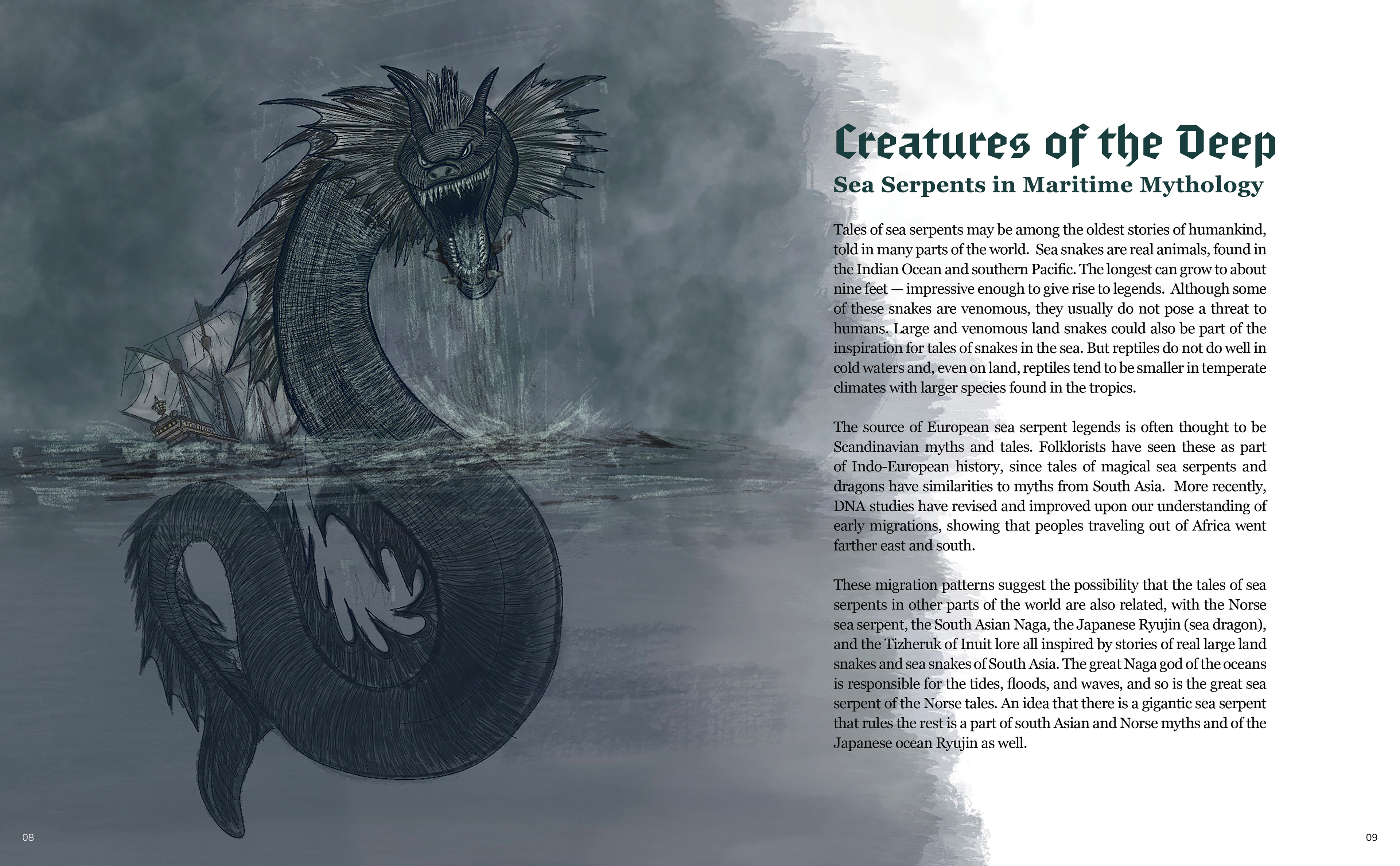
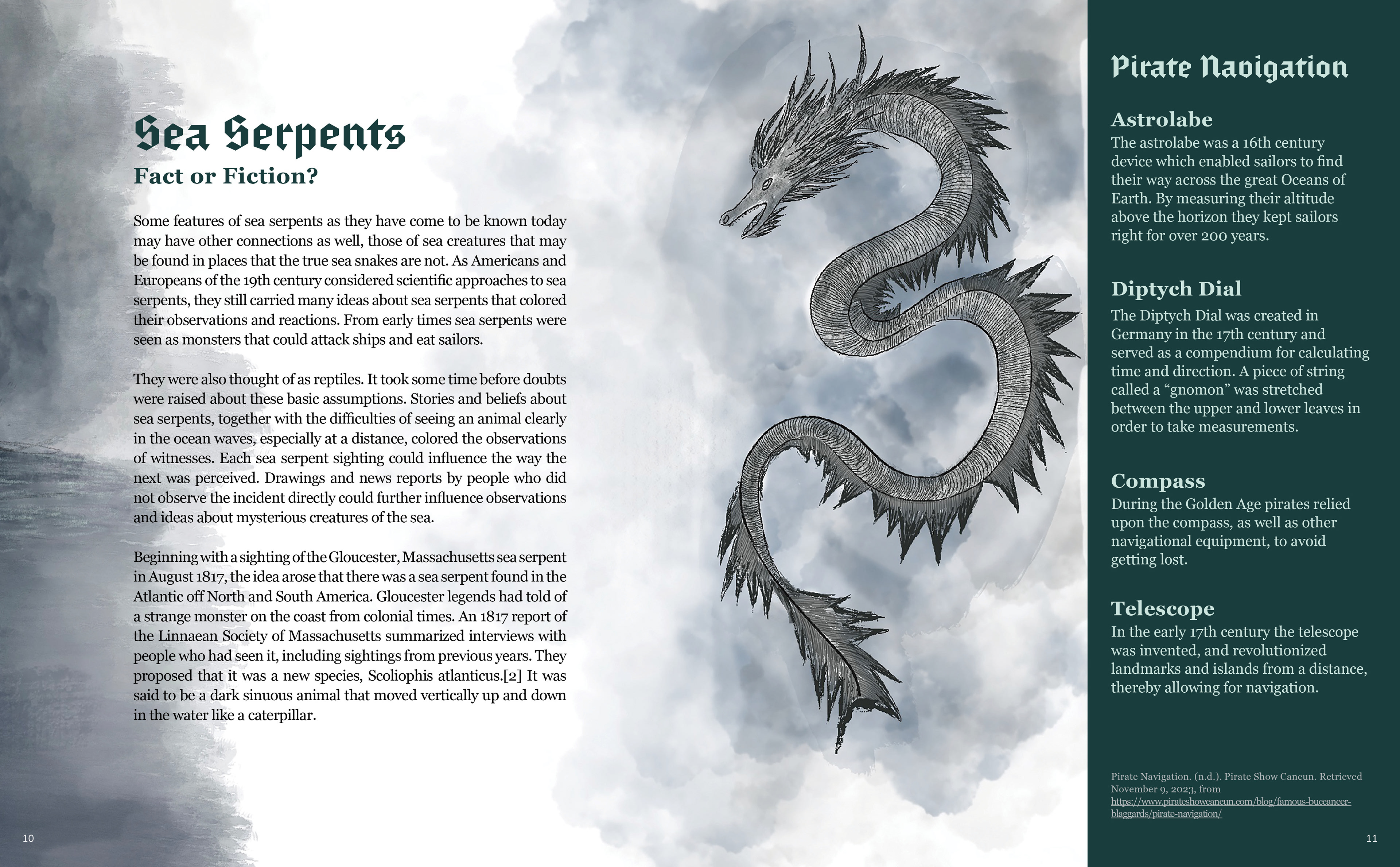
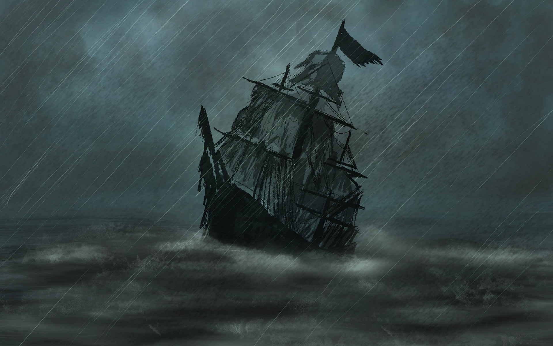
Each chapter had a full-page illustration that set the tone—whether it was a kraken wrapping itself around an abandoned ship, a ghostly vessel sailing under a blood-red moon, or an eerie treasure map with hidden symbols. These images were strategically placed to guide the reader’s journey, acting as visual waypoints that enhanced the storytelling rather than distracting from it.
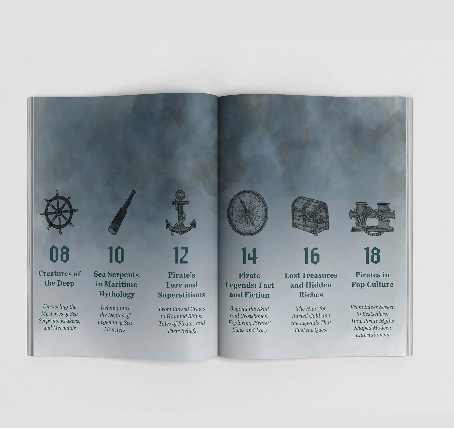
To further emphasize the balance between history and myth, I used decorative chapter dividers with intricate maritime symbols—anchors, compass roses, and swirling ocean waves—tying each section together in a cohesive visual language.
Here are the time-lapse videos that highlight the creation process of illustrations made in Procreate.
Challenges & Problem-Solving
One of the biggest challenges I faced was ensuring the visuals remained engaging without becoming too dark or frightening. Pirate mythology is full of eerie, ghostly elements, but I didn’t want the book to feel like a horror story. Instead, I aimed for a tone of mystery and excitement—something that felt thrilling and adventurous rather than unsettling.
I achieved this by carefully selecting colour contrasts, keeping the illustrations detailed yet stylized, and ensuring the text provided a sense of wonder rather than fear. The balance between real and mythical was also a key consideration—by blending historical facts with legendary tales, I kept the book grounded while allowing space for imagination.
Final Experience and Takeaways
Ultimately, Pirate Mythology was designed to be more than just a book—it was meant to be an experience. For my target audience—teen and young adult readers who enjoy history, fantasy, and sci-fi—the book had to be visually compelling and narratively rich. Every design choice, from the layout to the typography, was made with the goal of keeping the reader engaged and intrigued.
The biggest takeaway I want readers to have is simple: enjoy the journey. I want them to feel the thrill of exploration, to be captivated by the myths, and to appreciate the artistry behind the storytelling. Whether they are drawn in by the visuals, the legends, or the interactive elements, my hope is that Pirate Mythology transports them to a world where history and fantasy collide in the most exciting way possible.
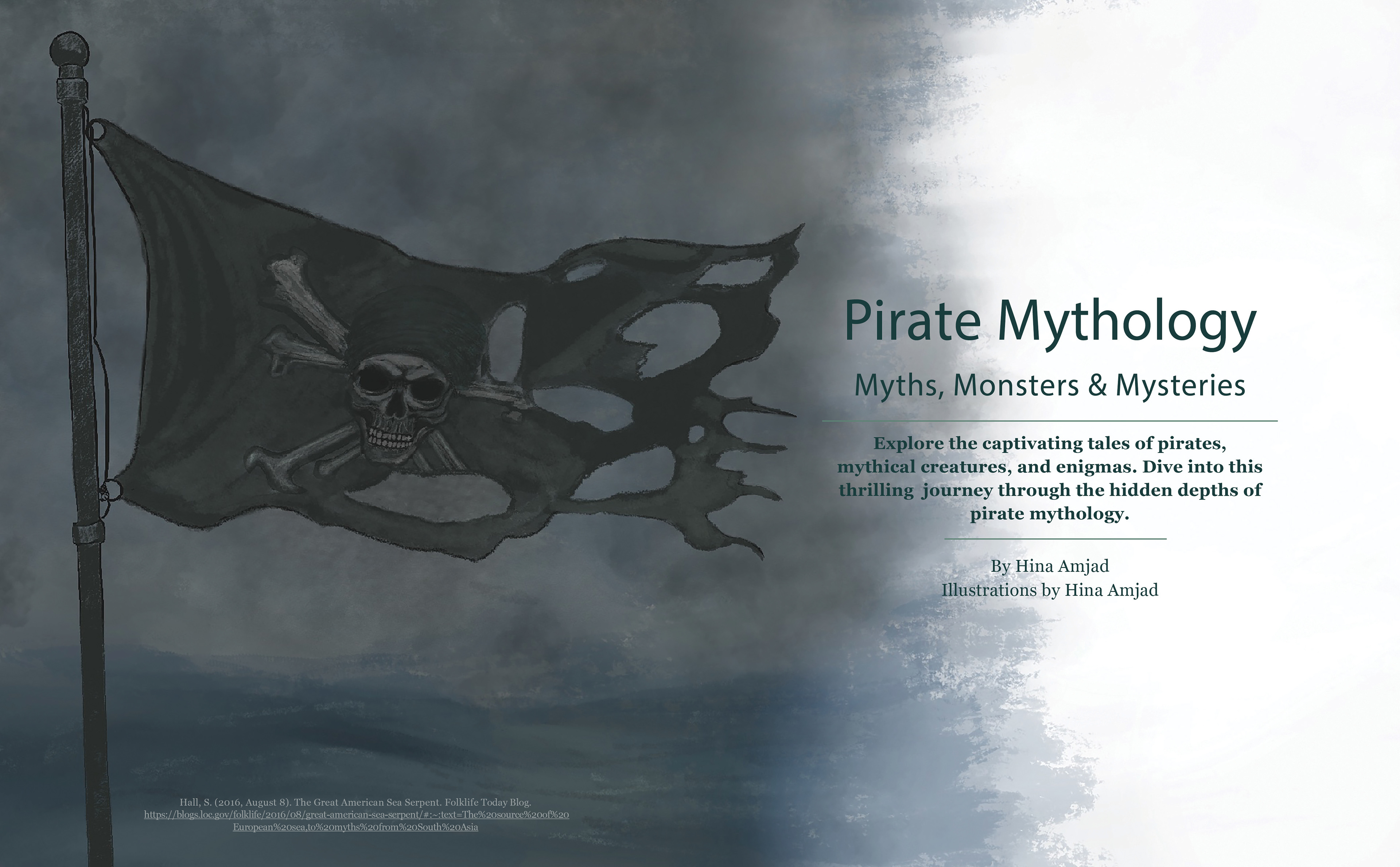
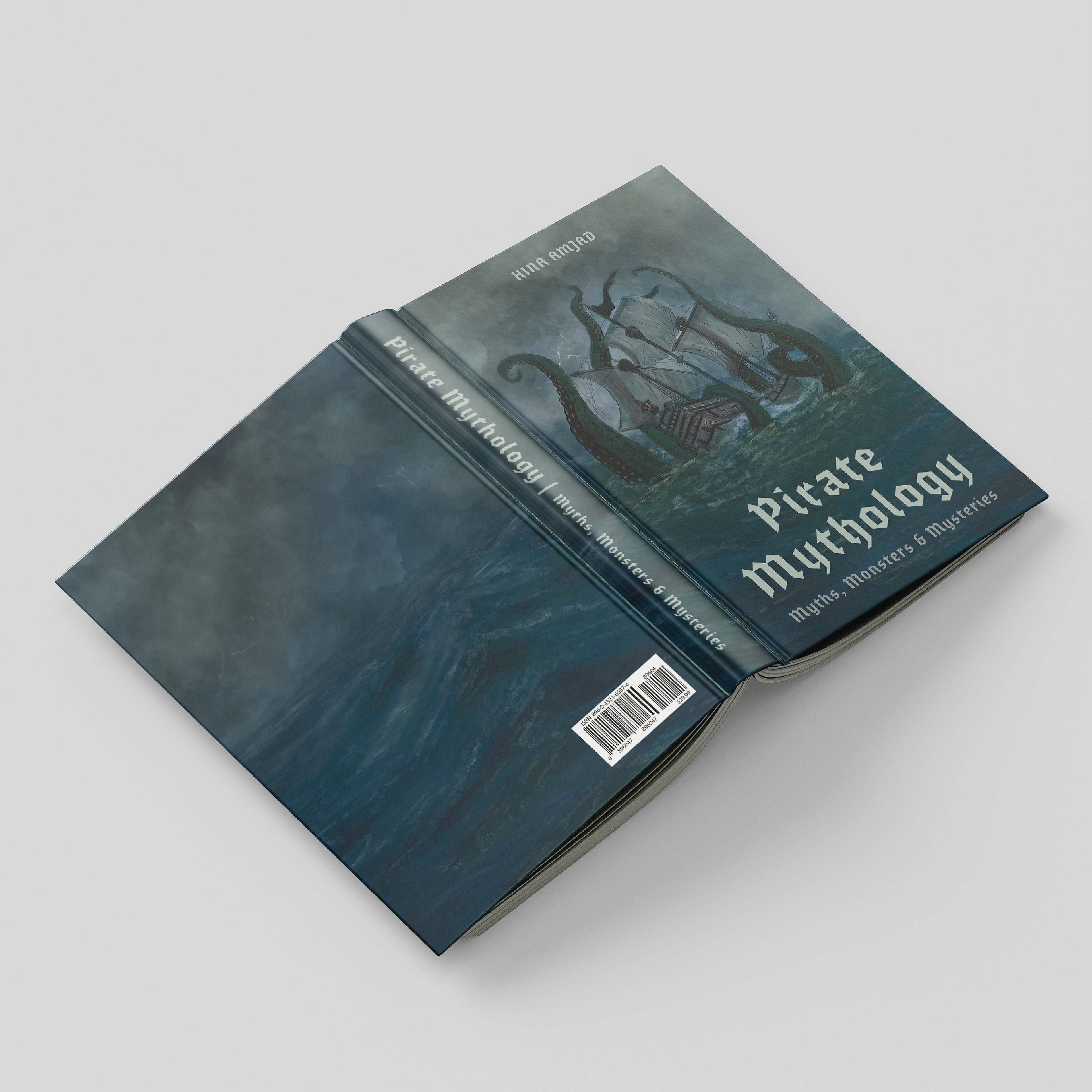
Final Cover Page
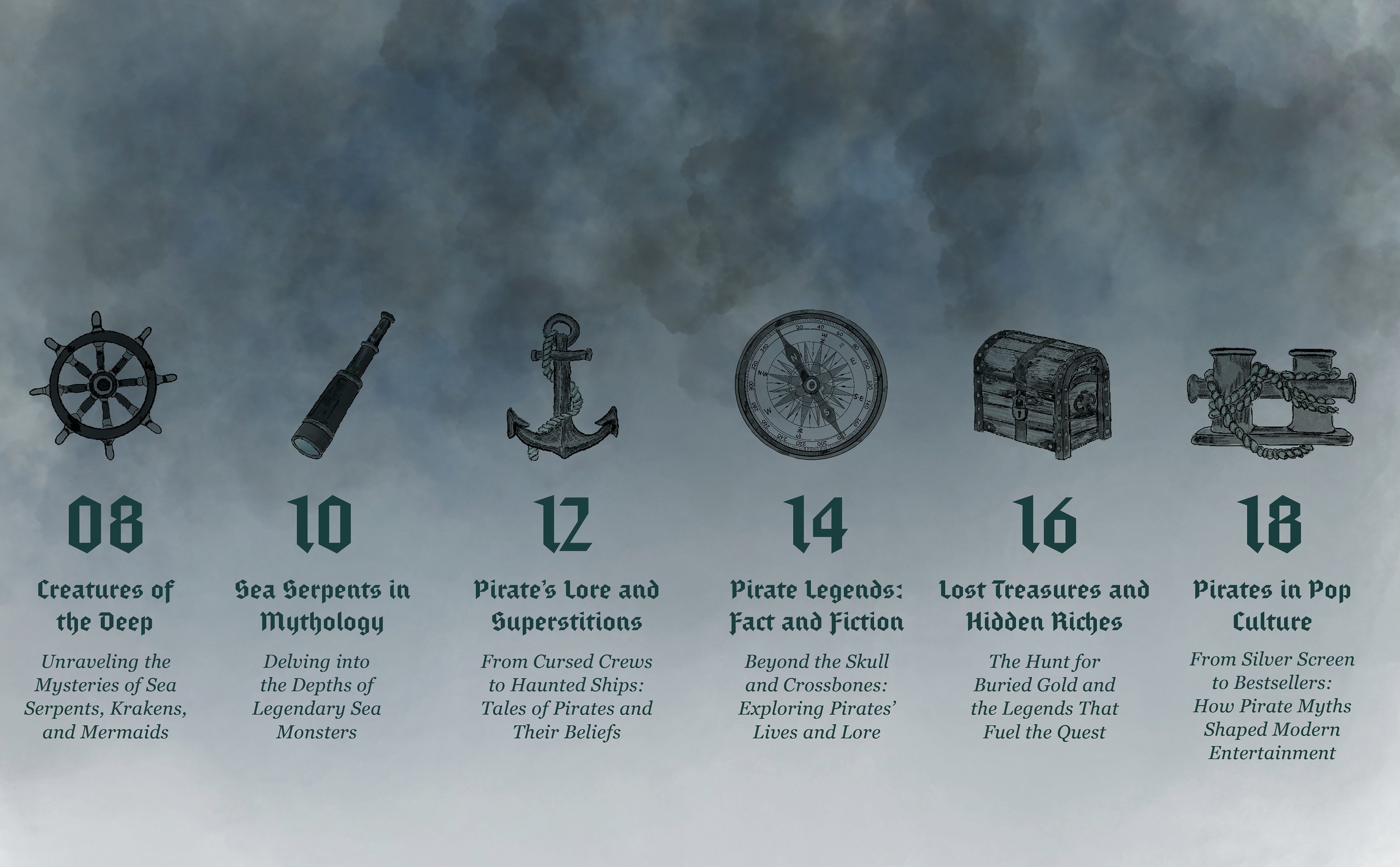
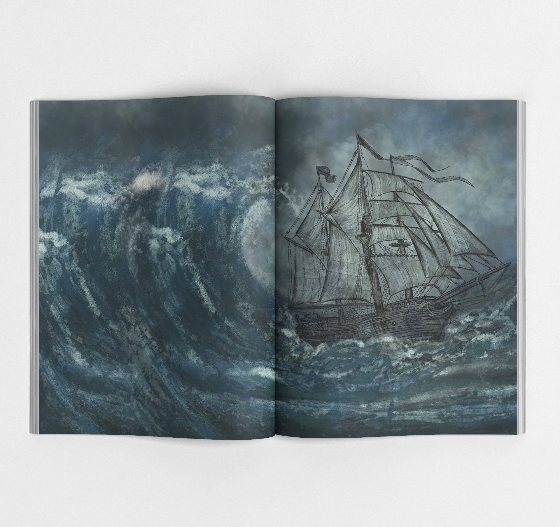
Inside pages
Mockups

Mockups: Designed by Freepik www.freepik.com