
Daily Yolk – A Brunch Brand That Slows Down the City Beat
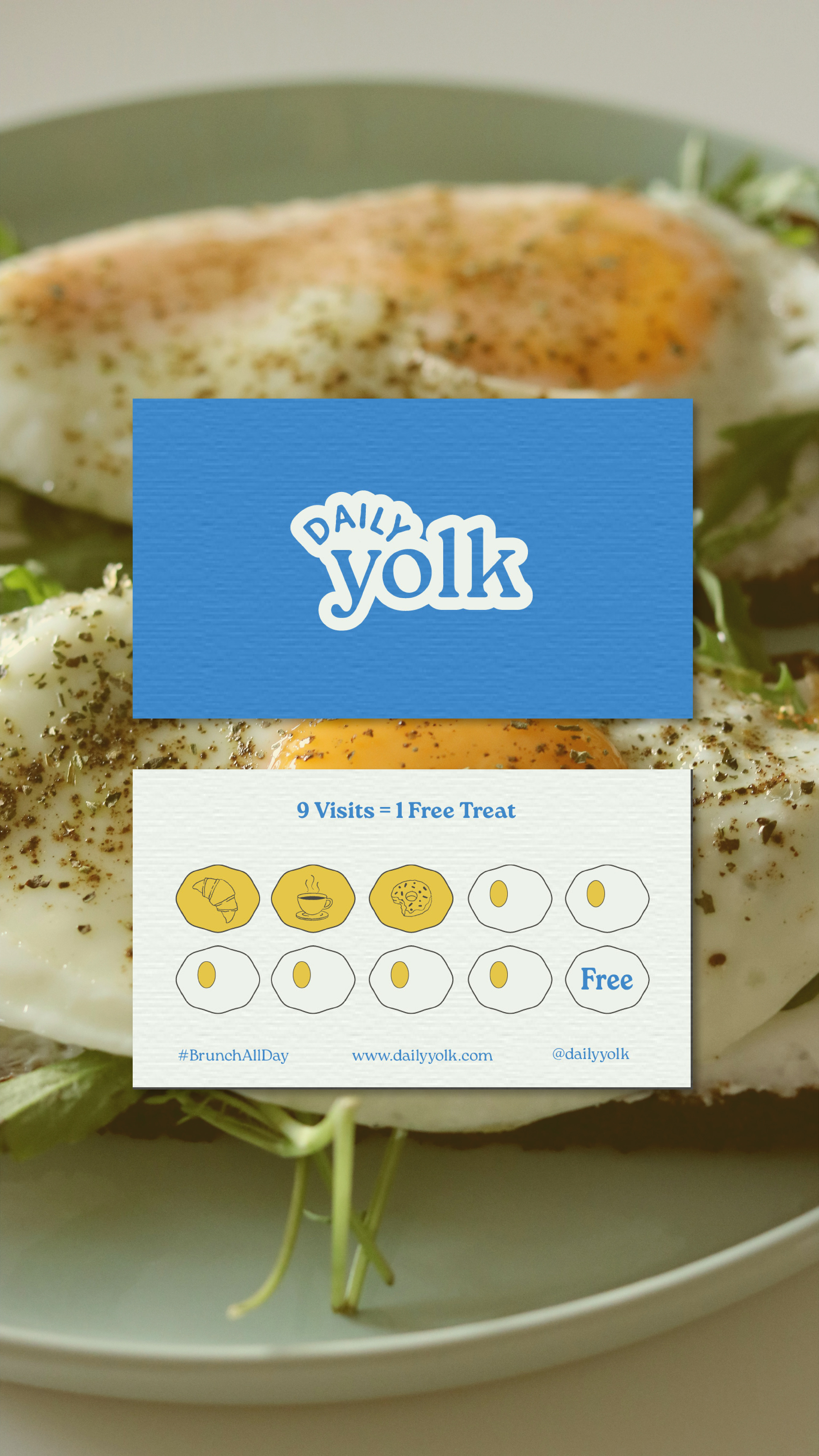
Logo and Brand Identity
Daily Yolk is more than a café—it’s a celebration of slow, golden mornings in a world that never stops moving. This brand was created for brunch lovers who believe breakfast isn’t just a meal—it’s a ritual, a moment of pause, and sometimes, a reset. Daily Yolk offers all-day breakfast with a playful twist, and the design system was built to reflect that energy: warm, modern, and just a little cheeky.
The Story Behind Daily Yolk
In cities where hustle culture rules, the joy of a calm morning often slips away. Daily Yolk emerged to reclaim that feeling—a place where people could slow down, share plates, sip coffee, and savor comfort food no matter the hour. It’s built for early risers, remote workers, and brunch seekers alike.
From the outset, the brand’s ambition wasn’t just to serve eggs and coffee. It was to create a community hub rooted in comfort, quality, and warmth. The goal was to build a brand that could hold space for both connection and creativity, where every detail—from the first bite to the last sip—felt intentionally designed to bring joy.
Strategy & Discovery: Finding the Brand’s Heart
The foundation of Daily Yolk began with a deep dive into brand strategy. I explored the audience, cultural context, and competitive landscape to define its place in the café scene. Through moodboards, tone mapping, and positioning exercises, the brand personality began to form: modern, cozy, playful, and warm.
Visually and verbally, Daily Yolk needed to feel like a familiar hug but with enough edge to stand out. The brand pillars were crafted to support that balance—championing comfort, quality, creativity, and friendliness across every touchpoint.
This strategic groundwork informed every creative decision, ensuring the identity wouldn’t just look good—but feel right.

Design Exploration: Sketches, Ideas, and Identity
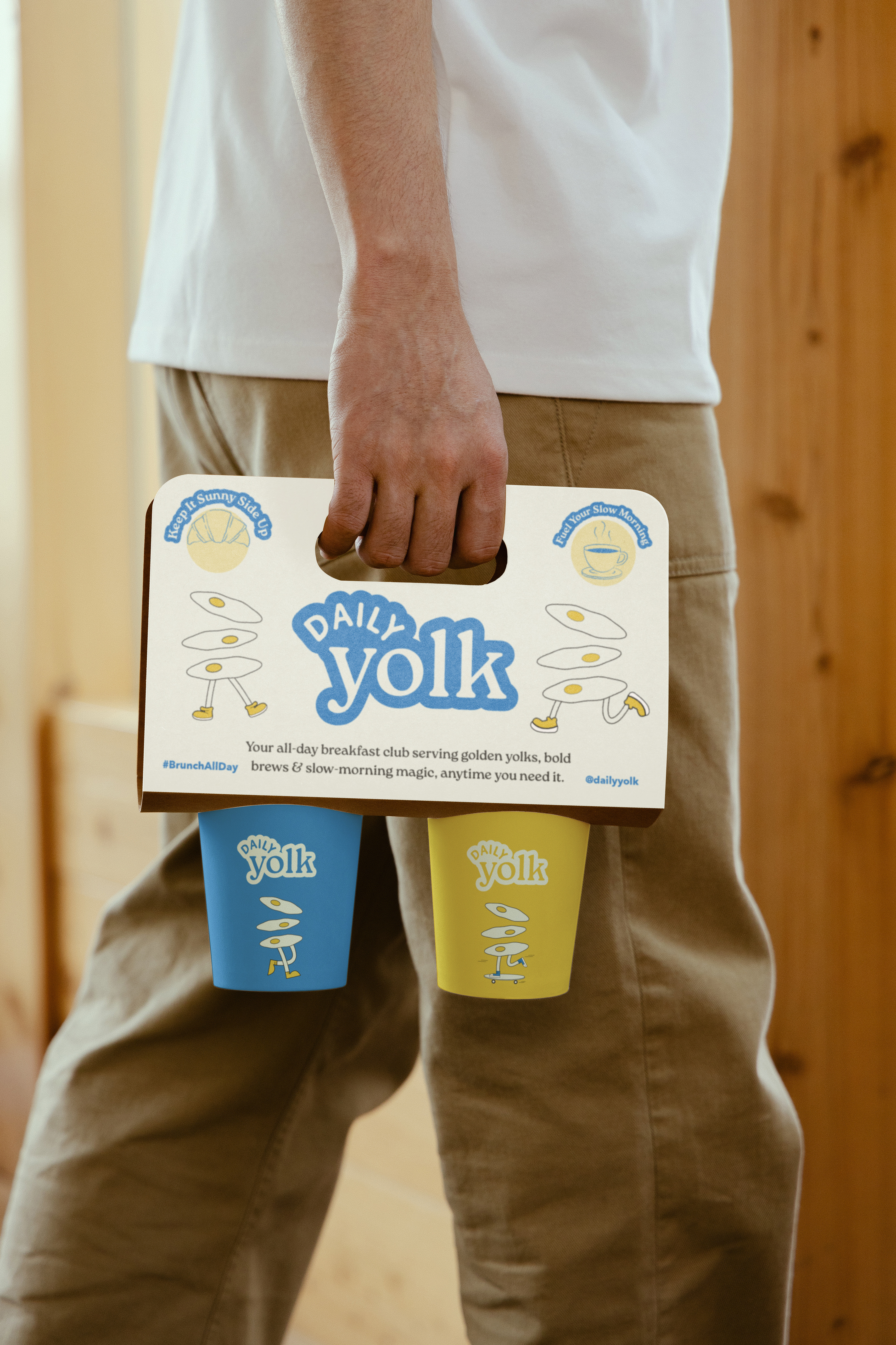
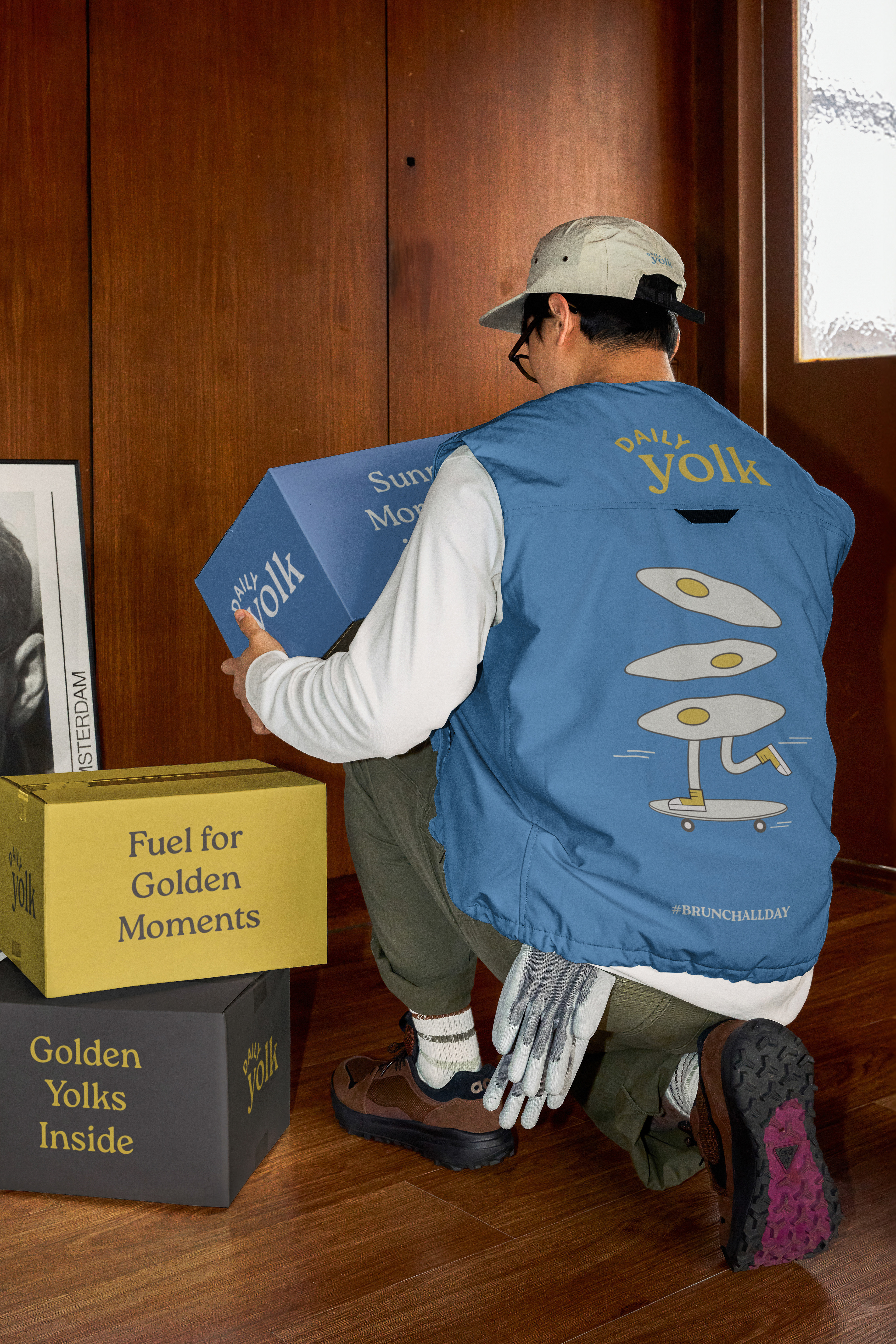
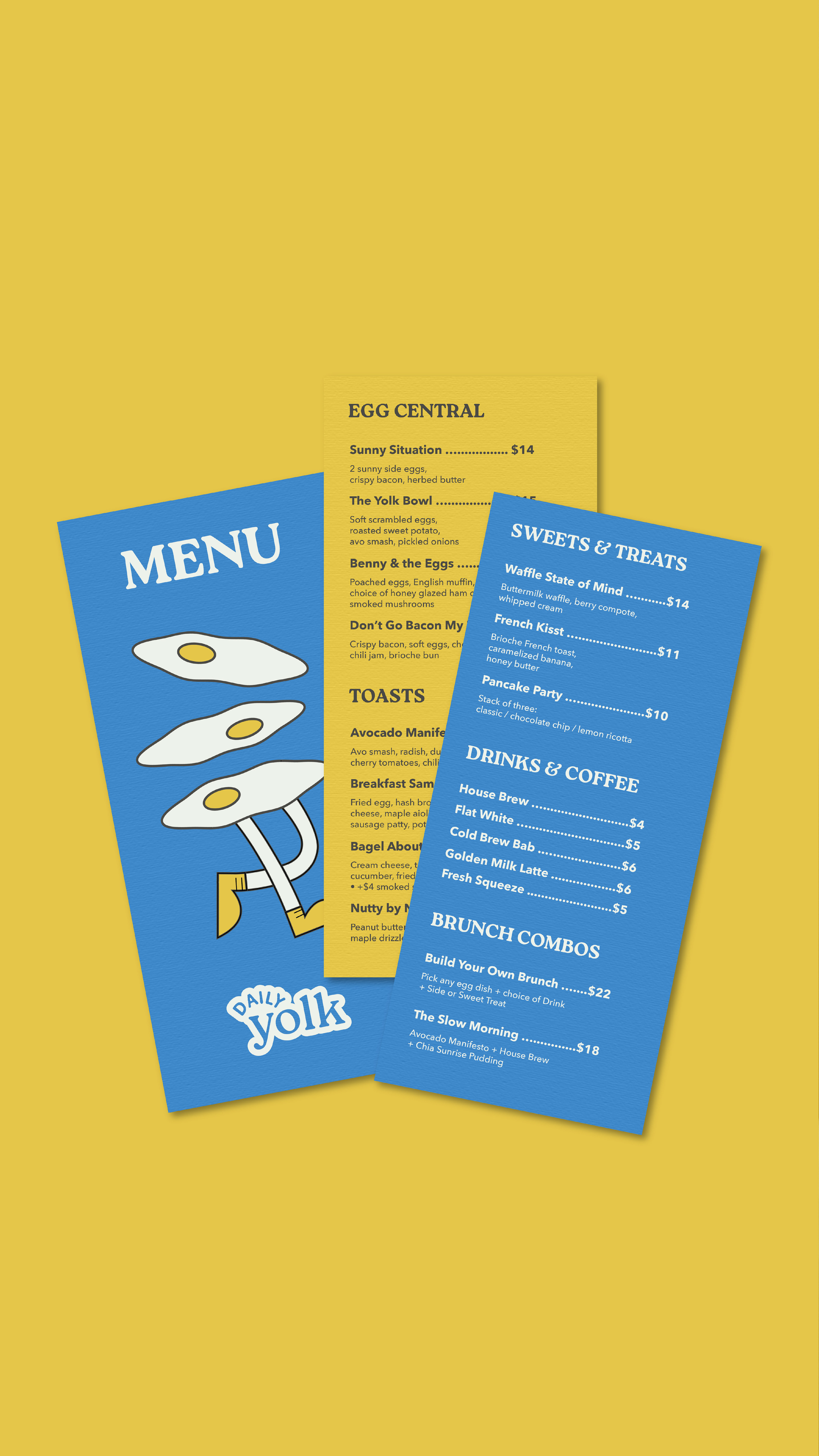
The logo design started with rough sketches exploring yolks, sunny-side symbolism, and round, cozy typography. The biggest challenge was finding the right tone—something polished but not cold, inviting but not childish.
After multiple iterations, the final logo emerged as a custom wordmark with circular characters and soft spacing, giving it a hand-touched feel. Its shape suggests the curves of an egg without being overly literal, while subtle warmth in the letterforms adds friendliness without losing clarity.


Final Outcome: A Slow Morning, Anytime
Daily Yolk delivers a brand that’s more than aesthetic—it’s emotional. It invites people to slow down, feel at home, and savour joy in the everyday. From logo to latte art, every touchpoint contributes to a cohesive, heartfelt experience.
The final system is thoughtful, fun, and full of personality—built not just to attract but to keep people coming back. Daily Yolk isn’t just another café. It’s a modern brunch ritual. And the brand reflects that with every yolky detail.


Mockups: @scenenumber.mockup
Designed by Freepik www.freepik.com