SafeGeneration
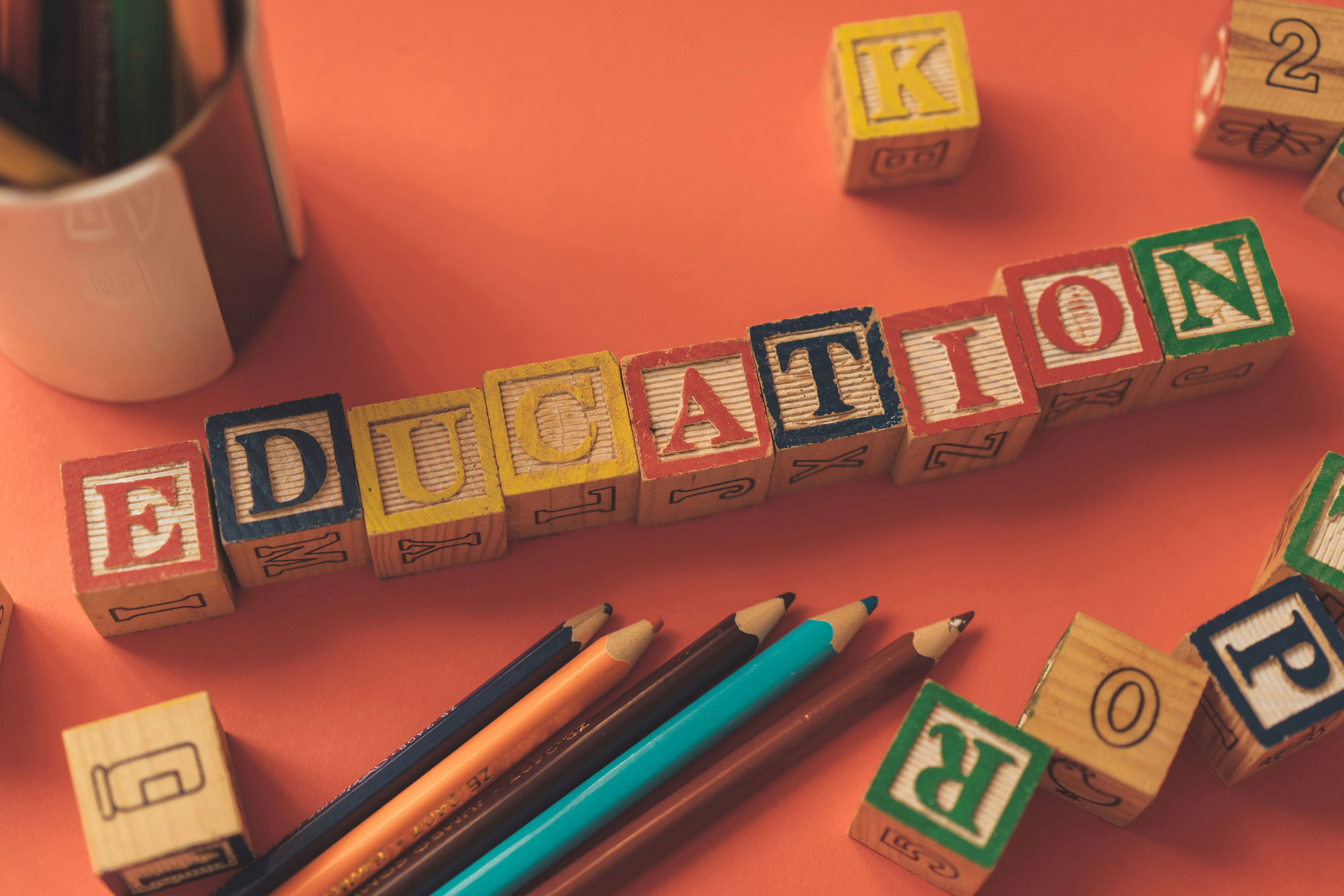
Designing A Brand for Safer Schools
SafeGeneration is a nonprofit organization dedicated to empowering middle school students aged 10 to 14 by fostering safe, inclusive, and supportive environments. We believe that every student deserves a learning space free from the harm of bullying, where they can grow, thrive, and realize their potential.
The Challenge: Creating a Safer Space for Students
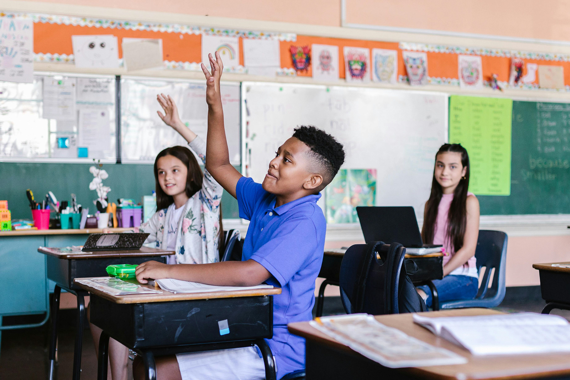
Schools should be a place where students feel safe, supported, and empowered. But for many, that’s not
the reality. Bullying, mental health struggles, and the lack of accessible resources leave students feeling unheard. While many anti-bullying campaigns exist, they often fail to connect with students.
The challenge was clear: How could design be used to create a brand that truly resonates with students, encourages reporting, and fosters a culture of inclusion and support?
From the beginning, SafeGeneration was more than just a branding project—it was an initiative to create real change. The goal was to design a visual identity, mobile app, and website that would not only inform but also actively engage students in making their schools safer. The challenge wasn’t just about aesthetics; it was about building trust, creating accessibility, and making an emotional impact.
Research & Discovery: Understanding the Audience
Before designing anything, I needed to understand the problem at its core. I started by researching schools, student behavior, and existing anti-bullying initiatives. Many organizations had powerful messages but lacked the visual appeal or emotional connection needed to truly engage middle school students. The key insight from my research was that students respond to designs that feel familiar, uplifting, and approachable. They are drawn to visuals that mirror the things they already enjoy—cartoons, digital illustrations, and friendly, organic shapes.
Understanding this, I explored classroom environments, school colours, and even the design of games and media popular among middle school students. The research helped refine my approach: SafeGeneration had to be bold, inviting, and empowering, while also maintaining a level of professionalism that would make it trusted by parents, educators, and schools.
MOOD BOARD

Bringing the Brand to Life: The Logo & Visual Identity
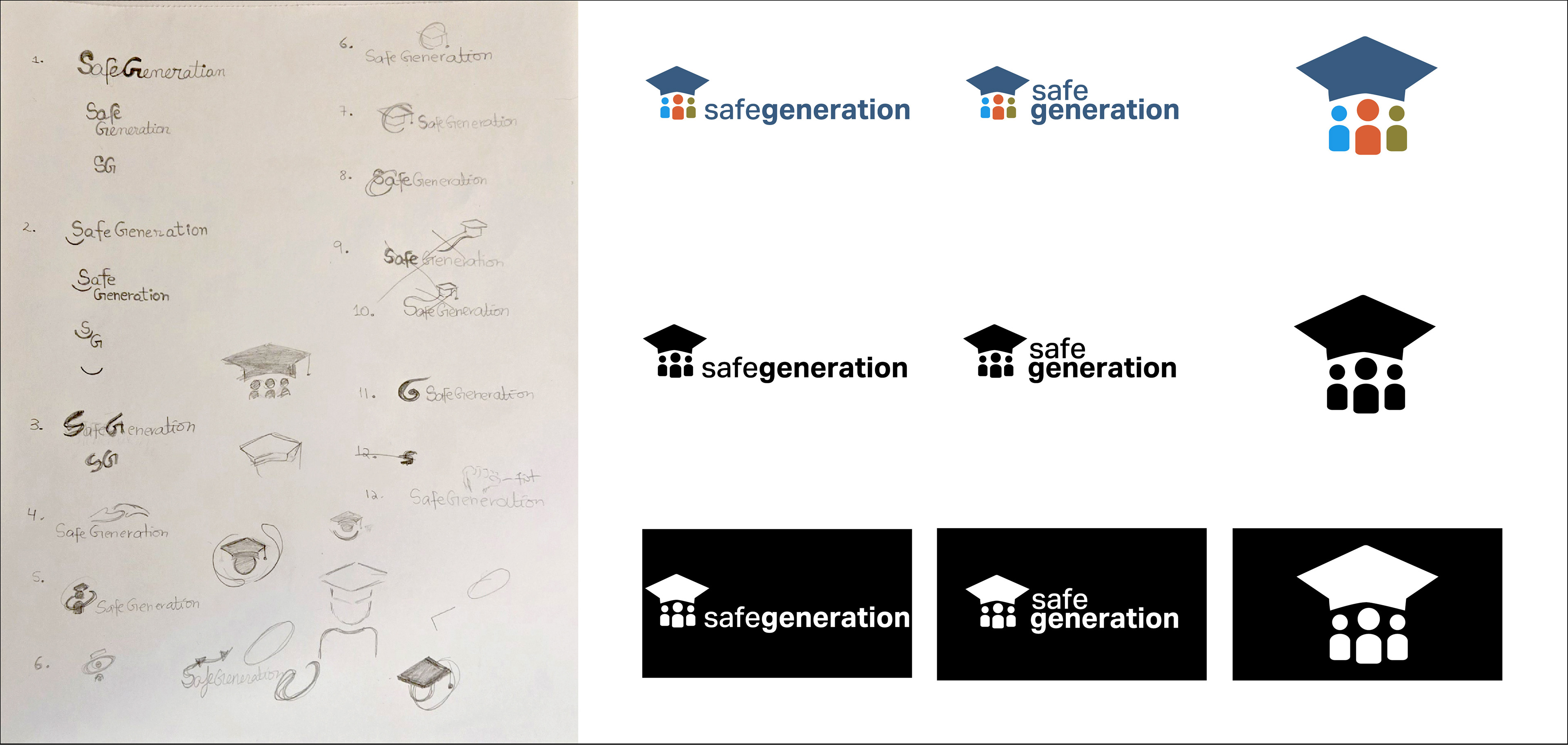
With a strong research foundation, the next step was translating these insights into a brand identity. I started by defining the core values of SafeGeneration—empowerment, inclusion, respect, collaboration, and safety. These values had to be reflected in every part of the brand, beginning with the logo.
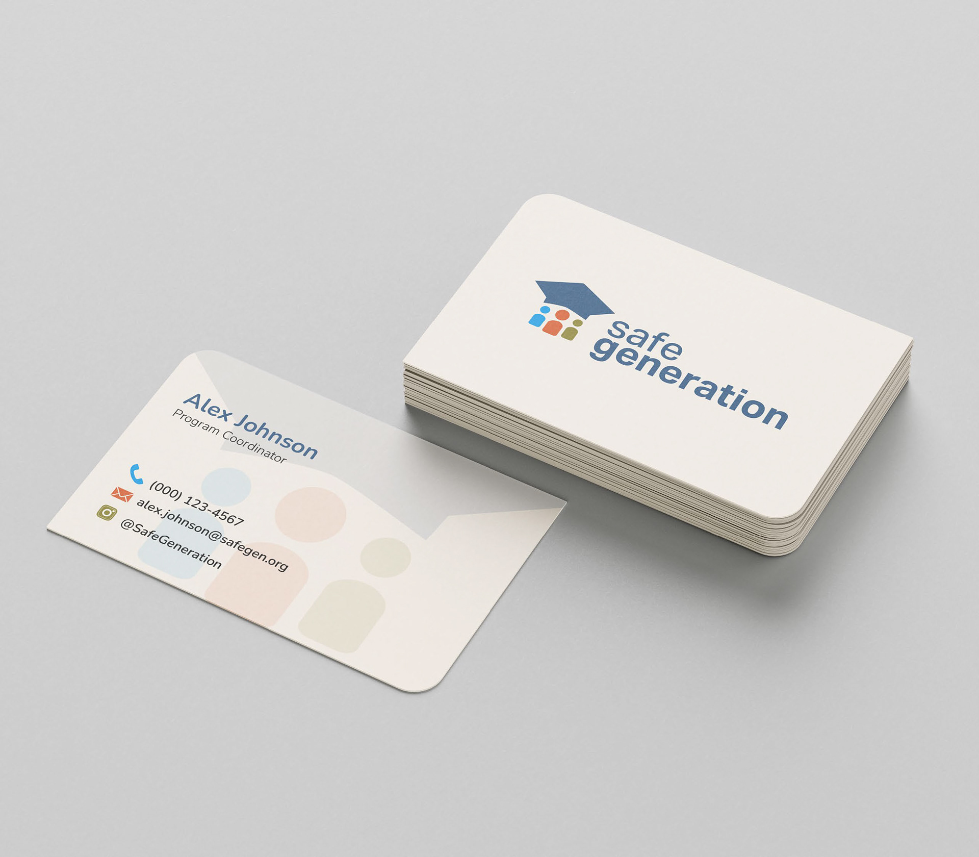
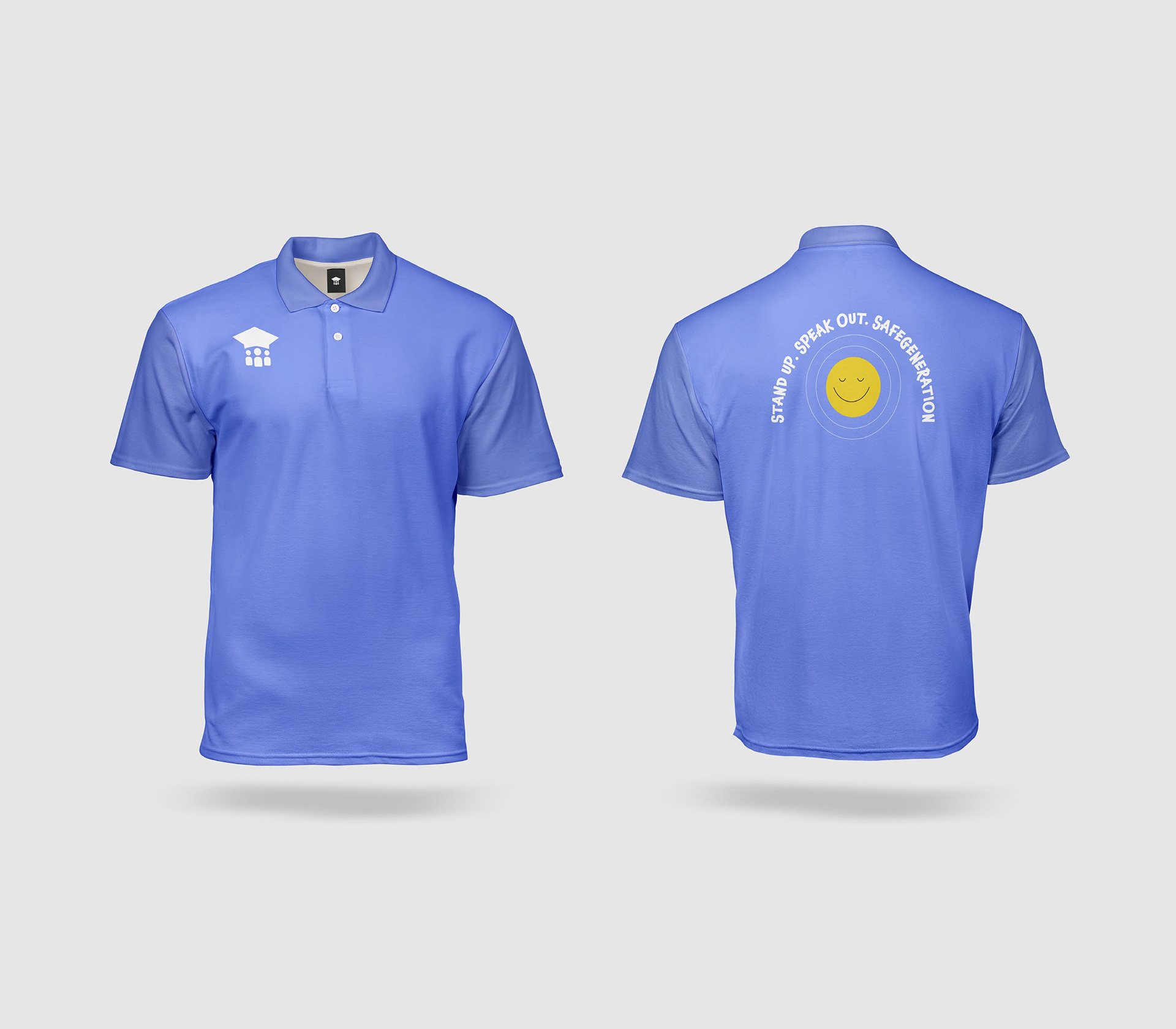
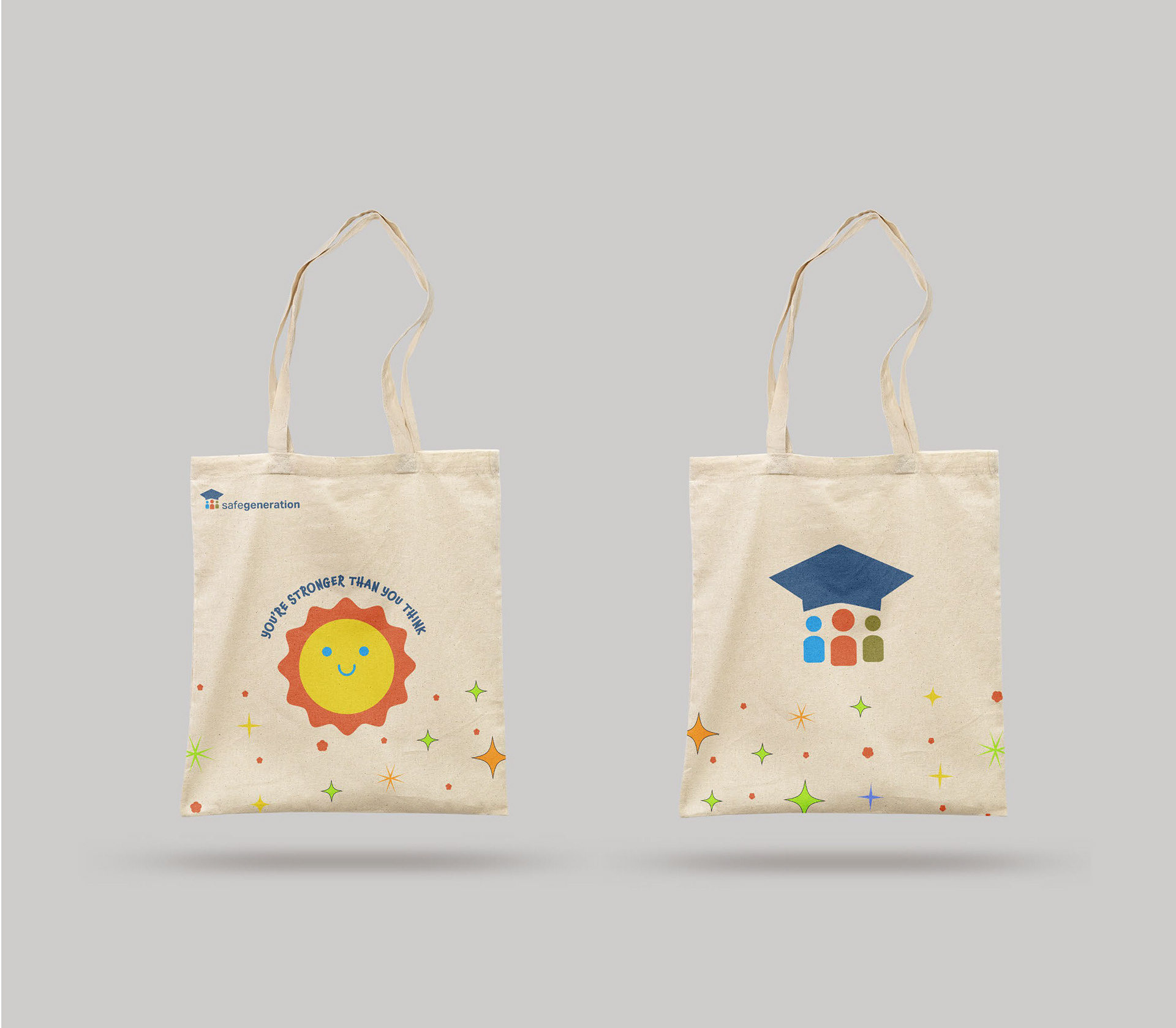
I brainstormed symbols that would visually represent students supporting each other and the journey of education.The final logo design featured three abstract student figures surrounding a graduation cap—a simple yet meaningful way to represent community, growth, and success. The choice of Aktiv Grotesk as the typeface for logo word mark was intentional; its rounded and friendly style added warmth while remaining modern and clean. To ensure balance, I used a mix of weights—"Safe" in medium weight and "Generation" in bold—allowing the logo to feel structured yet welcoming.
Colour played a crucial role in shaping the brand’s personality. Drawing from my research on classroom environments and student-friendly design, I selected four colours in the logo that felt both energetic and reassuring.
Creating a Visual Language: Illustrations, Typography & Imagery
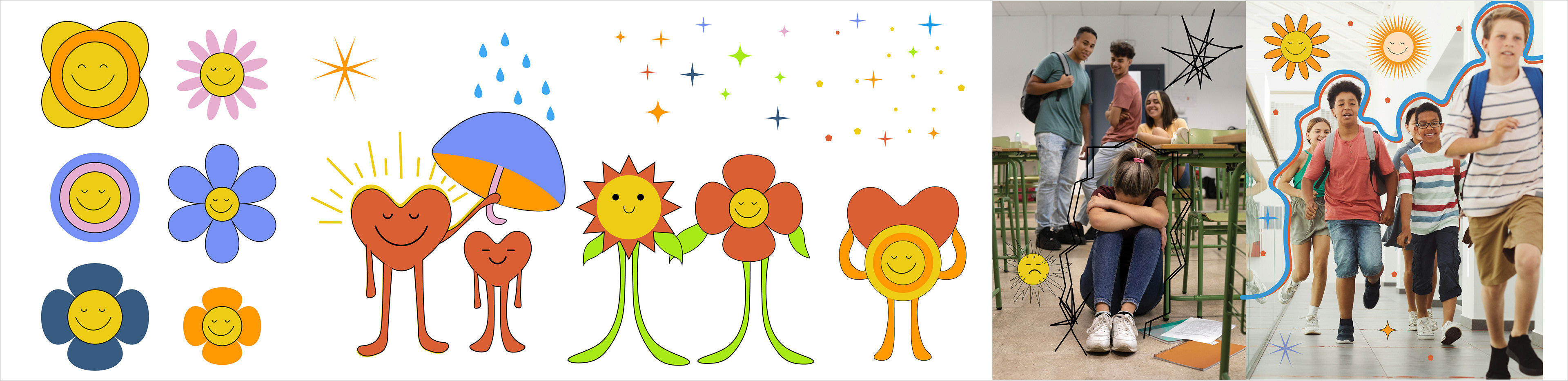
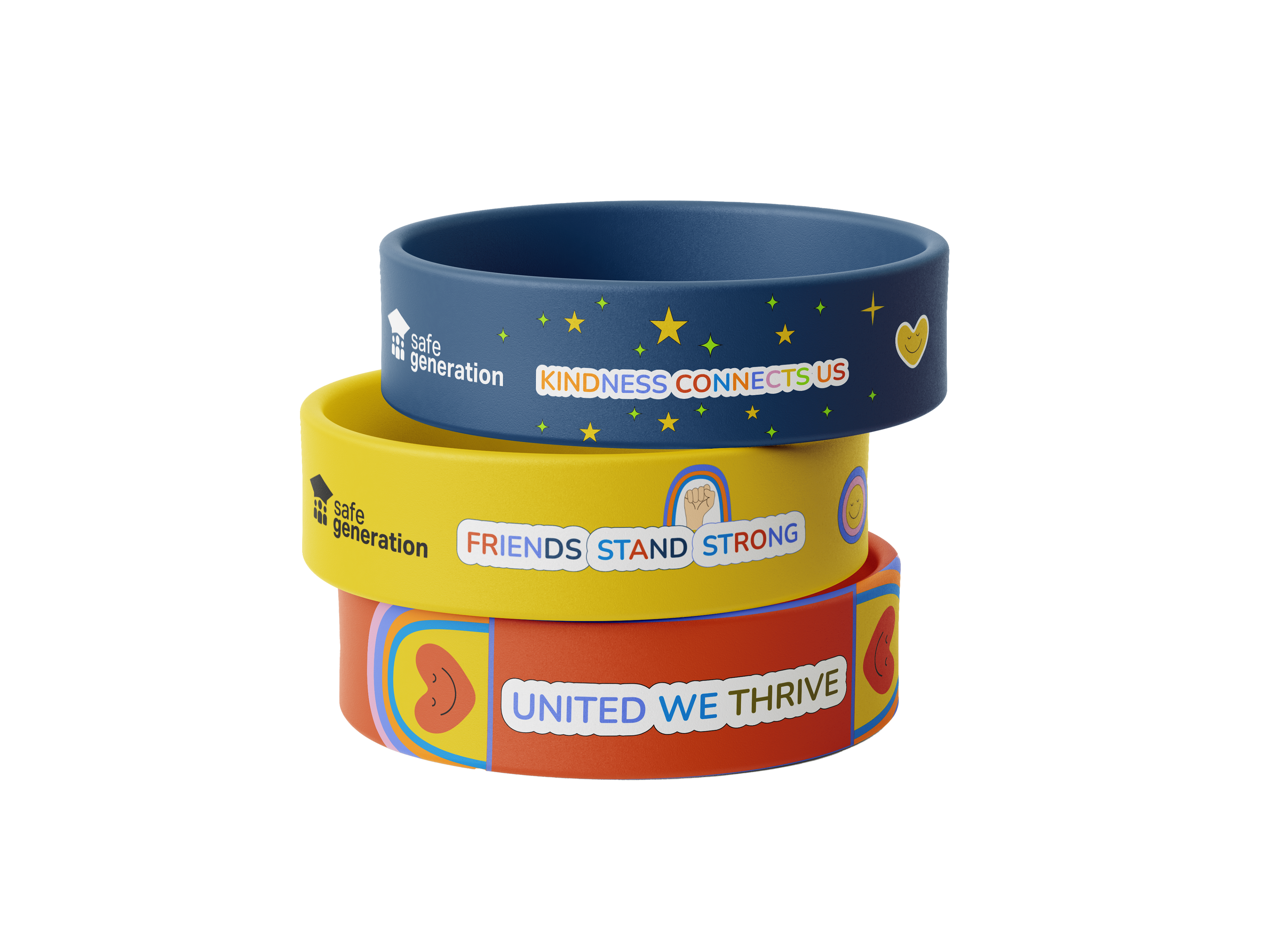
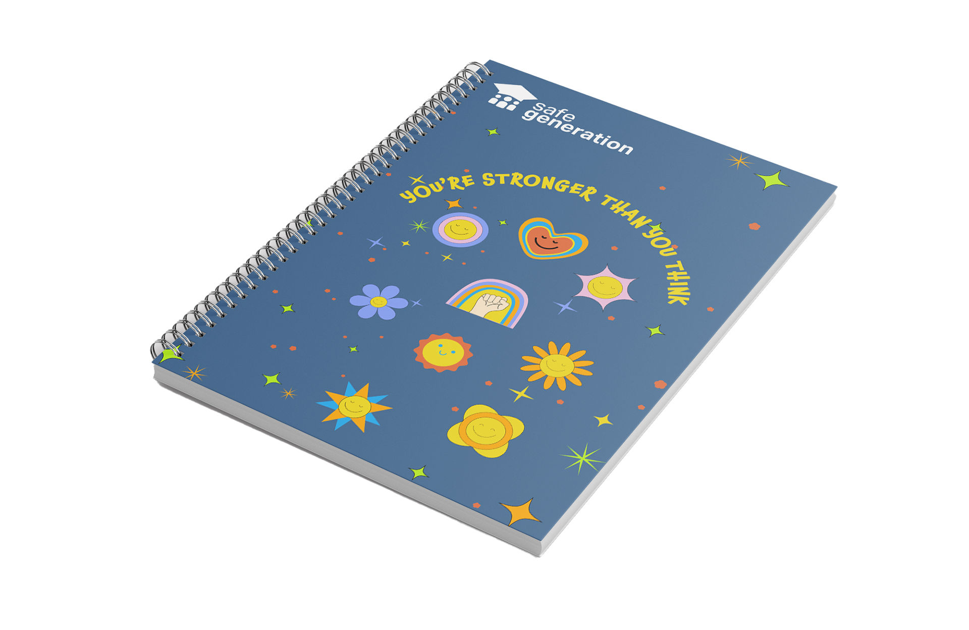
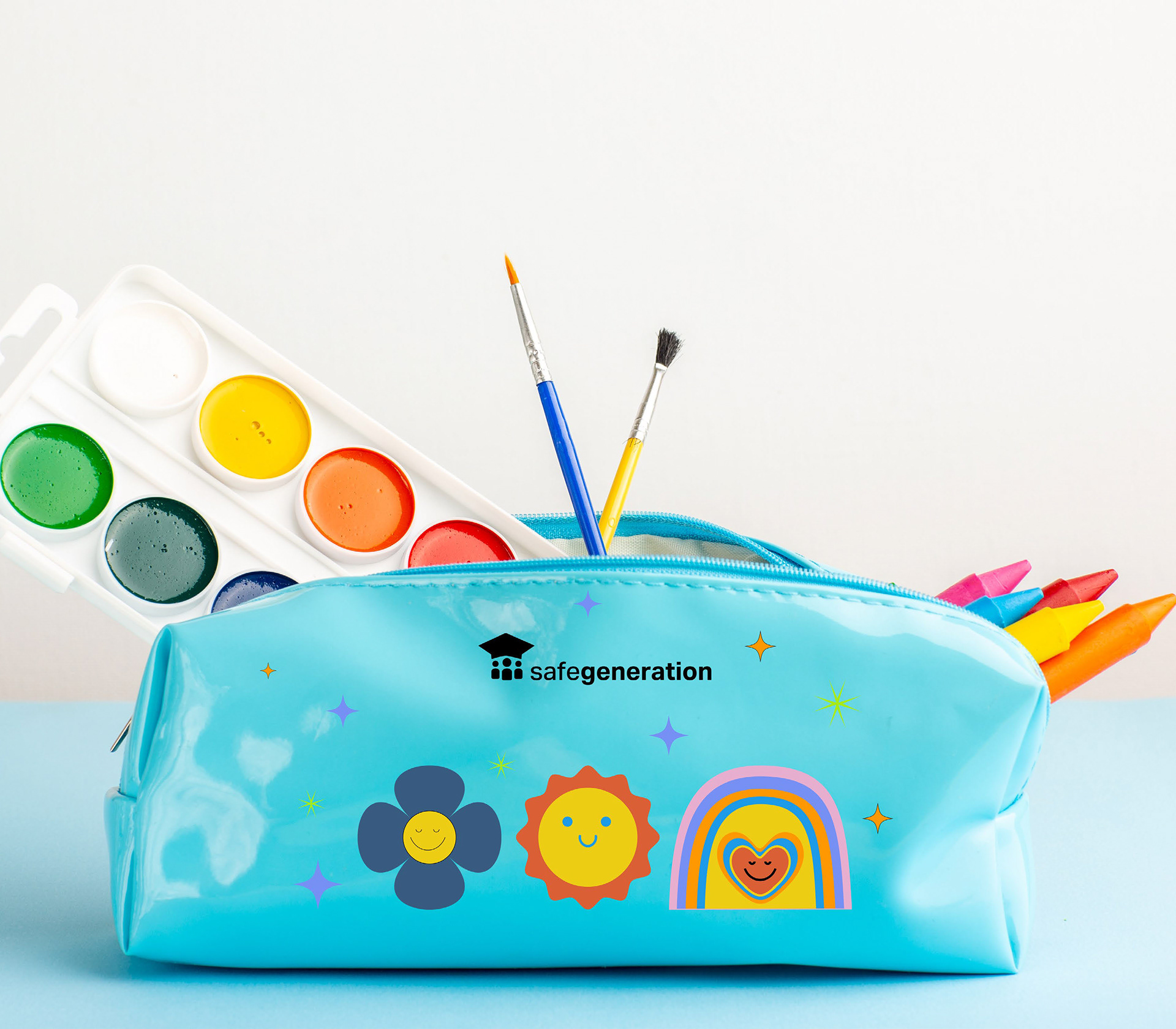
The SafeGeneration identity needed to be more than just a logo—it had to be a visual system that could be recognized and trusted across different platforms. To achieve this, I created a set of illustrations inspired by simple, positive shapes like hearts, circles, and flowers. Each character and scene was designed to foster inclusivity and positivity, with friendly facial expressions and bright, harmonious colours.
Typography was another crucial element. I selected Nunito as the primary typeface because of its rounded, approachable feel, making it ideal for headers and key messaging. Raleway served as the secondary font, providing a clean and professional look for body text, while Chaloops, a playful decorative font, was used sparingly for callouts, quotes, and merchandise. This combination allowed the brand to feel structured and clear while maintaining a sense of warmth and personality.
Imagery was also a key part of the brand’s storytelling. Rather than relying on generic stock photos, I carefully curated images that felt real and emotionally resonant. Every photo used in SafeGeneration materials was paired with hand-drawn doodles, reinforcing the brand’s playful yet thoughtful identity.
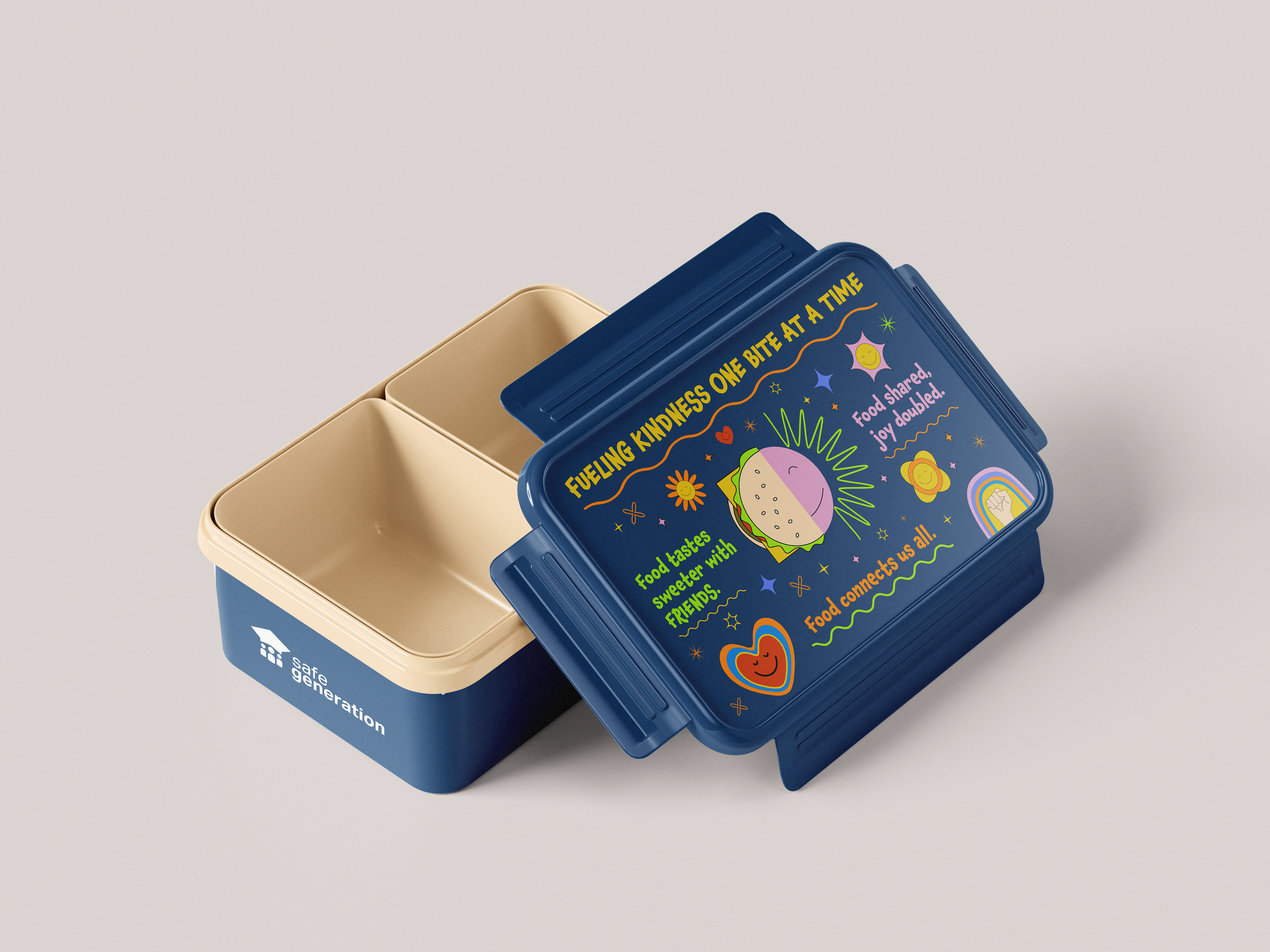
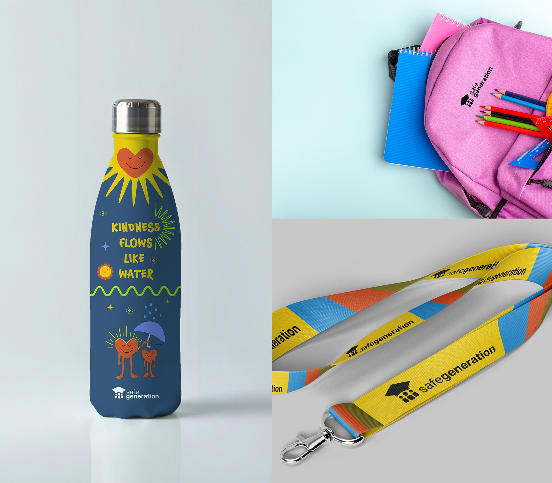
Mockups


Designing the SafeGeneration Mobile App: A Resource for Students
With the brand identity established, the next challenge was bringing it to life through digital tools. The SafeGeneration mobile app was designed as a confidential and accessible resource for students to report bullying, seek guidance, and access support.
The first step was studying existing apps in similar spaces—what worked, what didn’t, and what could be improved. I then moved into wire framing, carefully structuring the app to ensure an intuitive and student-friendly experience. The app had to be simple, clear, and non-intimidating while still providing essential functionality.
The app’s main features included:
A reporting system that allowed students to confidentially report bullying incidents
A peer support chat where students could connect with others for guidance
Educational resources on handling difficult situations and mental well-being
Every screen was designed with accessibility in mind—large buttons, easy navigation, and a colour-coded system to guide users through their options. The tone of the app was encouraging, never overwhelming, ensuring that students felt supported rather than intimidated when seeking help.
Expanding the Digital Presence: The SafeGeneration Website
While the mobile app was designed primarily for students, the SafeGeneration website needed to serve a broader audience—including parents, educators, and school administrators. It was built as a central hub for resources, educational materials, and brand information.
The website followed the same branding principles as the app——ensuring a seamless brand experience across platforms. Navigation was structured to be clear and logical, allowing visitors to quickly access information about SafeGeneration’s mission, the app, and how they could get involved.
Final Takeaway & Impact:
SafeGeneration is more than just a brand—it’s a tool for change. By combining thoughtful design, accessibility, and technology, this project aims to empower students to speak up, seek support, and create safer school environments. The visual identity, mobile app, and website work together to build trust, inclusivity, and engagement, ensuring that students feel heard and supported. My hope is that SafeGeneration not only raises awareness but also drives real action, fostering a culture where every student feels safe, valued, and empowered to thrive.
Mockups by: Designed by Freepik www.freepik.com