STARBALM — Branding the In-Between
STARBALM is a conceptual lip veil brand born from the interplay of contrasts — light and dark, soft and bold, real and dreamlike. What began as a full branding exercise — from logo design to colour theory, typography, packaging, and storytelling — evolved into a more personal journey: an emotional exploration of what it means to exist in the in-between — between day and night, magic and realism, subtlety and statement. The brand draws inspiration from its founder, a lifelong stargazer who crafted her own balms using kitchen oils and pigments, watching constellations from her rooftop.
Concept & Foundation
This brand began with a single question:
“What does balance actually feel like — especially in a product that’s both skincare and self-expression?”
I explored pairs like day vs. night, real vs. dream, bold vs. soft. The turning point came when I imagined the moment where these opposites meet — a soft, suspended space that holds the emotional core of the brand. I pictured evening light, soap bubbles catching colour, and natural transitions that feel both magical and grounded.
A common thread emerged: gradients — moments where contrast dissolves into harmony. From dusk skies where light and dark blend, to the iridescence of bubbles reflecting soft hues, these colour shifts capture the essence of being in between. Gradients became the foundation of the brand’s identity, expressing both its visual beauty and deeper meaning.
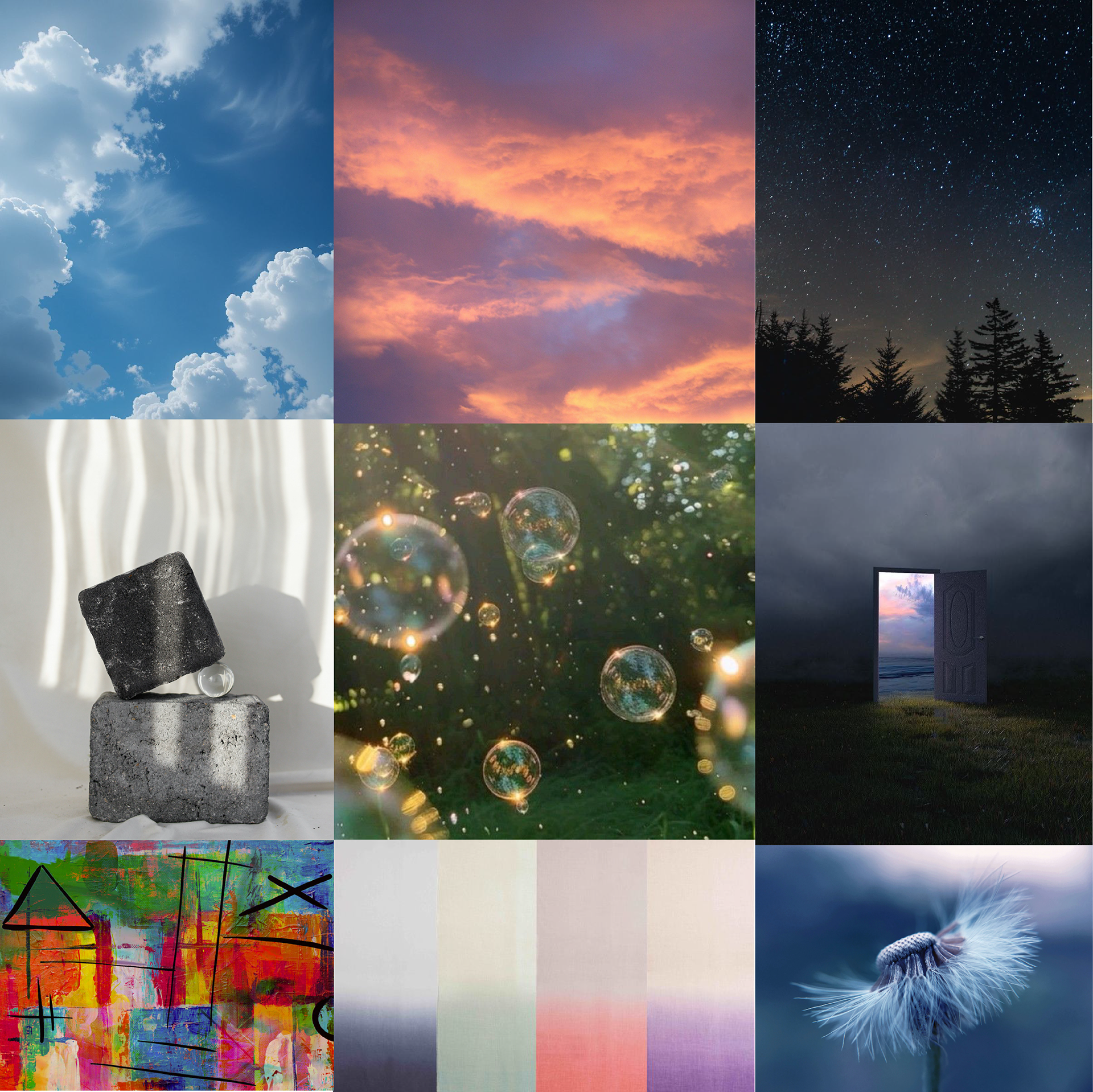
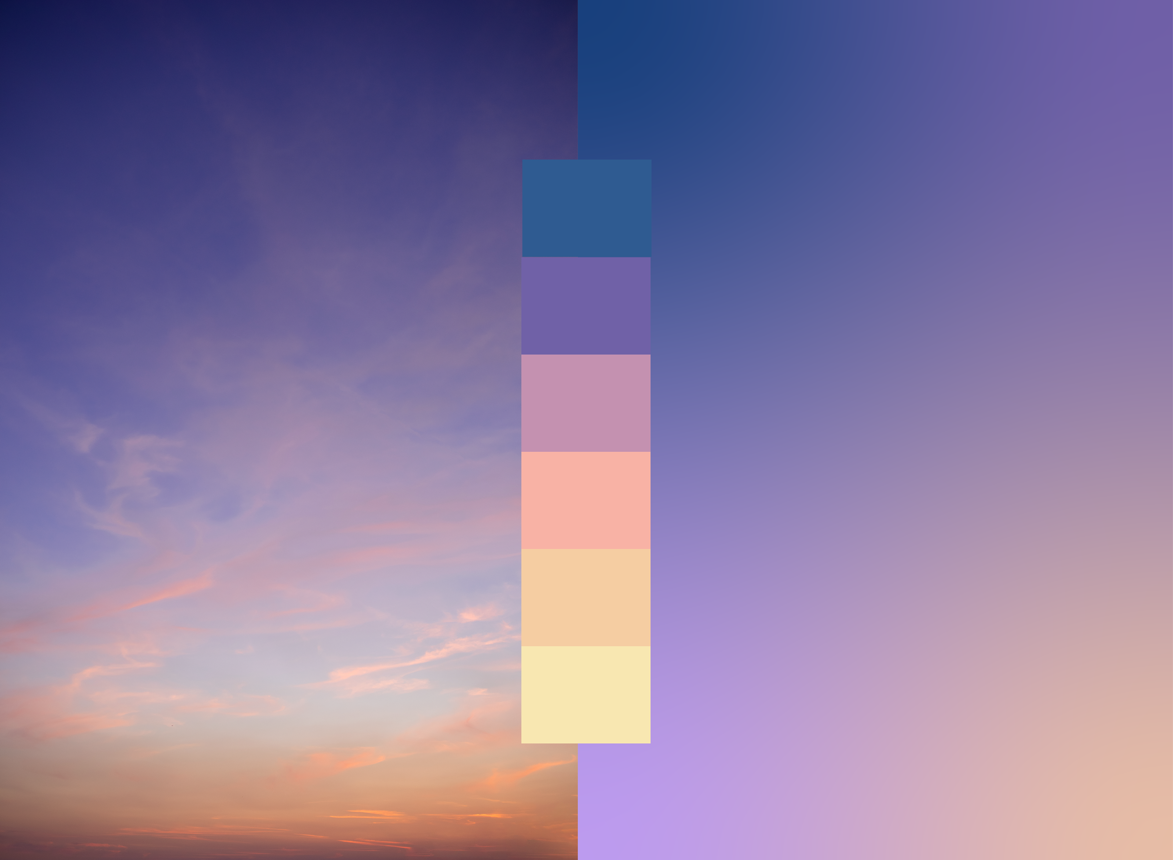
Images are sourced from Pinterest
Colour Exploration
The image on left became the inspiration behind my colour selection. It captures that fleeting moment in the sky — either just before day begins or just after it ends. A perfect visual representation of the in-between, where opposites gently meet.
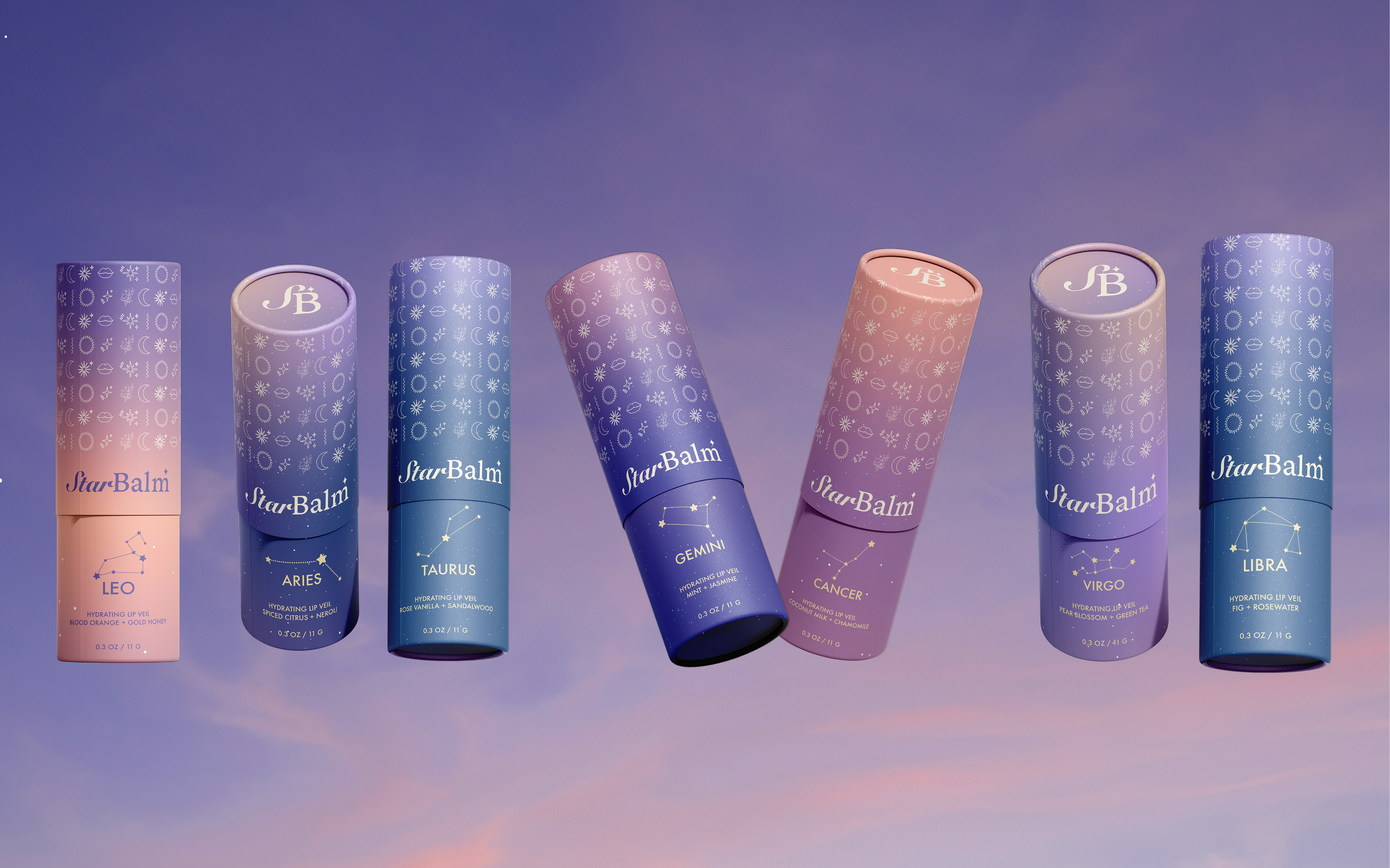
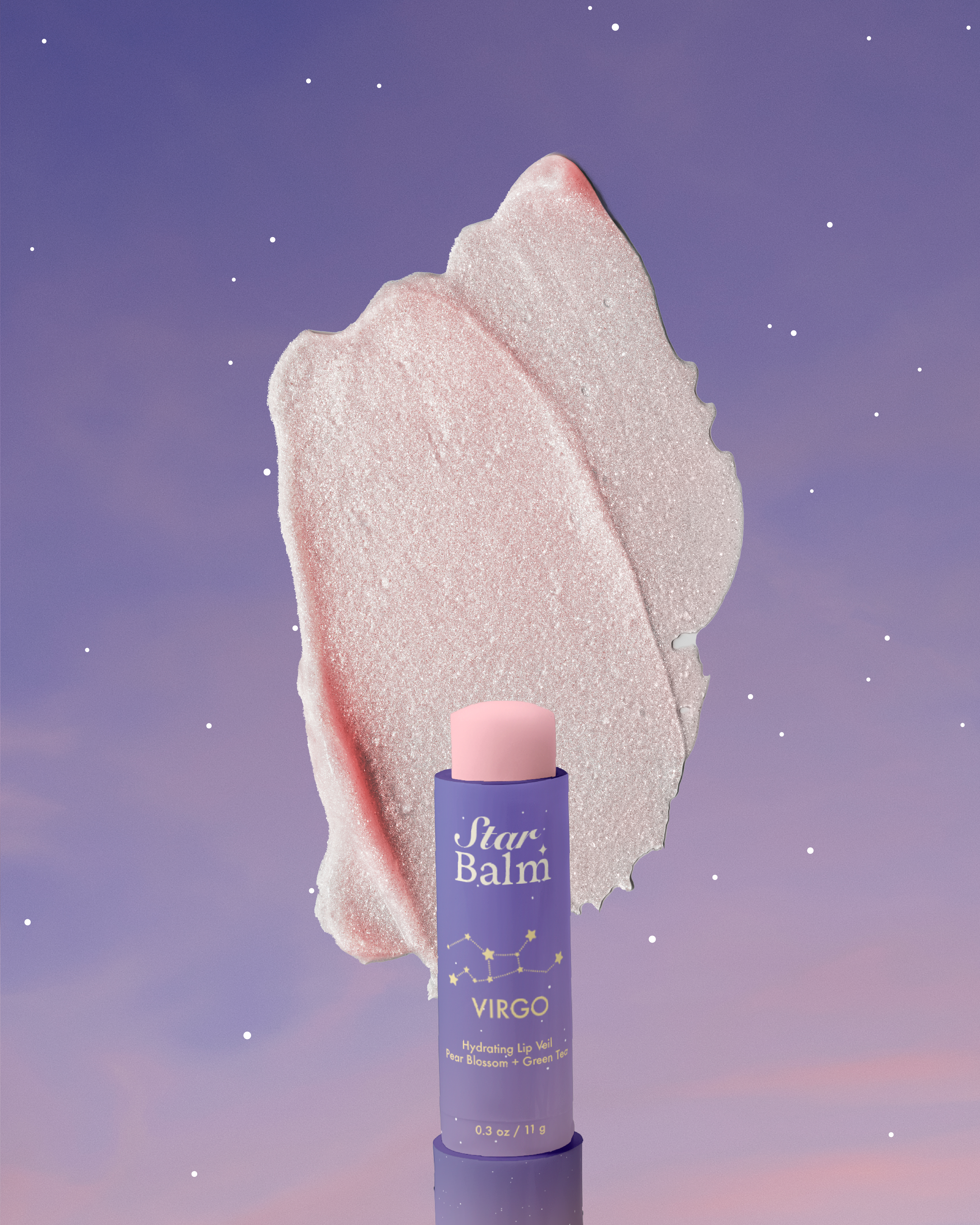
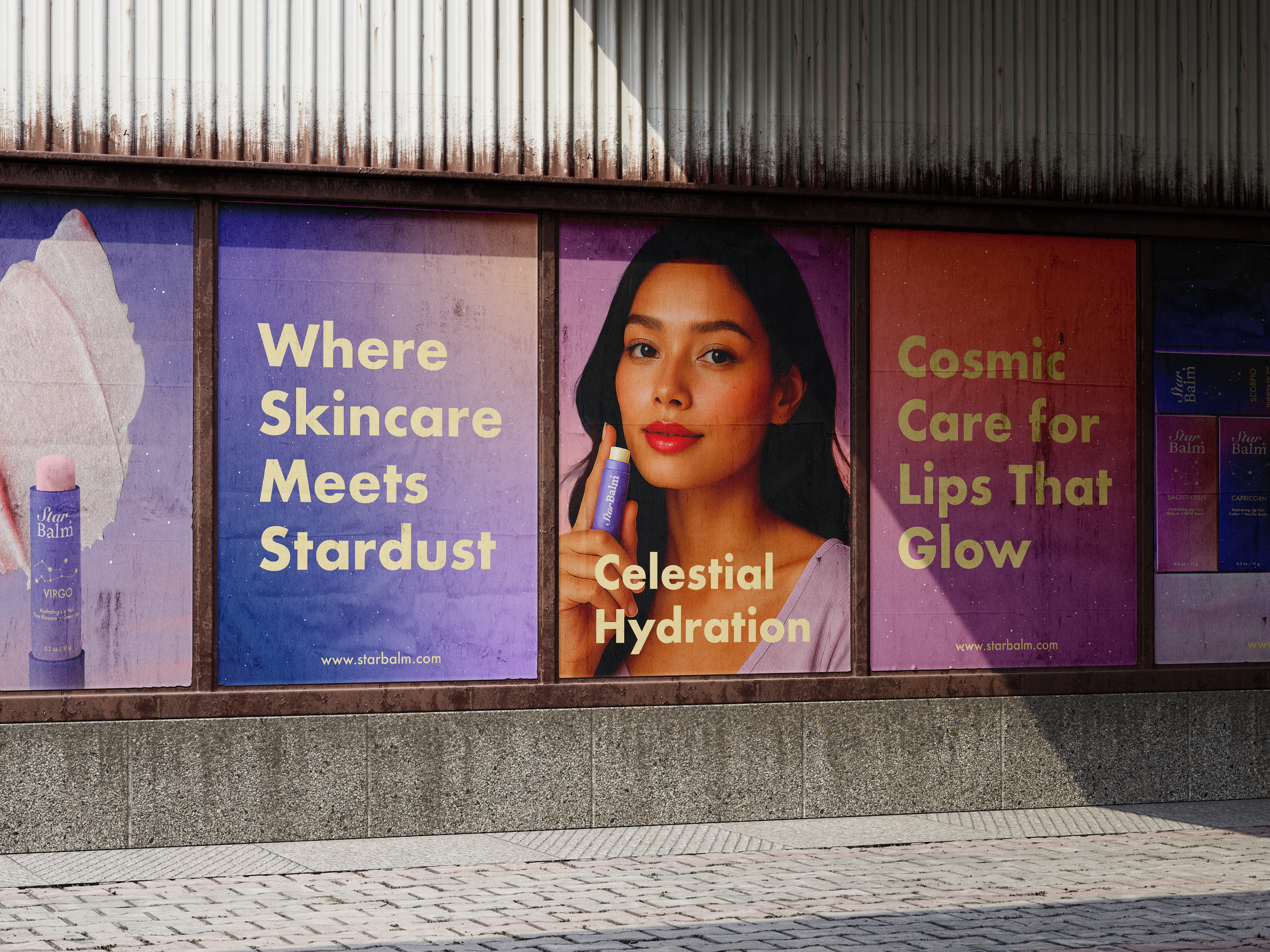
The palette felt naturally aligned with beauty and femininity. I chose purple as the dominant tone — a colour that sits between warm and cool — supported by complementary hues like peach and pink to create soft, seamless transitions that reflect the brand’s emotional core.
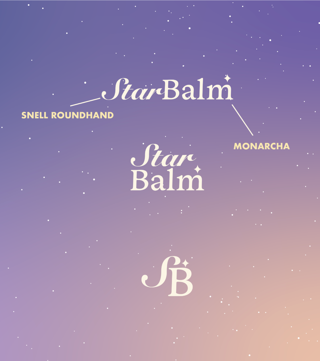
Snell Roundhand
Dreamy · Romantic · Nostalgic
Monarcha
Grounded · Bold · Structured
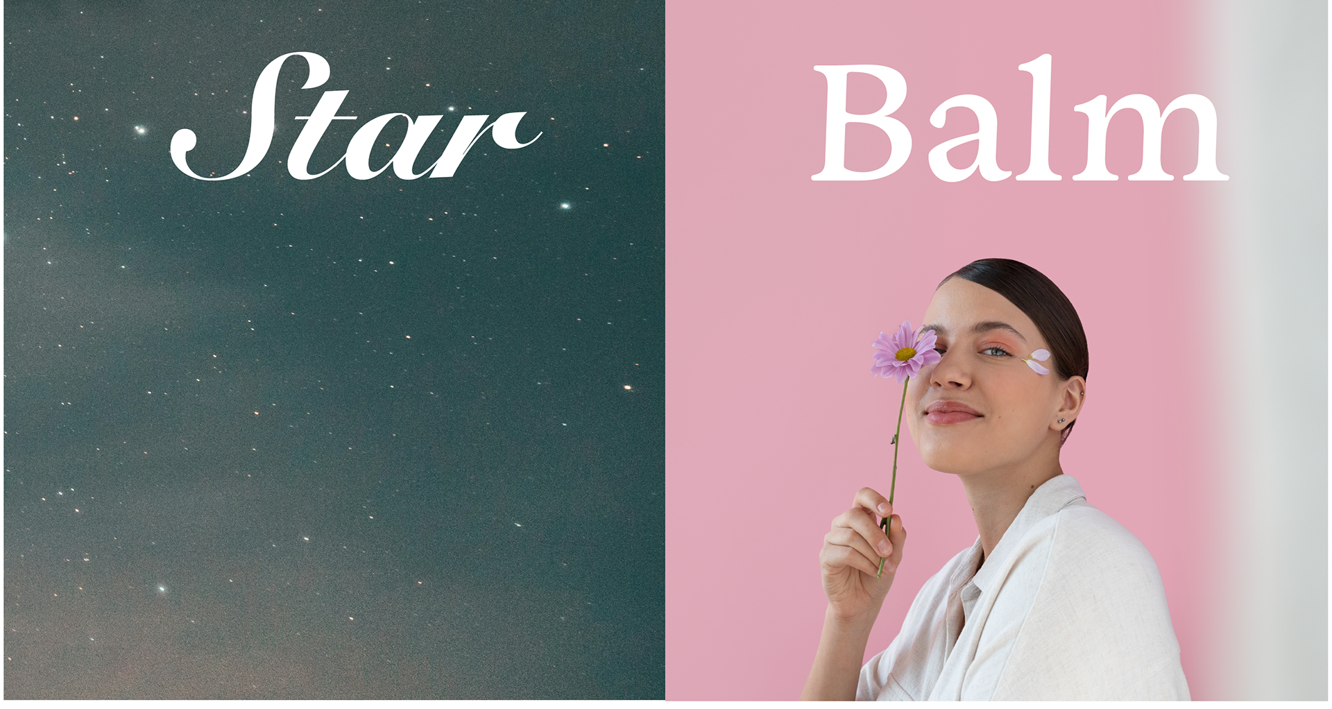
Typography as Contrast
Typography in STARBALM wasn’t just a stylistic choice — it became a visual language of feeling. Each typeface was chosen to embody one half of the brand’s emotional duality — the dream and the real — and together, they balance like dusk between day and night.
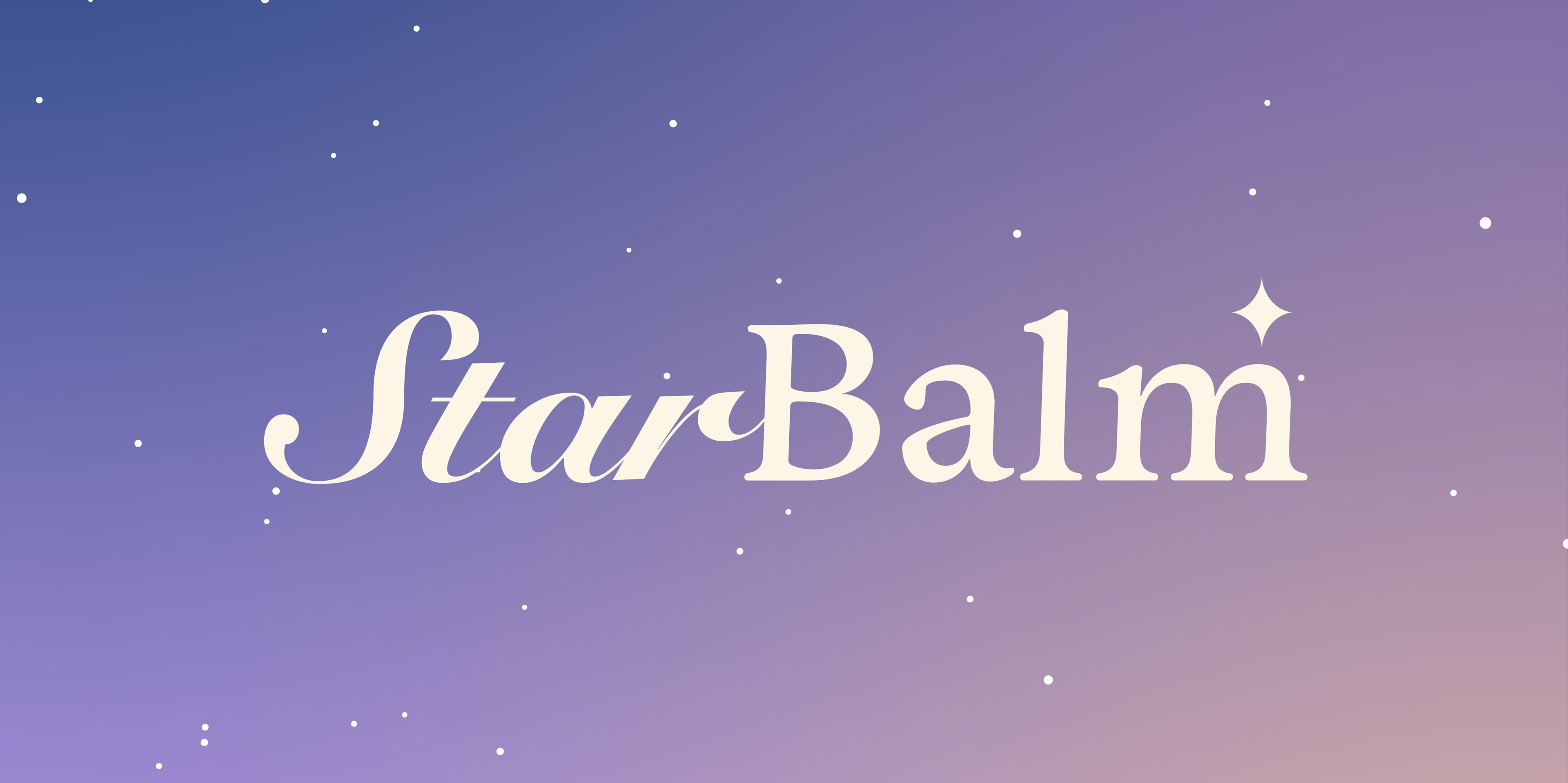
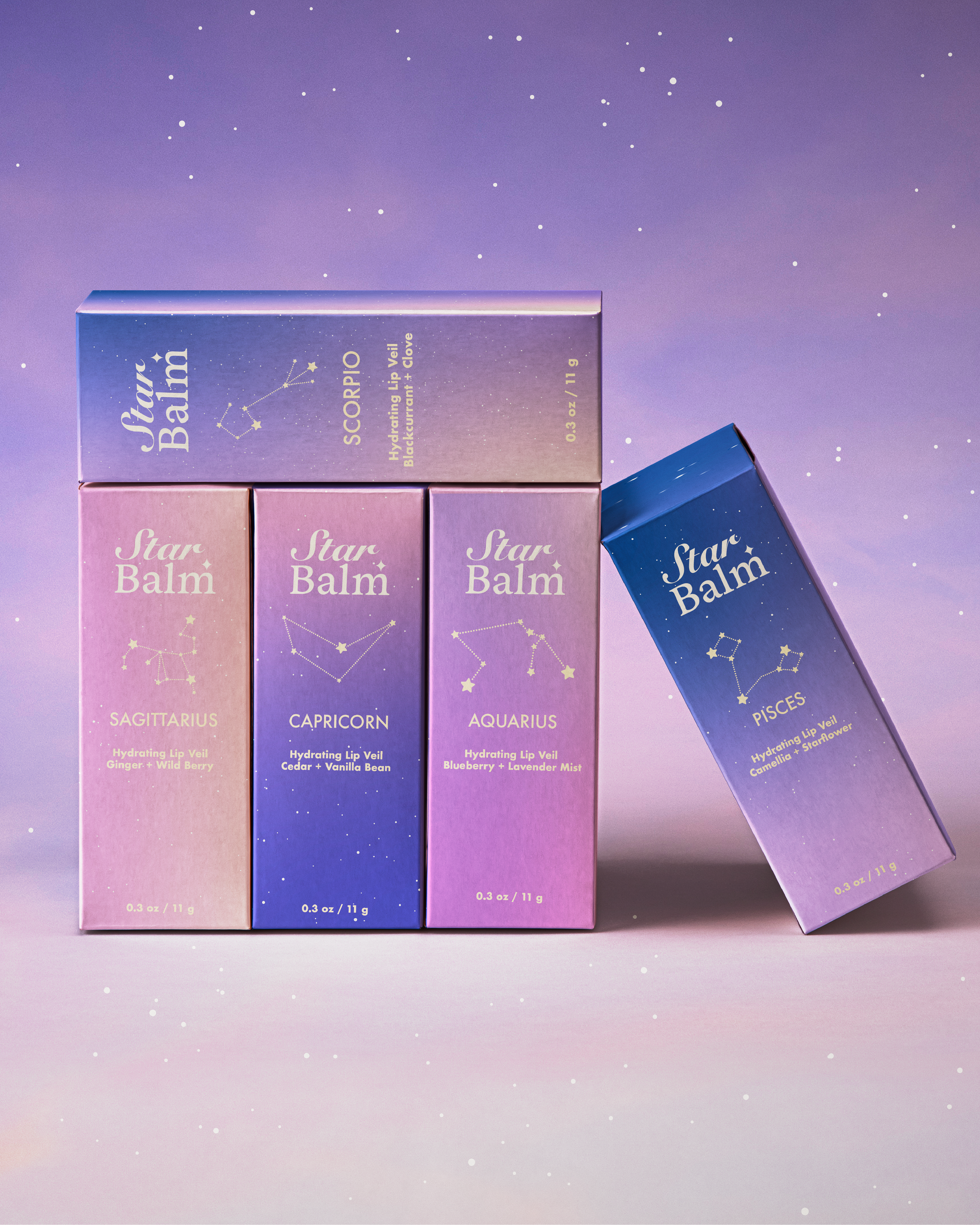
Logo Development
The STARBALM logo is built on contrast — two distinct typefaces brought together to reflect the brand’s core duality. “Star” feels dreamy and romantic, while “balm” is bold and grounded. Instead of blending them, I let their differences shine, inspired by logos that use contrasting fonts to create tension and harmony. This contrast visually tells the story of being in-between — where softness meets strength.
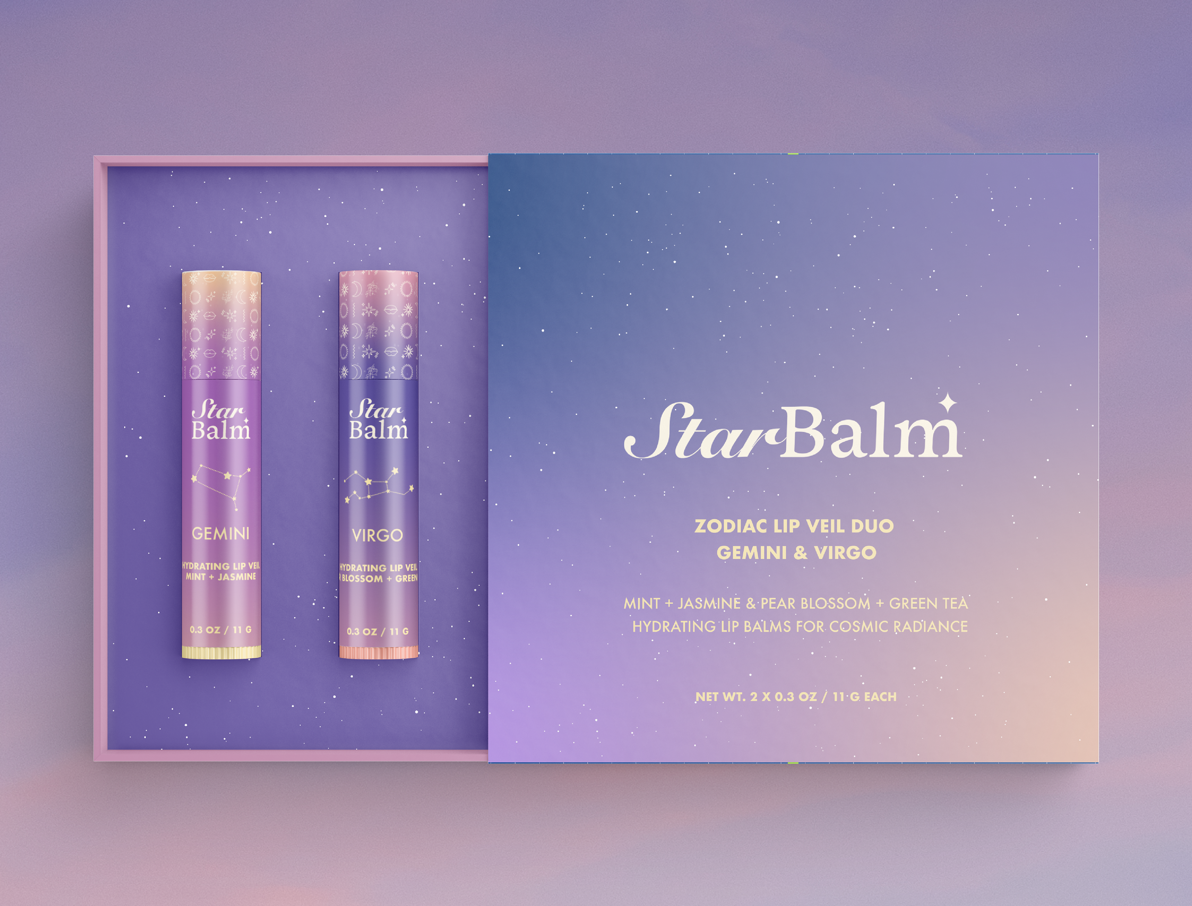

Mockups by: Designed by Freepik www.freepik.com