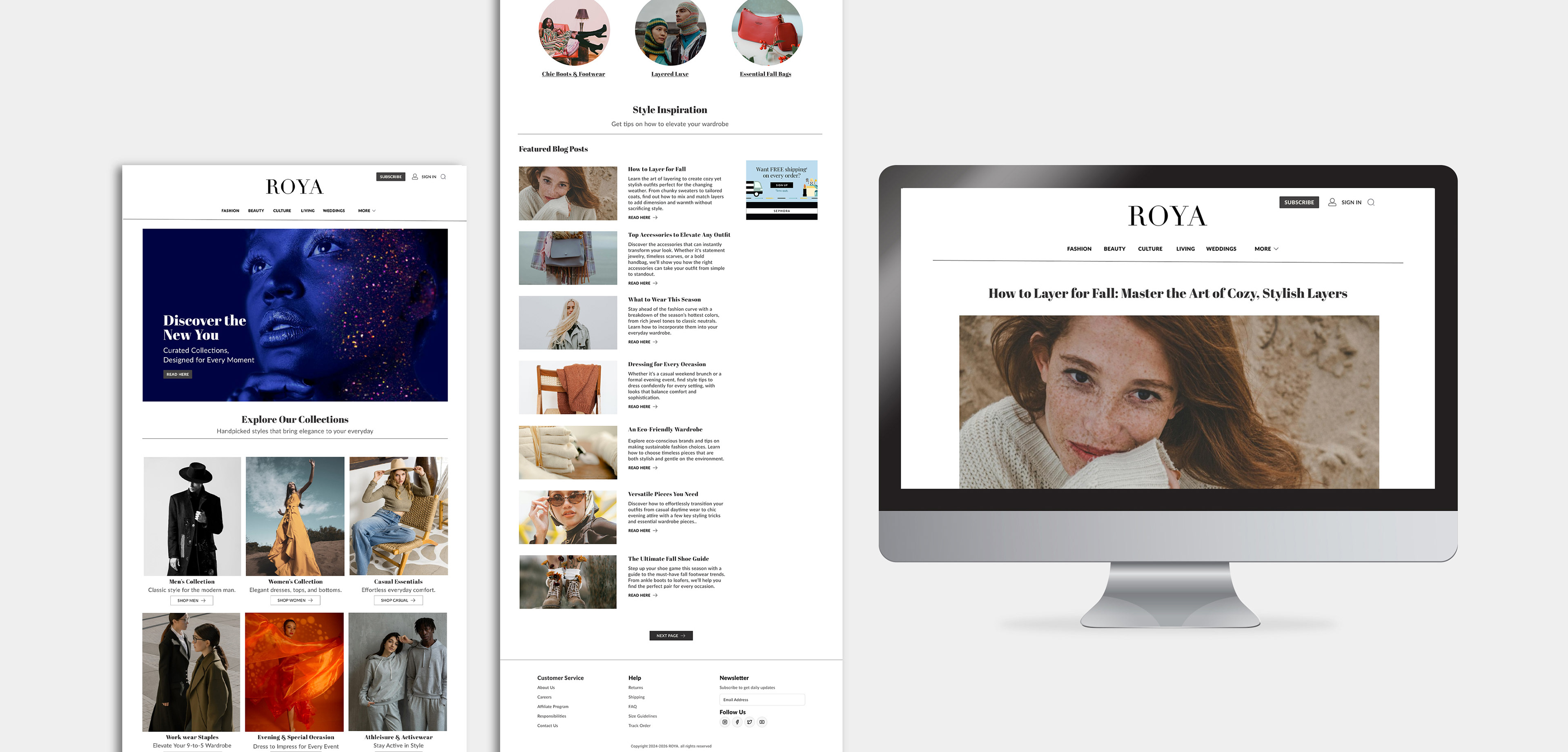
Roya: A Sophisticated Digital Experience for Fashion
Media Website Design
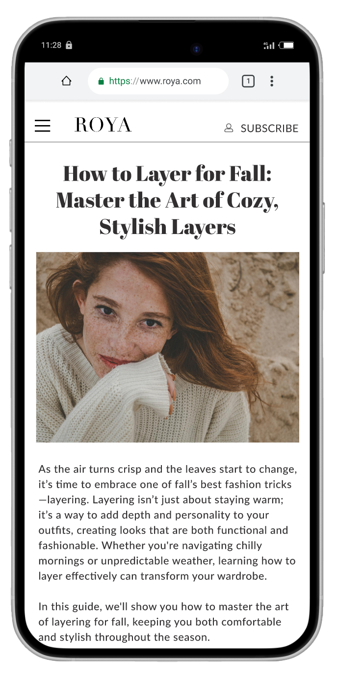
The Roya fashion website design aimed to create a sophisticated, modern digital experience tailored for high-end fashion enthusiasts. The goal was to craft a visually appealing website that reflected the brand’s blend of timeless elegance and contemporary style. The design needed to provide users with a seamless and intuitive browsing experience while showcasing high-quality fashion photography.
The Challenge & Problem
The challenge was to develop a website that balanced a clean, minimalistic design with effective content organization. Given the nature of fashion websites, which often feature large amounts of imagery, the goal was to ensure that the website wasn’t overwhelming while still offering a rich visual experience. The site needed to be easy to navigate and capable of handling multiple categories of fashion content without feeling cluttered.
Design Process
1. Research & Empathy Mapping
The design process started with research into leading fashion websites like Vogue to explore current design trends and best practices. I also created mood boards to visualize the aesthetic direction, focusing on clean lines, negative space, and high-end photography. The research phase helped define key design priorities and ensured the user experience would align with expectations for luxury fashion sites.
The design process started with research into leading fashion websites like Vogue to explore current design trends and best practices. I also created mood boards to visualize the aesthetic direction, focusing on clean lines, negative space, and high-end photography. The research phase helped define key design priorities and ensured the user experience would align with expectations for luxury fashion sites.
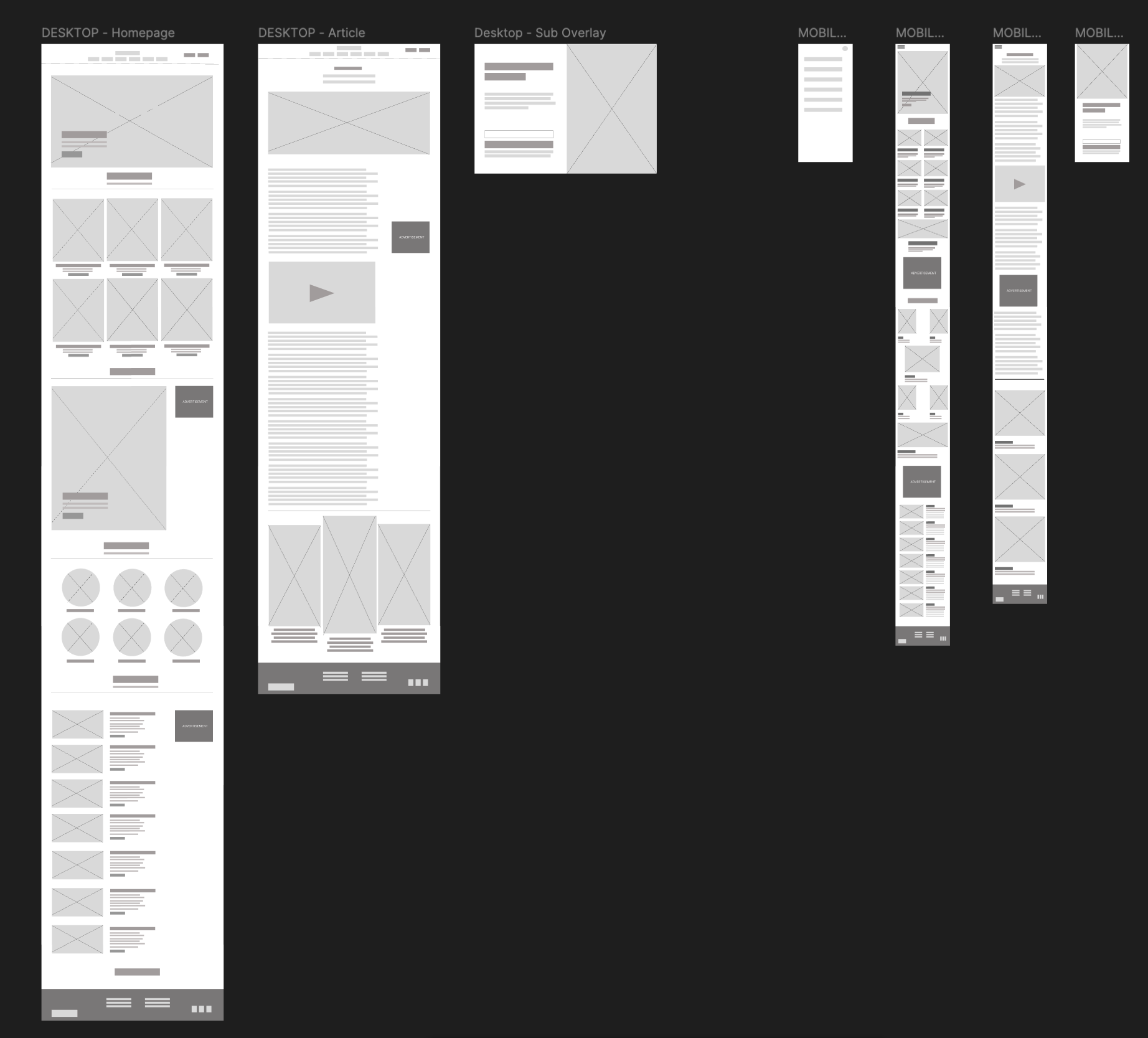
2. Wireframes & Sketches
Initial wireframes were created to map out the structure of the website. This process helped define how key elements like navigation, the homepage layout, and individual product pages would work together. Sketches were then developed to explore visual ideas and test how photography and text could be effectively balanced.
Initial wireframes were created to map out the structure of the website. This process helped define how key elements like navigation, the homepage layout, and individual product pages would work together. Sketches were then developed to explore visual ideas and test how photography and text could be effectively balanced.
3. Choosing a Colour Palette & Typography
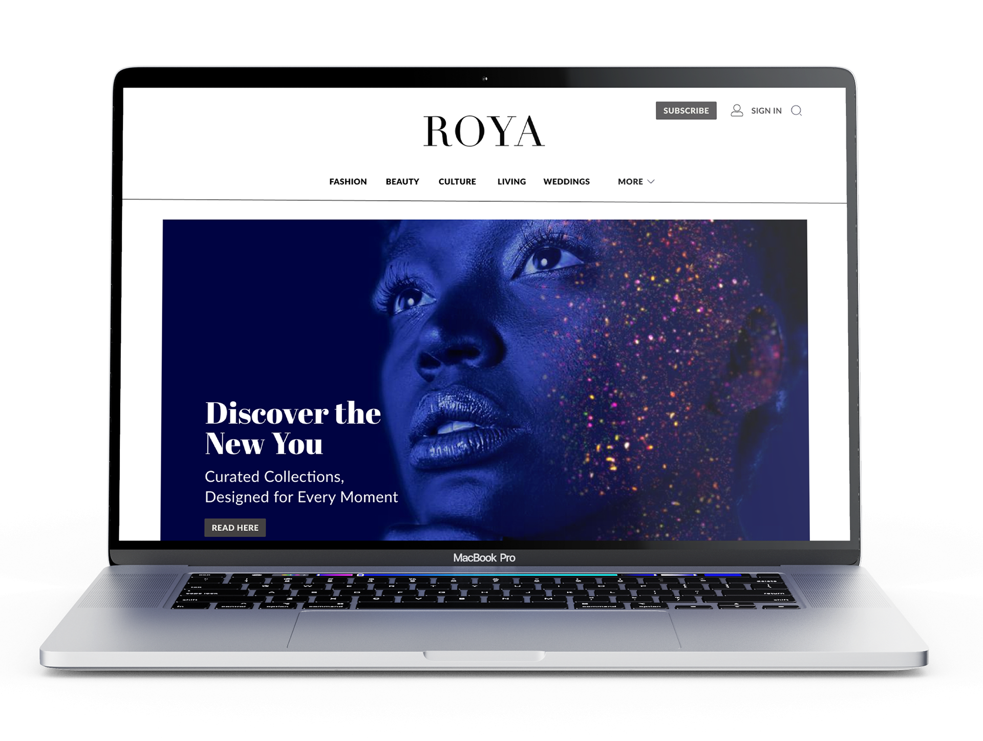
A minimalist approach was taken with a predominantly white background to highlight the fashion imagery. Dark gray accents were used for navigation and other key elements to create subtle contrast. The typography was chosen to be modern and readable, enhancing the overall clean and refined aesthetic of the site.
A minimalist approach was taken with a predominantly white background to highlight the fashion imagery. Dark gray accents were used for navigation and other key elements to create subtle contrast. The typography was chosen to be modern and readable, enhancing the overall clean and refined aesthetic of the site.
4. Navigation & Layout
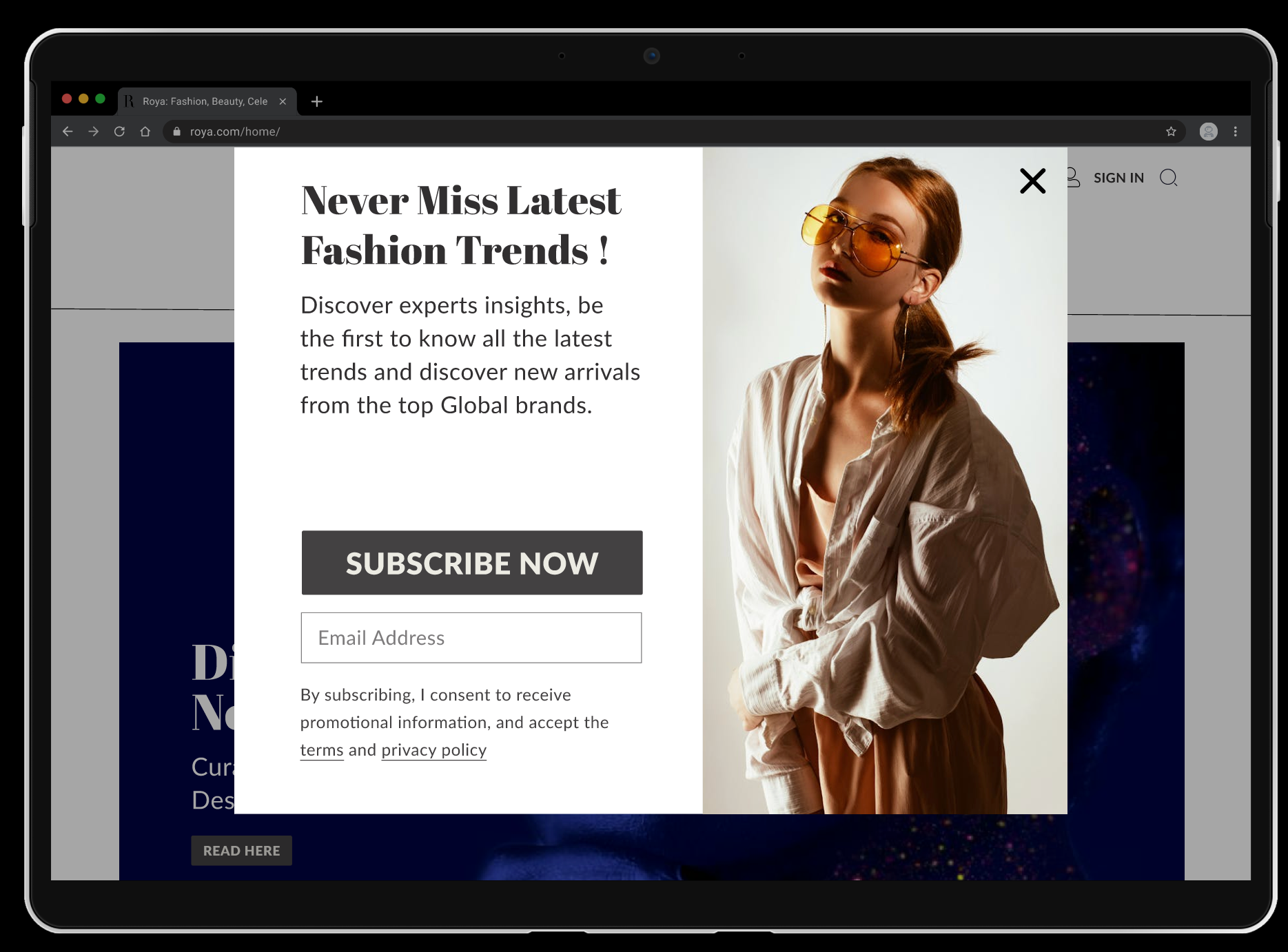
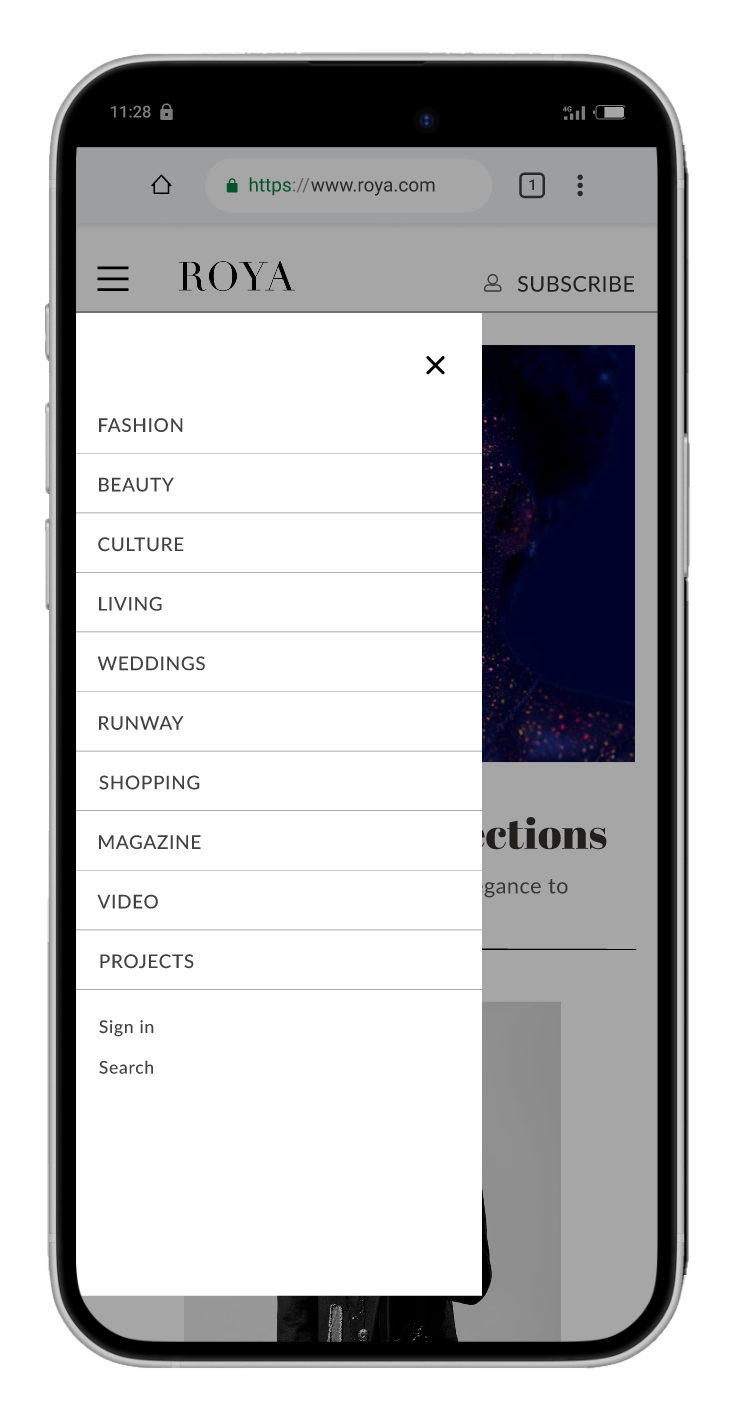
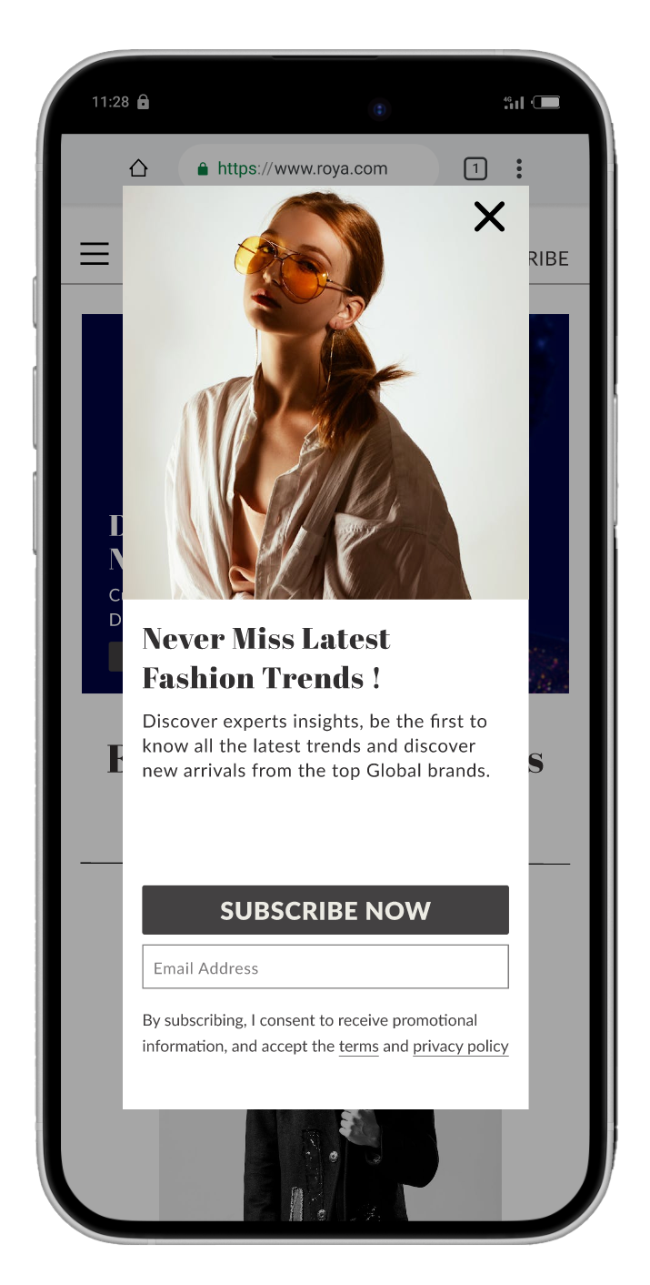
The website layout was designed to be intuitive, ensuring users could easily browse through various fashion collections and categories. To enhance user experience, the navigation bar was kept simple and easily accessible. The logo was centered at the top of the page, contributing to a balanced, clean header. Call-to-action buttons such as Subscribe and Sign Up were strategically placed for visibility without interrupting the flow of the page.
The website layout was designed to be intuitive, ensuring users could easily browse through various fashion collections and categories. To enhance user experience, the navigation bar was kept simple and easily accessible. The logo was centered at the top of the page, contributing to a balanced, clean header. Call-to-action buttons such as Subscribe and Sign Up were strategically placed for visibility without interrupting the flow of the page.
5. Design Iterations
Throughout the design process, feedback was gathered, and the design was refined based on the changes. For example, the size of icons on subpages was adjusted to ensure visibility, and advertisement sizes were reworked for better proportioning within the layout.
Throughout the design process, feedback was gathered, and the design was refined based on the changes. For example, the size of icons on subpages was adjusted to ensure visibility, and advertisement sizes were reworked for better proportioning within the layout.
Desktop and Mobile Wireframes
Solution & Outcome
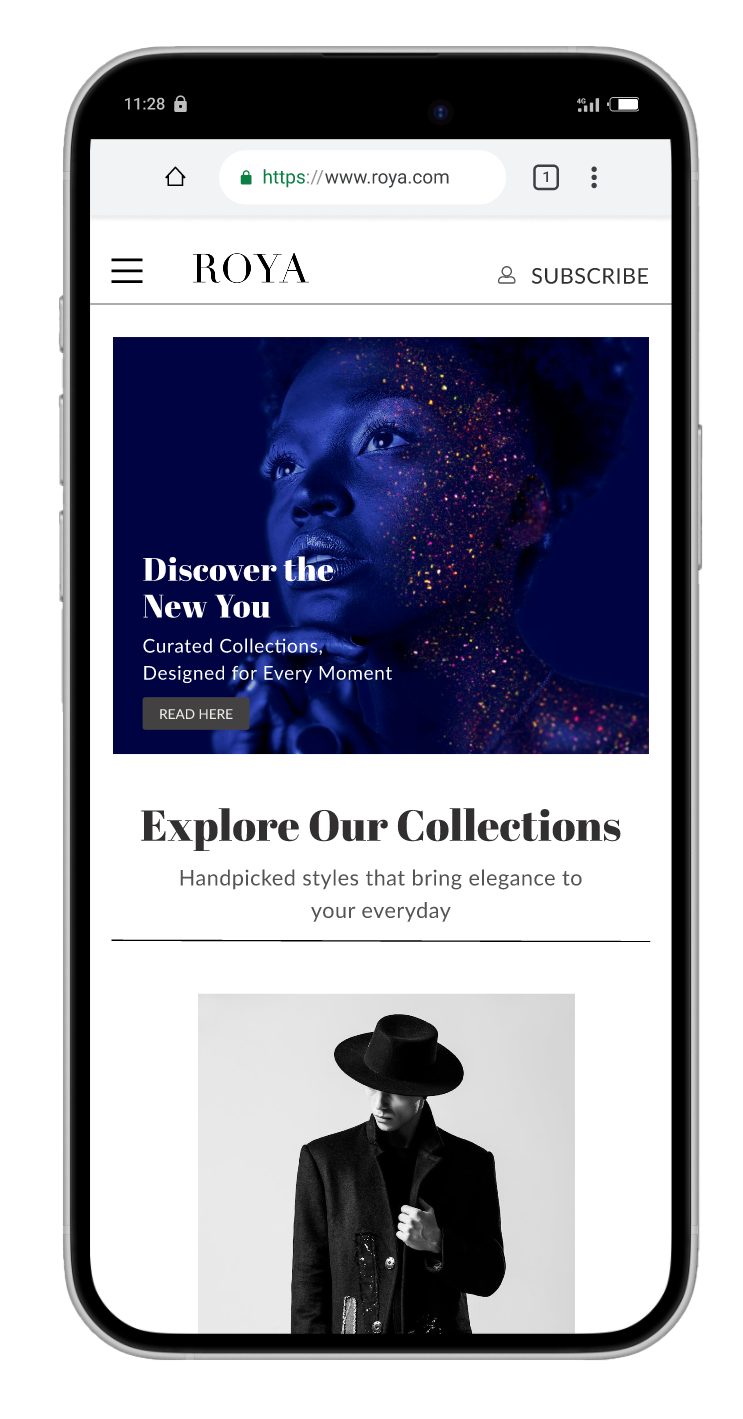
The final design successfully balanced functionality with elegance by incorporating a clean and minimalist aesthetic that allowed fashion imagery to take centre stage. Clear and simple navigation, complemented by strategically placed call-to-action buttons, enhanced usability and improved the overall user experience. A comprehensive design library ensured consistency throughout the website while streamlining the design process. Additionally, the website was built with responsive design principles, ensuring seamless performance across devices and delivering a high-end experience on both desktop and mobile platforms.
Mockups
Mockups by: Designed by Freepik www.freepik.com