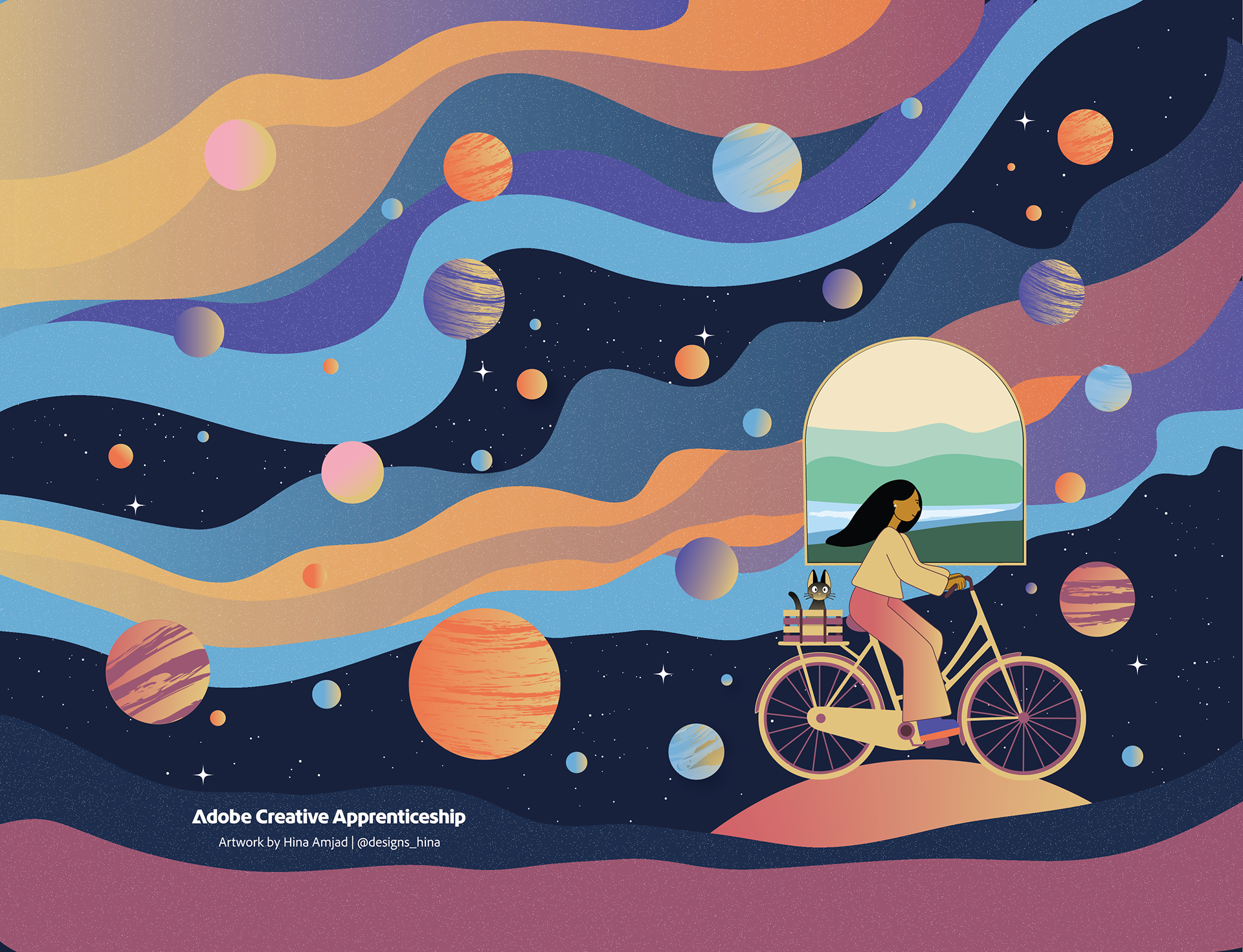
Dreaming in Colour
Notebook Cover Commissioned by Adobe Creative Apprenticeship
This notebook cover was created as part of a commission from the Adobe Creative Apprenticeship. The brief asked for a bold, vibrant design that would immediately catch the eye — especially for a Gen Z audience — and bring the theme “Dreaming in Colour” to life.
Inspiration & Concept
I started by researching what resonates with Gen Z visually — bold colours, emotional connection, character-driven artwork, and playful surrealism. Yellow kept showing up — known for its energy and optimism — and the idea of a main character felt essential.
That’s when the concept came together:
A character cycling through the cosmos, floating through colour and thought. The piece became a visual metaphor for creative thinking — being physically grounded but mentally somewhere else. The window showing Earth was added to subtly contrast imagination vs. reality.
A character cycling through the cosmos, floating through colour and thought. The piece became a visual metaphor for creative thinking — being physically grounded but mentally somewhere else. The window showing Earth was added to subtly contrast imagination vs. reality.
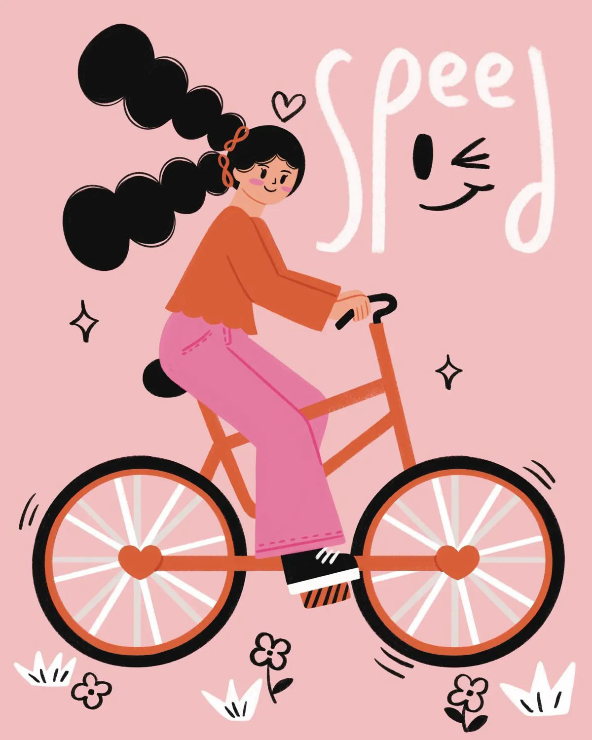


Images are sourced from Pinterest
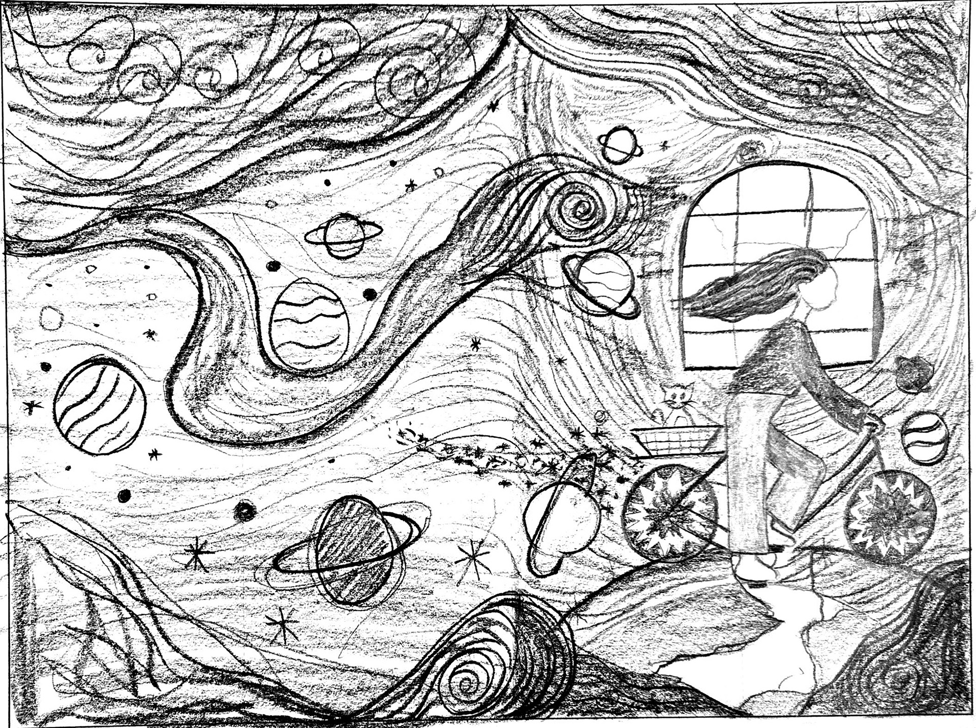
Sketch of the artwork
Visual Approach
I wanted this to feel dreamy without being chaotic. The colour palette is anchored in glowing yellows with complementary tones like deep purple, maroon, and soft blues — all carefully balanced to avoid overwhelming the eye. I focused on creating flow and harmony while still letting the artwork feel energetic and alive.
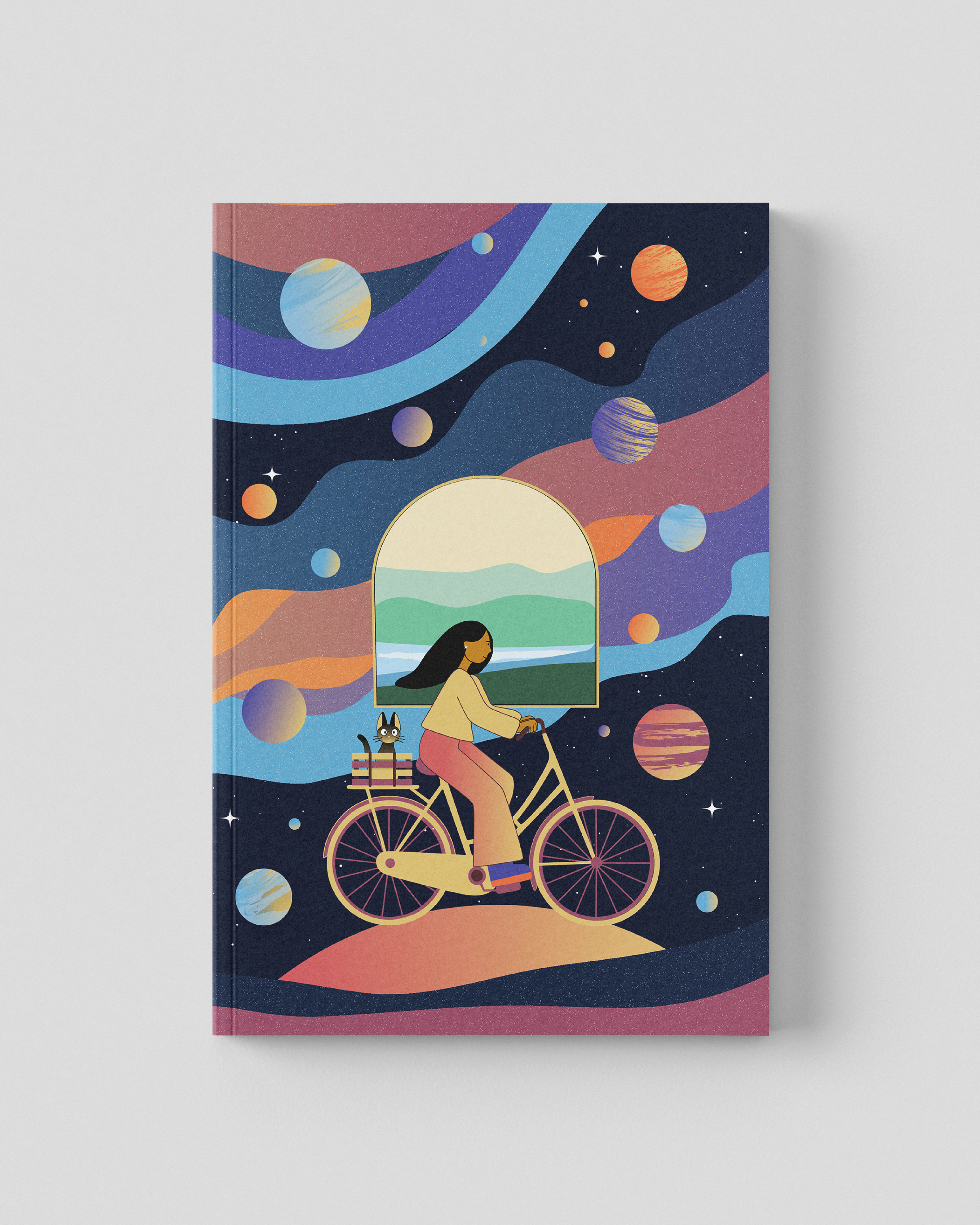
As a designer, this project was personal. It was a chance to build something expressive — not just for a client, but for other young creatives who might see a bit of themselves in the character or the moment. This notebook isn’t just a product — it’s a small visual story about imagination, escape, and how design lives in the in-between.